
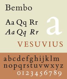
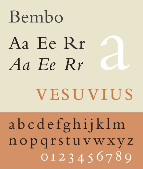
Shown here ET Bembo Classification Old style Variations Bembo Titling | Category Serif Foundry Monotype Imaging | |
 | ||
Link catalog.monotype.com/family/monotype/bembo Designer Monotype Imaging, Francesco Griffo | ||
Bembo typeface animation in after effects
Bembo is a 1929 serif typeface created by the British branch of the Monotype Corporation and most commonly used for body text. It is a member of the "old-style" of serif fonts, with its regular or roman style based on a design cut around 1495 by Francesco Griffo for Venetian printer Aldus Manutius, sometimes generically called the "Aldine roman". Bembo is named for Manutius's first publication with it, a small 1496 book by the poet and cleric Pietro Bembo. The italic is based on work by Giovanni Antonio Tagliente, a calligrapher who worked as a printer in the 1520s, after the time of Manutius and Griffo.
Contents
- Bembo typeface animation in after effects
- History
- Italic
- Monotype history
- Characteristics
- Poliphilus and Blado
- Centaur
- Titling fonts
- The Renaissance
- 20th Century
- Reception
- Monotype digitisations
- Other Griffo inspired fonts
- Free and open source fonts
- Privately used fonts
- References
Monotype created Bembo during a period of renewed interest in the printing of the Italian Renaissance, under the influence of Monotype executive and printing historian Stanley Morison. It followed a previous more faithful revival of Manutius's work, Poliphilus, whose reputation it largely eclipsed. Monotype also created a second, much more eccentric italic for it to the design of calligrapher Alfred Fairbank, which also did not receive the same attention as the normal version of Bembo.
Since its creation, Bembo has enjoyed continuing popularity as an attractive, legible book typeface. Prominent users of Bembo have included Penguin Books, the Everyman's Library series, Oxford University Press, Cambridge University Press, the National Gallery, Yale University Press and Edward Tufte. Bembo has been released in versions for phototypesetting and in several revivals as digital fonts by Monotype and other companies.
History
The regular (roman) style of Bembo is based on Griffo's typeface for Manutius. Griffo, sometimes called Francesco da Bologna (of Bologna), was an engraver who created designs by cutting punches in steel. These were used as a master to stamp matrices, the moulds used to cast metal type.
Manutius at first printed works only in Greek. His first printing in the Latin alphabet, in February 1496 (1495 by the Venetian calendar), was a book entitled Petri Bembi de Aetna Angelum Chabrielem liber. This book, usually now called De Aetna, was a short 60-page text about a journey to Mount Etna, written by the young Italian humanist poet Pietro Bembo, who would later become a Cardinal, secretary to Pope Leo X and lover of Lucrezia Borgia.
Griffo was the one of the first punchcutters to fully express the character of the humanist hand that contemporaries preferred for manuscripts of classics and literary texts, in distinction to the book hand humanists dismissed as a gothic hand or the everyday chancery hand. One of the main characteristics that distinguished Griffo's work from most of the earlier "Venetian" tradition of roman type by Nicolas Jenson and others is the horizontal cross-stroke of the "e", although he was not the first to introduce this style. Modern font designer Robert Slimbach has described Griffo's work as a breakthrough leading to an "ideal balance of beauty and functionality", as earlier has Harry Carter. The type is sometimes known as the "Aldine roman" after Manutius' name.
In France, his work inspired many French printers and punchcutters such as Robert Estienne and Claude Garamond from 1530 onwards, even though the typeface of De Aetna with its original capitals was apparently used in only about twelve books between 1496 and 1499. Historian Beatrice Warde suggested in the 1920s that its influence may have been due to the high quality of printing shown in the original De Aetna volume, perhaps created as a small pilot project. De Aetna was printed using a mixture of alternate characters, perhaps as an experiment, which included a lower-case p in the same style as the capital letter with a flat top. In 1499, Griffo recut the capitals, changing the appearance of the typeface slightly. This version was used to print Manutius' famous illustrated volume Hypnerotomachia Poliphili.
Griffo's roman typeface, with several replacements of the capitals, continued to be used by Manutius's company until the 1550s, when a refresh of its equipment brought in French typefaces which had been created by Garamond, Pierre Haultin and Robert Granjon under its influence. UCLA curators, who maintain a large collection of Manutius's printing, have described this as a "wholesale change ... the press followed precedent; popular in France, [these] types rapidly spread over western Europe". Ultimately, old-style fonts like all of these fell out of use with the arrival of the much more geometric Didone types of the eighteenth and nineteenth centuries. They returned to popularity later in the century, with the arrival of the Arts and Crafts movement.
In 1500, Manutius released the first books printed using italic type, again designed by Griffo. This was originally not intended as a complementary design, as is used today, but rather as an alternative, more condensed typeface suitable for small volumes.
Italic
Bembo's italic is not based directly on the work of Griffo, but on the work of calligrapher and handwriting teacher Giovanni Antonio Tagliente (sometimes written Giovannantonio). He published a writing manual, The True Art of Excellent Writing, in Venice in 1524, after the time of Manutius and Griffo, with engravings and some text set in an italic typeface presumably based on his calligraphy. (Tagliente did not only publish on handwriting, but also self-help guides on learning to read, arithmetic, embroidery and a book of model love letters.) It too was imitated in France, with imitations appearing from 1528 onwards. Another influential italic type created around this time was that of Ludovico Vicentino degli Arrighi, also a calligrapher who became involved in printing. His almost upright italic design was also imitated in France and would also become influential to twentieth-century font designs.
Monotype history
Monotype Bembo is one of the most famous revivals of the Aldine typeface of 1495. It was created under the influence of Monotype executive and printing historian Stanley Morison by the design team at the Monotype factory in Salfords, Surrey, south of London. While most printers of the Arts and Crafts movement of the previous sixty years had been more interested in the slightly earlier typefaces of Nicolas Jenson, Morison greatly admired Aldus Manutius' typeface above others of the period. The main reasons for his admiration were the balance of the letter construction, such as the evenness of the 'e' with a level cross-stroke and the way the capitals were made slightly lower than the ascenders of the tallest lower-case letters. He described the Aldine roman as "inspired not by writing, but by engraving; not script but sculpture."
Bembo's development took place following a series of breakthroughs in printing technology which had occurred over the last fifty years without breaking from the use of metal type. Pantograph engraving had allowed punches to be precisely machined from large plan drawings. This gave a cleaner result than historic typefaces whose master punches had been hand-carved out of steel at the exact size of the desired letter. It also allowed rapid development of a large range of sizes. In addition, hand printing had been superseded by the hot metal typesetting systems of the period, of which Monotype's was one of the most popular (in competition with that of Linotype's). Both allowed metal type to be quickly cast under the control of a keyboard, eliminating the need to manually cast metal type and slot it into place into a printing press. With no need to keep type in stock, just the matrices used as moulds to cast the type, printers could use a wider range of fonts and there was increasing demand for varied typefaces. Artistically, meanwhile, the preference for using mechanical, geometric Didone and “modernised old style” fonts introduced in the nineteenth century was being displaced by a revival of interest in "true old style" serif fonts developed before this, a change that has proved to be lasting. At the same time, hot metal typesetting had imposed new restrictions: in Monotype's system (while less restrictive than Linotype's), in order to mechanically count the number of characters that could be fitted on a line, letters could only be certain widths, and care was needed to produce letters that looked harmonious in spite of this.
Morison was interested in the history of the 15th century Italian printing, and had discussed the topic with his correspondent, the printer Giovanni Mardersteig, in correspondence with whom he wrote a series of letters discussing Bembo's development. He also discussed the project in his letters with the Poet Laureate Robert Bridges, who had some interest in printing.
Bembo's technical production followed Monotype's standard method of the period. The characters were drawn on paper in large plan diagrams by the highly experienced drawing office team, led and trained by American engineer Frank Hinman Pierpont and Fritz Steltzer, both of whom Monotype had recruited from the German printing industry. The drawing staff who executed the design was disproportionately female and in many cases recruited from the local area and the nearby Reigate art school. A wax-copy was made from these drawing, the wax-copy was used to produce a lead plate with the design. These plates were then used as a plan for machining metal punches to stamp matrices in the Benton-pantographs. It was Monotype's standard practice at the time to first engrave a limited number of characters and print proofs from them to test overall balance of colour on the page, before completing the remaining characters.
Monotype's publicity team described the final italic as "fine, tranquil" in a 1931 showing, emphasising their desire to avoid a design that seemed too eccentric. It was, however, not the only design considered. Morison initially commissioned from the calligrapher Alfred Fairbank a nearly upright italic design based on the work of Arrighi, and considered using it as Bembo's companion italic before deciding it was too eccentric for this purpose. Monotype ultimately created a more conventional design influenced by Tagliente's typeface and sold Fairbank's design as Bembo Condensed Italic. It was digitised as "Fairbank" in 2003, and sold independently of Monotype's Bembo digitisations. Morison conceded in his memoir that the Fairbank design "looked its best when given sole possession of the page". Fairbank later complained that he had not been told that his italic was intended to be a complementary design, and that he would have designed it differently if he had been.}}
As was normal in metal type fonts of the period from Monotype and other companies, the font was drawn differently at different sizes by modifying Griffo's original single-size design, a quite large letter at an approximate size of 15 points. The changes made were looser spacing, higher x-height (taller lower-case letters) and a more solid colour of impression at smaller sizes, and a finer, more graceful and tightly spaced design at large sizes.
Characteristics
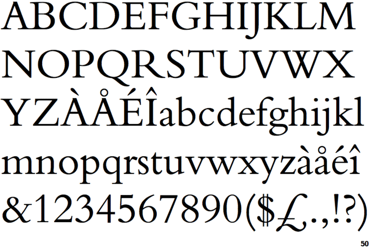
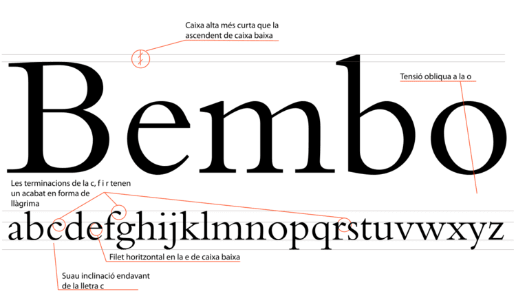
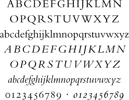
Among Bembo's more distinctive characteristics, the capital "Q"'s tail starts from the glyph's centre, the uppercase "J" has a slight hook and the sides of the "M" splay outwards slightly. Many lowercase letters show subtle, sinuous curves; the termination of the arm of both the r and the e flare slightly upward and outward. The lowercase "c" and "e" push slightly forwards. Characters "h", "m", and "n" are not quite vertical on their right-hand stems, with a subtle curve towards the left going down the stroke. In italic, the k has an elegantly curved stroke in the lower-right and descenders on the p, q and y end with a flat horizontal stroke. In the 1950s, Monotype noted that its features included: "serifs fine slab, fine-bracketed and in l.c. prolonged to right along baseline." This meant that many of the serifs (especially the horizontals, for example on the W) are fine lines of quite uniform width, rather than forming an obvious curve leading into the main form of the letter. The ascenders reach above the cap height.
In metal type, Bembo includes two capital "R"s, one with a long, extended leg following Griffo, one with a more tucked-in leg suitable for body text.
Bembo does not attempt to strictly copy all the features of Renaissance printing, instead blending them with a twentieth-century sensibility and the expectations of contemporary design. An eccentricity of Griffo's first De Aetna capitals was an asymmetrical M that does not seem to have a serif at top right. So odd it has been suggested it may have been the result of faulty casting of type, it was nonetheless often copied in French imitations by Garamond and his contemporaries. Monotype's revival declined to follow this, although it was recreated for a British Museum exhibition catalogue. Monotype also did not copy the curving capital Y used by Manutius in the tradition of the Greek letter upsilon which had been used in some versions of Poliphilus and Blado, although not in the digitisation of Poliphilus. Nesbitt has described the capitals as "a composite design in the spirit of [Griffo's] type".
In the italic, the expansive ascenders of Tagliente's type were shortened and the curl to the right replaced with more conventional serifs. Monotype also cut italic capitals sloped to match the lower-case, whereas in the Renaissance italics were used with upright capital letters in the Roman inscriptional tradition. The bold (Monotype's invention, since Griffo and his contemporaries did not use bold type) is extremely solid, providing a very clear contrast to the regular styles, and Monotype also added lining (upper-case height) figures as well as the text figures (at lower-case height) used in the fifteenth and sixteenth centuries. Historian James Mosley suggests that the numerals of Bembo were based on those Monotype had already developed for the typeface Plantin.
Poliphilus and Blado
Monotype had already designed two other types inspired by the same period of Italian printing and calligraphy, the roman Poliphilus and italic Blado (both 1923). Made more eccentric and irregular than the sleek lines of Bembo to evoke the feel of antique printing, these remained in Monotype's catalogue and have been digitised, but are much less known today. Bembo can therefore be seen as an iteration of a preexisting design concept towards mass market appeal, taking the basic idea of the Griffo design and (unlike Poliphilus) updating its appearance to match the more sophisticated printing possible by the 1920s. Bembo's original working name was "Poliphilus Modernised".
Poliphilus is named after the book Hypnerotomachia Poliphili, one of Manutius's most famous books in the Latin alphabet, which was printed with the same roman as De Aetna but recut capitals; it was made for the Medici Society, who planned to create an English translation. Blado is named after the printer Antonio Blado, a colleague of Arrighi. Morison preferred Bembo's roman and was somewhat dismissive of Poliphilus. Unlike Bembo, both in metal featured a Greek-influenced Y with a curving head, as in the original.
Centaur
Monotype licensed and released the font Centaur around the same time as Bembo. It was drawn by the American book designer Bruce Rogers. Its roman is based on a slightly earlier period of Italian renaissance printing than Bembo, the work of Nicolas Jenson in Venice around 1470 (the so-called Venetian style). Like Bembo, its italic (by Frederic Warde) comes from the 1520s, being again loosely based on the work of Arrighi from around 1520. Compared to Bembo it is somewhat lighter in structure, something particularly true in its digital facsimile. Penguin often used it for headings and titles of 'classic' editions, particularly its capitals and italic; its lower-case does not so effectively harmonise with Bembo due to the different letter shapes such as the tilted 'e'.
Titling fonts
Monotype created several titling designs based on Renaissance printing that could be considered complementary to Bembo: Bembo Titling (based directly on Bembo's capitals, but more delicate to suit a larger text size) and the more geometric Felix Titling in 1934, inspired by humanist capitals drawn by Felice Feliciano in 1463. In the hot metal type era Monotype also issued a titling version of Centaur, which was often used by Penguin; Monotype's digitisations of Centaur do not include it.
The Renaissance
20th Century
Reception
Bembo has been very popular in book publishing, particularly in Britain. It was also recommended by HMSO in its style guide for outsourced printing jobs. Cambridge University Press's history describes Bembo as one of its most commonly used typefaces; Morison was closely connected to Cambridge and his personal archive (as well as much of Monotype's) went to the university after his death.
Among reviews of typefaces, writing in the anthology Typographic Specimens: The Great Typefaces, Jeff Price commented that Bembo became noted for its ability to "provide a text that is extremely consistent in colour", helping it to "remain one of the most popular book types since its release". Modern font designer Nick Shinn has also commented, "Bembo has a sleek magnificence, born of high-precision technology at the service of accomplished production skills, which honours the spirit of the original, and an exotic grace of line which humbles most new designs made more ostensibly for the new technology." Oxford University Press editor John Bell also borrowed the name for his set of comic verse lampooning publishing, Mutiny on the Bembo.
Monotype digitisations
Monotype has released two separate digitisations named Bembo and more recently Bembo Book, as well as the more slender caps-only display font Bembo Titling and the alternate italic design Fairbank. Bembo Book is considered to be superior by being thicker and more suitable for body text, as well as for offering the alternate shorter R for better-spaced body text.
Monotype's original, early digitisation of Bembo was widely seen as unsuccessful. Two main problems have been cited with it: it was much lighter in type colour than the original metal type, perhaps through failure to anticipate the reduced ink spread on modern printing equipment. In addition, the digital Bembo was based on the 9 pt metal drawings, creating a font with different proportions to the metal type in the point sizes at which Bembo was most often used in books. This made the proportions of the digital font appear wrong, failing to match the subtlety of the metal type and even phototype, which was released in three different optical sizes for different print sizes. Future Monotype executive Akira Kobayashi commented:
"I got into a slight panic. None of the letters looked like Bembo! For a moment I froze in front of the computer, thinking about writing a letter of complaint to the company for sending us the wrong font. After a while I checked the Bembo Italic and I slowly began to realise that the fonts were Bembo. I calmed down enough to recall that the typeface was originally designed for metal type, and most of the specimens and texts I saw were set in metal type in text size. That was why the images of the characters did not overlap. I knew that a metal typeface was cut or designed separately for each size, but a film composition or digital face is a kind of compromise having proportions designed for reduction and enlargement. I was overwhelmed to see the huge gap. Then I looked into the types used in Western offset-litho prints to see the digital Bembo types in use ... the types that were originally designed for hot-metal often looked too light and feeble ... Bembo Book is more or less what I expected."
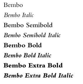
While Bembo Book is considered the superior digitisation, the original continues to offer the advantages of two extra weights (semi- and extra-bold) and infant styles with simplified a and g characters resembling handwriting; its lighter appearance may also be of use on printing equipment with greater ink spread. Cross-licensing has meant that it is sold by a range of vendors, often at very low prices. As an example of this, Fontsite obtained the rights to resell a derivative of the original digitisation, using the alternative name Borgia and Bergamo, upgrading it by additional OpenType features such as small capitals and historical alternative characters. Neither version includes digitisations of the larger size versions of Bembo, which had a more delicate and elegant design.
Other Griffo-inspired fonts
A major professional competitor to Bembo is Agmena, created by Jovica Veljović and released by Linotype in 2014. Intended as a unified serif design supporting Roman, Greek and a range of Cyrillic alphabets such as Serbian, it features a more calligraphic italic than Bembo with swash capitals and support for Greek ligatures.
A looser interpretation of the Griffo designs is Iowan Old Style, designed by John Downer and also released by Bitstream. With a larger x-height (taller lower-case letters) than the print-oriented Bembo and influences of signpainting (Downer's former profession), it was intended to be particularly clear for reading at distance, in displays and in signage. It is a default font in Apple's iBooks application.
Not explicitly influenced by Bembo but also influenced by Griffo is Minion by Slimbach. Released by Adobe, a 2008 survey ranked it as one of the most popular typefaces used in modern fine printing.
Besides designs with similar inspiration, a number of unofficial releases and digitisations of Bembo have been made in the phototypesetting and digital periods, reflecting the lack of effective intellectual property protection for typefaces. Several unofficial versions were released during the phototypesetting period under alternate names; for example one unofficial phototypesetting version was named "Biretta" after the hat worn by Roman Catholic clergy, and another by Erhard Kaiser was created for the East German printing concern Typoart, outside the reach of Western intellectual property laws. In the digital period, Rubicon created a version named "Bentley" intended for small sizes and Bitstream made a version under the name of "Aldine 401". Its licensee ParaType later created a set of Cyrillic characters for this in 2008. The name "Bembo" remains a Monotype trademark and may not be used to describe such clones.
Free and open-source fonts
Two open-source designs based on Bembo are Cardo and ET Book. The Cardo fonts, developed by David J. Perry for use in classical scholarship and also including Greek and Hebrew, are freely available under the SIL Open Font License. Unimpressed by the first Bembo digitisation, statistician and designer Edward Tufte commissioned an alternative digitisation for his books in a limited range of styles and languages, sometimes called 'ET Bembo'. He released it publicly as an open-source font named 'ET Book' in September 2015.
Privately used fonts
Heathrow and other British airports used a highly divergent adaptation of Bembo for many years. Designed by Shelley Winters and named BAA Bembo or BAA Sign, it was very bold with a high x-height.
The National Gallery in London used Bembo, then its corporate font, as a plan for the carving of its name into its frontage.
The Yale face, developed by Matthew Carter as a corporate font for Yale University, is based on Griffo's work; Yale commissioned a custom font from Carter, a member of the university faculty, after being dissatisfied with digital versions of Bembo. Carter commented on the design that "John Gambell, the Yale University printer who initiated and ran the project, also liked the idea of an Aldine face ... Monotype Bembo had been used for University printing at an earlier time, so there was a useful precedent." It is available exclusively to "Yale students, employees, and authorized contractors for use in Yale publications and communications. It may not be used for personal or business purposes, and it may not be distributed to non-Yale personnel."
In the pre-digital period, IBM offered Aldine, a font inspired by Bembo, as a font for the IBM Composer. This was an ultra-premium electric golfball typewriter system, intended for producing copy to be photographically enlarged for small-scale printing projects, or for high-quality office documents. Ultimately the system proved a transitional product, as it was displaced by cheaper phototypesetting, and then in the 1980s by word processors and general-purpose computers.