
Nationality American Name Edward Tufte | ||
 | ||
Occupation Professor, statistician, writer, sculptor Notable works The Visual Display of Quantitative InformationBeautiful Evidence Awards Guggenheim Fellowship for Social Sciences, US & Canada, Phi Beta Kappa Award in Science Books The Visual Display of Quantitati, Envisioning Information, Beautiful Evidence, Visual Explanations, The Cognitive Style of P Similar People Stephen Few, Robert A Dahl, Ben Schott, Andrei Severny, Paul Rand | ||
Tech state data visualization keynote by dr edward tufte
Edward Rolf Tufte (; born March 14, 1942) is an American statistician and professor emeritus of political science, statistics, and computer science at Yale University. He is noted for his writings on information design and as a pioneer in the field of data visualization.
Contents
- Tech state data visualization keynote by dr edward tufte
- Edward tufte beautiful evidence highlights
- Biography
- Work
- Information design
- Criticism of PowerPoint
- Small multiple
- Sparkline
- Sculpture
- References
Edward tufte beautiful evidence highlights
Biography
Edward Rolf Tufte was born in 1942 in Kansas City, Missouri, to Virginia Tufte and Edward E. Tufte (1912–1999). He grew up in Beverly Hills, California, where his father was a longtime city official, and he graduated from Beverly Hills High School. He received a BS and MS in statistics from Stanford University and a PhD in political science from Yale. His dissertation, completed in 1968, was entitled The Civil Rights Movement and Its Opposition. He was then hired by Princeton University's Woodrow Wilson School, where he taught courses in political economy and data analysis while publishing three quantitatively inclined political science books.
In 1975, while at Princeton, Tufte was asked to teach a statistics course to a group of journalists who were visiting the school to study economics. He developed a set of readings and lectures on statistical graphics, which he further developed in joint seminars he taught with renowned statistician John Tukey, a pioneer in the field of information design. These course materials became the foundation for his first book on information design, The Visual Display of Quantitative Information.
After difficult negotiations with mainline publishers failed, Tufte decided to self-publish Visual Display in 1982, working closely with graphic designer Howard Gralla. He financed the work by taking out a second mortgage on his home. The book quickly became a commercial success and secured his transition from political scientist to information expert.
On March 5, 2010, President Barack Obama appointed Tufte to the American Recovery and Reinvestment Act's Recovery Independent Advisory Panel "to provide transparency in the use of Recovery-related funds".
Work
Tufte is an expert in the presentation of informational graphics such as charts and diagrams, and is a fellow of the American Statistical Association. He has held fellowships from the Guggenheim Foundation and the Center for Advanced Study in the Behavioral Sciences.
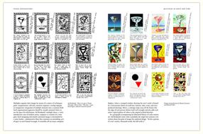
He is intensely critical in the self-editing process. He pulls in and casts out ideas from books, journals, posters, auction catalogs, and other less common sources. He invites others to critique his work in-progress and may nurture dozens of ideas over months in various states of growth and fruition. He deletes almost every photograph he takes. Over time, he deletes most of what he writes on his own forum, ET Notebooks. Every printing of every book corrects numerous small blemishes, ranging from color registration to kerning and hinting.
Information design
Tufte's writing is important in such fields as information design and visual literacy, which deal with the visual communication of information. He coined the word chartjunk to refer to useless, non-informative, or information-obscuring elements of quantitative information displays. Tufte's other key concepts include what he calls the lie factor, the data-ink ratio, and the data density of a graphic.
He uses the term "data-ink ratio" to argue against using excessive decoration in visual displays of quantitative information. In Visual Display, Tufte explains, "Sometimes decoration can help editorialize about the substance of the graphic. But it is wrong to distort the data measures—the ink locating values of numbers—in order to make an editorial comment or fit a decorative scheme."
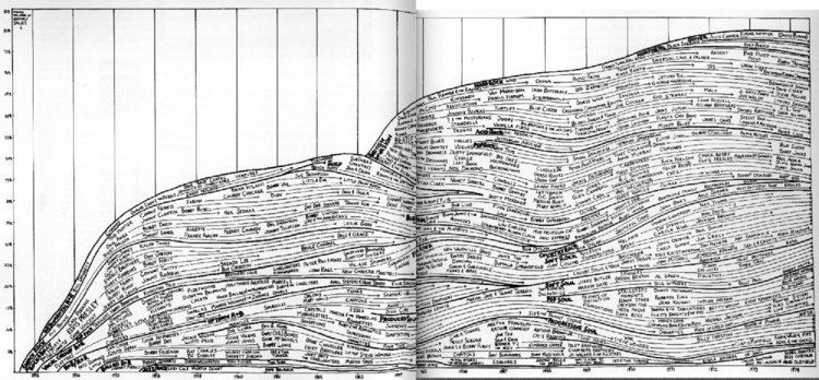
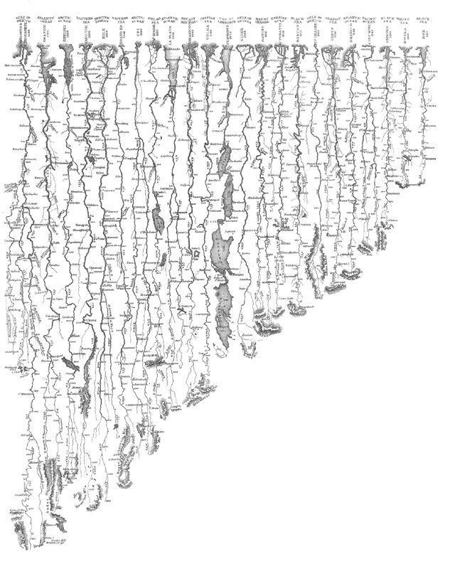
Tufte encourages the use of data-rich illustrations that present all available data. When such illustrations are examined closely, every data point has a value, but when they are looked at more generally, only trends and patterns can be observed. Tufte suggests these macro/micro readings be presented in the space of an eye-span, in the high resolution format of the printed page, and at the unhurried pace of the viewer's leisure.
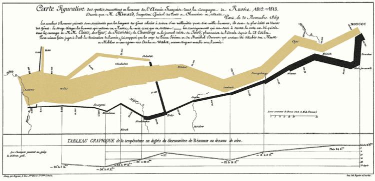
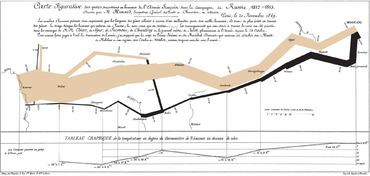
He uses several historical examples to make his case. These include John Snow's cholera outbreak map, Charles Joseph Minard's Carte Figurative, early space debris plots, Galileo Galilei's Sidereus Nuncius, and Maya Lin's Vietnam Veterans Memorial. For instance, the listing of the names of deceased soldiers on the black granite of Lin's sculptural memorial is shown to be more powerful as a chronological list rather than as an alphabetical one. The sacrifice each fallen individual has made is thus highlighted within the overall time scope of the war. In Sidereus Nuncius Galilei presents the nightly observations of the moons of Jupiter in relation to the body itself, interwoven with the two-month narrative record.
Criticism of PowerPoint
Tufte has criticized the way Microsoft PowerPoint is typically used. In his essay "The Cognitive Style of PowerPoint", Tufte criticizes many aspects of the software:
Tufte cites the way PowerPoint was used by NASA engineers in the events leading to the Space Shuttle Columbia disaster as an example of the many problems. The software style is designed to persuade rather than to inform people of technical details. Tufte's analysis of a NASA PowerPoint slide is included in the Columbia Accident Investigation Board’s report—including an engineering detail buried in small type on a crowded slide with six bullet points, that if presented in a regular engineering white paper, might have been noticed and the disaster prevented.
Instead, Tufte argues that the most effective way of presenting information in a technical setting, such as an academic seminar or a meeting of industry experts, is by distributing a brief written report that can be read by all participants in the first 5 to 10 minutes of the meeting. Tufte believes that this is the most efficient method of transferring knowledge from the presenter to the audience and then the rest of the meeting is devoted to discussion and debate.
Small multiple
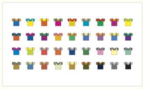
One method Tufte encourages to allow quick visual comparison of multiple series is the small multiple, a chart with many series shown on a single pair of axes that can often be easier to read when displayed as several separate pairs of axes placed next to each other. He suggests this is particularly helpful when the series are measured on quite different vertical (y-axis) scales, but over the same range on the horizontal x-axis (usually time).
Sparkline
Although Tufte is said to have invented Sparklines, in actuality he invented only the name and popularized it as technique. Sparklines are a condensed way to present trends and variation, associated with a measurement such as average temperature or stock market activity, often embedded directly in the text; for example: The Dow Jones index for February 7, 2006 . These are often used as elements of a small multiple with several lines used together. Tufte explains the sparkline as a kind of "word" that conveys rich information without breaking the flow of a sentence or paragraph made of other "words" both visual and conventional. To date, the earliest known implementation of sparklines was conceived by interaction designer Peter Zelchenko and implemented by programmer Mike Medved in early 1998.
Sculpture
Beyond his academic endeavors over the years, Tufte has created sculptures, often large outdoor ones made of metal or stone, which were first primarily exhibited on his own rural Connecticut property. In 2009–10, some of these artworks were exhibited at the Aldrich Contemporary Art Museum in Ridgefield, Connecticut, in the one-man show Edward Tufte: Seeing Around. The Tufte sculpture garden in Woodbury, Connecticut is open to the public one day per year.
In his sculpture, he digs through sources ranging from other art and other genres (most notably Feynman diagrams), to flea markets, nuclear power plants, and fields of grass. He is in search of forms and ideas from which to build models, table pieces, and occasionally larger landscape pieces. Even some nominally finished, large scale works are reworked heavily. But at the same time, some random sculptural equivalents of brush strokes or artifacts of a piece's former life are retained, a degree of wabi-sabi, as may be seen in Rocket Science (circa 2006–9, Hogpen Hill, Connecticut).
In 2010, "the man known as 'ET'... opened a gallery, ET Modern, in New York City's Chelsea Art District" at 11th Avenue and 20th Street. The gallery closed in 2013 "after 3.5 good years".