
Nationality Italian | Name Nicolas Jenson | |
 | ||
Occupation Typographerfrench engraver, Type Designer Notable work creation of Roman typeface, made the final definitive break from blackletter style Similar William Morris, Johannes Gutenberg, Johann Fust | ||
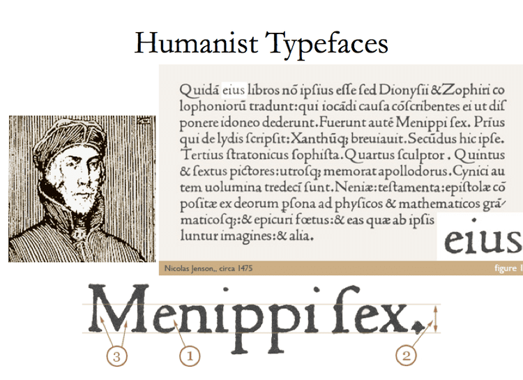
Nicholas Jenson (c.1420 – 1480) was a French engraver, pioneer, printer and type designer who carried out most of his work in Venice, Italy. Jenson acted as Master of the French Royal Mint at Tours, and is credited with being the creator of one of the finest early Roman type faces. Nicholas Jenson has been something of an iconic figure among students of early printing since the nineteenth century when the aesthete William Morris praised the beauty and perfection of his roman font. Jenson is an important figure in the early history of printing and a pivotal force in the emergence of Venice as one of the first great centers of the printing press.
Contents
History
In October 1458, while acting as Master of the French Royal Mint, Jenson was sent to Mainz, by King Charles VII, to study the art of metal movable type. By the time Jenson arrived in Mainz, there were a number of established printers under which he could have been apprenticed. Jenson left Mainz in 1461.
Some hypothesize that Jenson studied under the tutelage of Johann Gutenberg, although there is no verifiable evidence of this. By this time Gutenberg's first press had been seized by Johann Fust, and historians are unsure of his activities during this period.
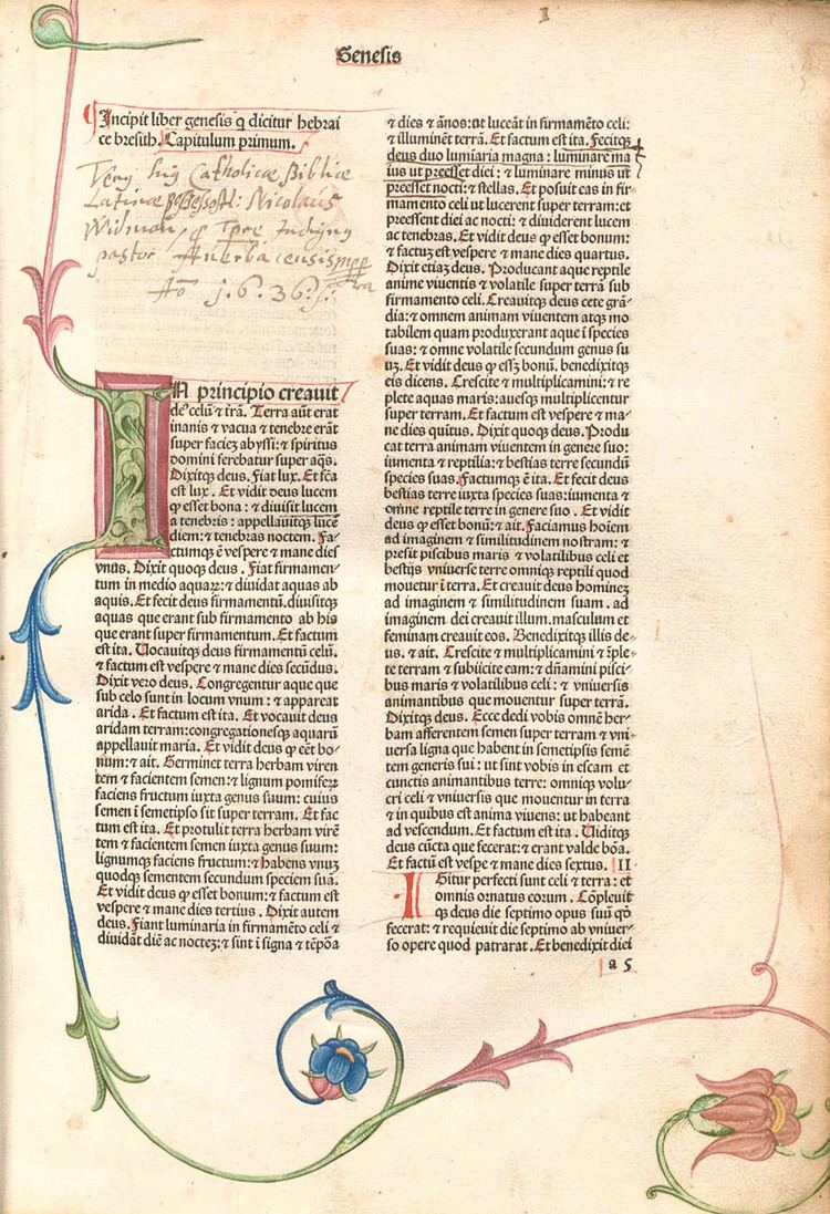
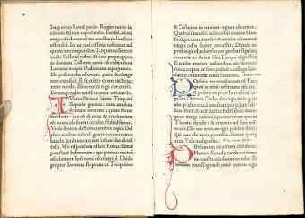
In 1468 Jenson went to Venice, opening a printing shop in 1470, and, in the first work he produced, the printed roman lowercase letter took on the proportions, shapes, and arrangements that marked its transition from an imitation of handwriting to the style that has remained in use throughout subsequent centuries of printing. Jenson also designed Greek-style type and black-letter type. The printer was prodigious in his publishing, eventually producing around 150 titles.
By the end of his life Jenson was a wealthy man, producing liturgical, theological and legal texts in a variety of gothic fonts, the roman type left only for the odd commissioned work.
Printing history
Working separately but concurrently with Johann and Wendelin of Speyer (de Spira), Nicholas Jenson is popularly thought to have made the final definitive break from blackletter style towards a fully evolved roman letterform.
During the 1470s Nicholas Jenson’s technical skill and business acumen helped establish Venice as Italy’s publishing capital and in centuries since he has been celebrated for perfecting roman type, the rebirth of Latin inscription.
In 1477 Jenson was able to run as many as twelve presses at the same time. To lower prices and force out less productive rivals, he cut cursive gothic type, enabling him to print text and gloss on the same page for the first time.
Jenson's printing
During the time of his arrival in Venice Jenson was quite successful as an artist but was financially successful as well. His early training as a gold smith allowed him even greater sensitivities to the sculptural nature of type; the letters Jenson employed were often beautiful capitals that could summon the spirit of Rome.
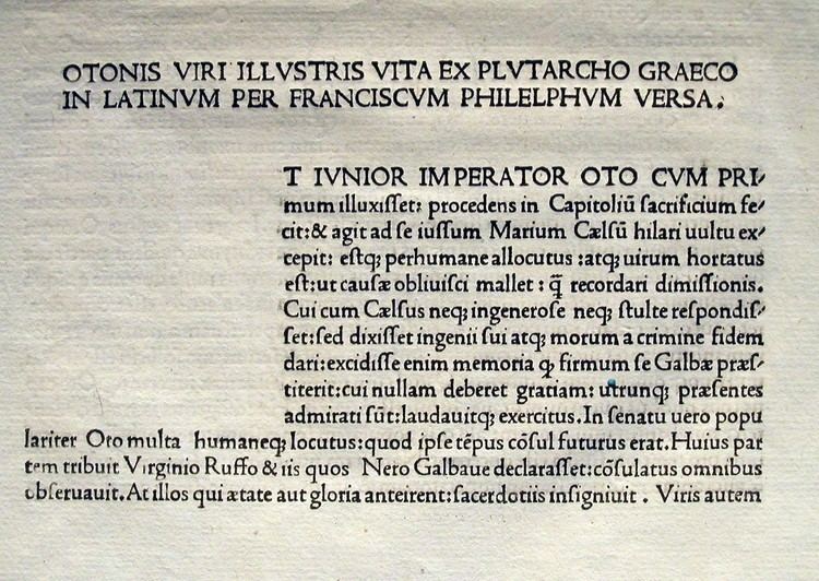
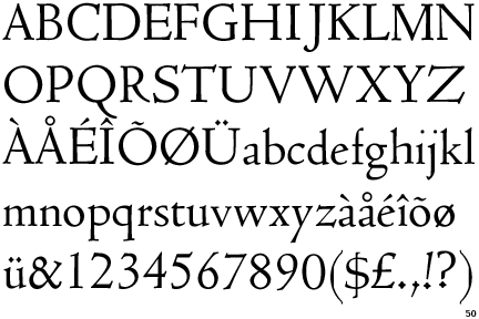
Jenson's highly legible and evenly colored typeface, based upon Humanistic scripts, has been reinterpreted through the centuries by numerous type designers, most notably William Morris. Jenson's fame as one of history's greatest typeface designers and punch cutters rests on the types first used in Eusebius's De praeparatione evangelica, which presents the full flowering of roman type design.
Jenson constructed the first roman typeface on the basis of typographical principles, as opposed to the old manuscript models. It was first in use in his 1470 edition of Eusebius. In 1471, a Greek typeface followed, which was used for quotations, and then in 1473 a Black Letter typeface, which he used in books on medicine and history.
In distinction to his contemporary printers, Jenson was able to expand his financial base. By 1477 he could run as many as twelve presses simultaneously. He is also responsible for launching two book trading companies, first in 1475 and then in 1480, under the name of Johannes de Colonia, Nicolaus Jenson et socii.
Following his death respective typefaces were employed by the Aldine Press, and have continued to be the basis for numerous fonts. Examples include William Morris' Golden Type, Bruce Rogers' "Centaur" in 1914, Morris Fuller Benton's "Cloister Old Style" in 1926, and Robert Slimbach's "Adobe Jenson" in 1996.