
Category Serif | Classification Garalde old style Date released 1990 | |
 | ||
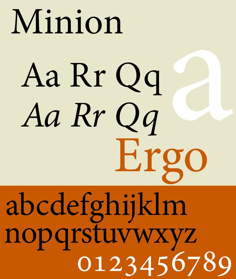
Minion is a serif typeface designed by Robert Slimbach in 1990 for Adobe Systems and inspired by late Renaissance-era type. The name comes from the traditional naming system for type sizes, in which minion is between nonpareil and brevier, with the type body 7pt in height. As the name suggests, it is particularly intended as a font for body text in a classical style, neutral and practical while also slightly condensed to save space. Slimbach described the design as having "a simplified structure and moderate proportions."
Contents
- Minion
- Minion Cyrillic
- Minion MM
- Minion Std Black
- Minion Pro
- Minion Web
- Minion Web Pro
- Minion Math and MnSymbol
- Minion in other font families
- Reception
- Usage
- Awards
- References
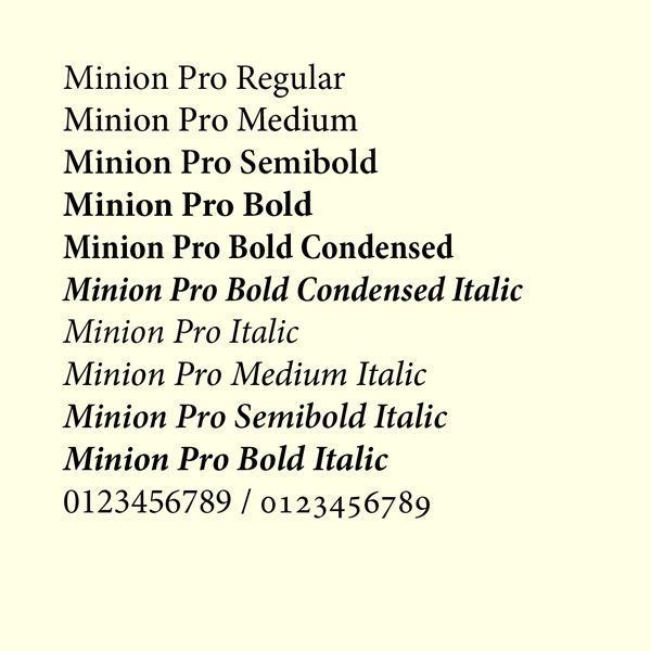
Minion was developed using sophisticated interpolation or multiple master technology to create a range of weights and optical sizes suitable for different text sizes. This automation of font creation was intended to allow a gradual trend in styles from solid, chunky designs for caption-size small print to more graceful and slender designs for headings. It is an early member of what became Adobe's Originals program, which created a set of type families primarily for book and print use, many like Minion in a deliberately classical style. Minion is a very large family of fonts, including Greek and Cyrillic alphabets, optical sizes, condensed styles and stylistic alternates such as swash capitals. It is one of the most popular typefaces used in books, one of the most famous being The Elements of Typographic Style, Robert Bringhurst's book about fine printing and page layout.
Minion
Modern Minion releases are in the OpenType (otf) format, allowing a variety of stylistic alternates such as small caps and ligatures to be encoded in the same font. The original release used additional 'expert set' fonts for these features, and may remain used by designers using more primitive software such as Microsoft Office that have limited OpenType support. (Like many Slimbach (and other Adobe) fonts, Minion features a 'Th' ligature, a tradition derived from calligraphy.)
Minion
The original release. Minion Black does not have italic counterpart. Minion Expert is a separate font package that include fonts containing small caps, ligatures, old style figures, and swash glyphs. There are also fonts for dingbats (Minion Ornaments), and a Black-weighted font (Minion Black Expert). Swash fonts are included for only the 2 lightest font weights. An 'expert set' font is used for older and simpler applications that cannot handle multiple text styles for the same letter (such as both lower-case letters and small caps) in the same font. Slimbach stated, "I saw it as being useful in text applications like newspapers, textbooks, and manuals, as well as signage and titles."
Minion Cyrillic
Minion Cyrillic was designed in 1992 by Robert Slimbach and was conceived as a non-Latin counterpart to Slimbach’s Minion typeface family. There were no Display-sized fonts, expert fonts, or Black-weighted fonts in this family.
Minion MM
The Multi Master version of the original Minion family, released in 1992. Commonly used in Adobe Acrobat to replace unknown fonts.
Minion Std Black
An OpenType version of the Minion Black font, but includes features found in Expert versions of PostScript Minion Black fonts. In addition, character set was updated to support Adobe Western 2.
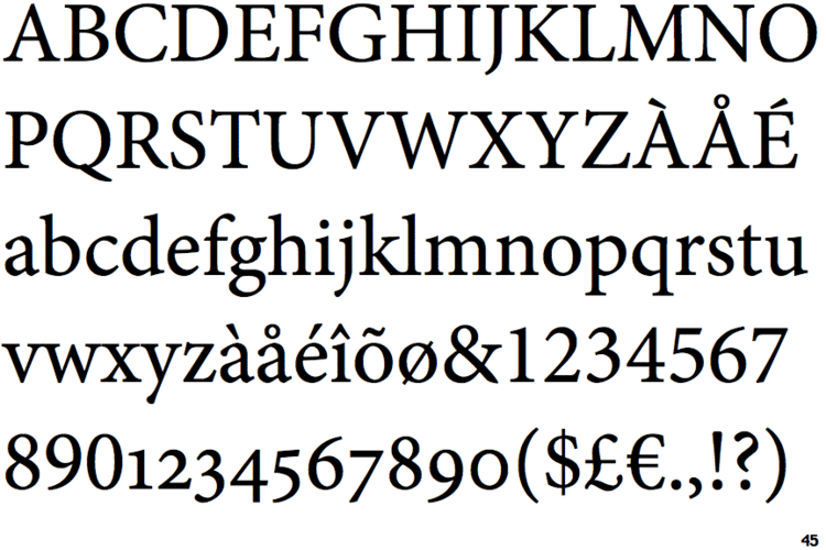
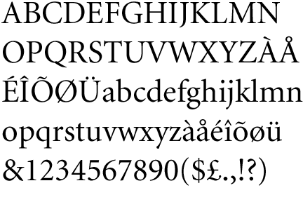
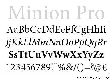
Minion Pro
An OpenType update of the original family, released in 2000. The update is based on Minion MM but features slight changes to the selection of instances and modifications of the font metrics.
The family comes with 3 (later 4, which adds Medium) weights, each in roman and italic, 2 widths, and 4 optical sizes (not sold in all packages). The Black weight from Minion Black Expert was not included. Each font includes the expert glyphs and dingbats that were previously found in Minion Expert package (swashes available in italic fonts only), Cyrillic Glyphs from Minion Cyrillic. In addition, the font family supports Adobe CE, Adobe Western 2, Greek, Latin Extended, Vietnamese character sets.
Minion Web
A TrueType version of Minion, designed for screen use. It supports ISO-Adobe character set. Version 1.00 of the font was distributed with Internet Explorer 4.0.
Minion Web Pro
An updated version of Minion Web, which supports Adobe CE and Adobe Western 2 character sets.
Minion Math and MnSymbol
Minion Math is a variant designed by Johannes Küster from typoma GmbH, for mathematical applications. Minion Math family includes 20 fonts in 4 weights and 5 optical sizes each. An additional optical size 'Tiny' is added. The October 2011 version (1.020) contains about 2900 glyphs per font; it also added OpenType math features. Minion Math had a working title, typoma MnMath. The final form is expected to include all Unicode mathematical symbols and many additional symbols.
An older companion to Adobe's Minion Pro (rather than replacement) is Achim Blumensath's MnSymbol, typically (but not necessarily) used from TeX. Although MnSymbol has a packaging as OpenType, it only provides TeX font metrics for math.
Minion in other font families
The Latin Minion glyphs are also used in other Adobe font families, including Adobe Arabic (Arabic), Adobe Hebrew (Hebrew), Adobe Thai (Thai), and Adobe Song (simplified Chinese).
Reception
Minion has generally received praise for its effectiveness as a clean, neutral book face with a very comprehensive range of features and styles. Slimbach himself has described it as "an exercise in restraint," noting that his other serif designs have tended to be more eccentric, such as Arno and Jenson.
Designer Matthew Butterick, however, mildly criticised it for being too neutral. "Minion is beautifully made—it’s balanced, it’s clean, it’s handsome, it’s conservative. It’s easy to like. And it’s been hugely successful as a book font, meaning you will not get fired for using Minion...[but] Minion succeeds so well in being noncontroversially good-looking that I find it sort of dull."
Usage
Awards
Minion Pro won bukva:raz! 2001 award under Greek category.