
Publication types Books | ||
 | ||
Official website www.penguinclassics.com Characters Cthulhu, Porthos, Athos, Aramis, Milady de Winter Books The Call of Cthulhu and Other, The Three Musketeers, The Thing on the Doorstep, Heroes in the Wind | ||
Bookshelf tour penguin classics vlogmas 8
Penguin Classics is an imprint published by Penguin Books, a subsidiary of Penguin Random House. They are published in varying editions throughout the world including in Australia, Canada, China, India, Ireland, New Zealand, South Africa, South Korea, the United Kingdom, and the United States. Literary critics see books in this series as important members of the Western canon, though many titles are translated or of non-Western origin; indeed, the series for decades from its creation included only translations, until it eventually incorporated the Penguin English Library imprint in 1986. The first Penguin Classic was E. V. Rieu's translation of The Odyssey, published in 1946, and Rieu went on to become general editor of the series. Rieu sought out literary novelists such as Robert Graves and Dorothy Sayers as translators, believing they would avoid "the archaic flavour and the foreign idiom that renders many existing translations repellent to modern taste."
Contents
- Bookshelf tour penguin classics vlogmas 8
- Penguin classics goody bag book haul
- Design
- Bill Amberg
- Series
- Complete Collection
- 60th Anniversary
- Controversy
- References
Penguin classics goody bag book haul
Design
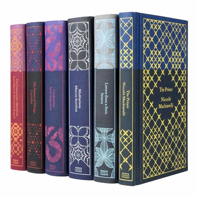
Penguin Books has paid particular attention to the design of its books since recruiting German typographer Jan Tschichold in 1947. The early minimalist designs were modernised by Italian art director Germano Facetti, who joined Penguin in 1961. The new classics were known as "Black Classics" for their black covers, which also featured artwork appropriate to the topic and period of the work. This design was revised in 1985 to have pale yellow covers with a black spine, colour-coded with a small mark to indicate language and period (red for English, purple for ancient Latin and Greek, yellow for mediaeval and continental European languages, and green for other languages).
In 2002, Penguin announced it was redesigning its entire catalogue. The redesign restored the black cover, adding a white stripe and orange lettering. The text page design was also overhauled to follow a more closely prescribed template, allowing for faster copyediting and typesetting, but reducing the options for individual design variations suggested by a text's structure or historical context (for example, in the choice of text typeface). Prior to 2002, the text page typography of each book in the Classics series had been overseen by a team of in-house designers; this department was drastically reduced in 2003 as part of the production cost reductions. The in-house text design department still exists, albeit much smaller than formerly, and is managed by text designers Claire Mason and Lisa Simmonds, who oversee the majority of the design work. Recent design work includes the Penguin Little Black Classic series.
Bill Amberg
Penguin Classics collaborated with Bill Amberg in 2008 in the design of six books (A Room with a View, Breakfast at Tiffany's, The Big Sleep, The Great Gatsby, Brideshead Revisited, and The Picture of Dorian Gray). These books are bound in leather which was "worked in a way that as the book is handled, the more protected and beautiful it becomes". The books also include their own leather bookmark, which is bound with the book title and author. It has been reported widely that the purpose for this approach by Penguin Classics is to target readers/collectors who would like a "high-end" book, but are not willing to pay over the odds for it.
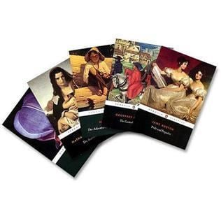
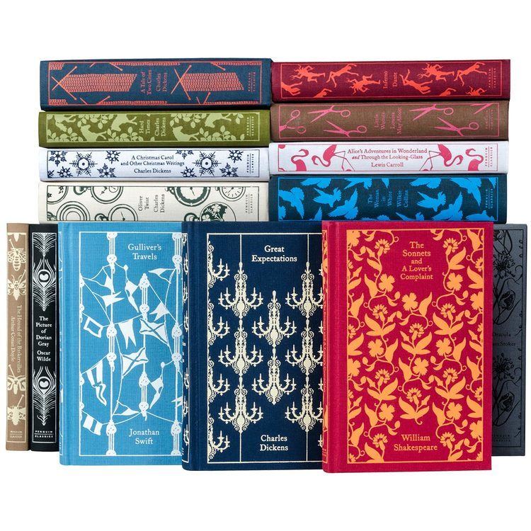
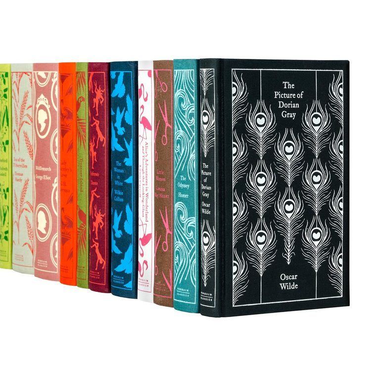
Series
Within the broader category of Classics, Penguin has issued specialised series with their own designs. These include:
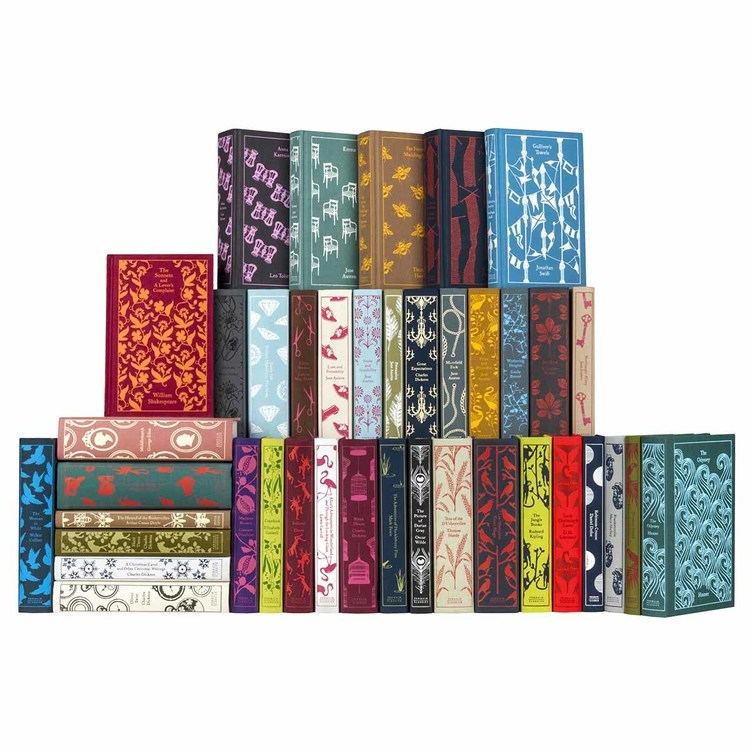
Complete Collection
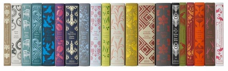
In 2005, an incomplete collection of books in the series was sold on Amazon.com as "The Penguin Classics Library Complete Collection". In 2005, the collection consisted of 1,082 different books (in multiple editions) and cost US$7,989.50. The collection weighed about 750 pounds (340 kg) and took about 77 linear feet (23.5 m) of shelf space; laid end-to-end the books would reach about 630 feet (192 m).
In 2008, Penguin Books published a complete annotated listing of all Penguin Classics titles in a single paperback volume in the style of its Penguin Classics books. The list organises the collection multiple times: alphabetically by author, subject categories, authors by region, and a complete alphabetic title index. This compiled listing indicates there are over 1,300 titles, and more to be published.
A feature of the World's Biggest Bookstore in Toronto, Canada, from its inception in the 1970s, and for years thereafter, was that it stocked all of the Penguin Classics titles. The upper section of the second floor of the store was dedicated to Penguin exclusively.
60th Anniversary
In 2007, Penguin Classics released a set of five books limited to 1,000 copies each, known as the Designer Classics. Each book was specially designed to celebrate Penguin Classics' Diamond Anniversary:
Controversy
In 2013, Penguin Classics published Morrissey's Autobiography. Concerns arose about the imprint's publishing a book too recently published to be an acknowledged classic, that such a book diluted the brand. Penguin argued that the autobiography was "a classic in the making". The Independent's Boyd Tonkin said: "The droning narcissism of the [book] may harm [Morrissey's] name a little. It ruins that of his publisher... Morrissey will survive his unearned elevation. I doubt that the reputation of Penguin Classics will."