
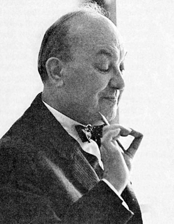
Name Jan Tschichold | Role Writer | |
 | ||
Parents Maria Zapff Tschichold, Franz Tschichold Books The New Typography, The form of the book, Treasury of Alphabets and Lette, Meisterbuch der Schrift, Schriften - 1925‑1974 Similar People Franz Roh, Paul Rand, Robert Bringhurst, Kurt Schwitters, John Heartfield | ||
Jan tschichold biography motion graphic
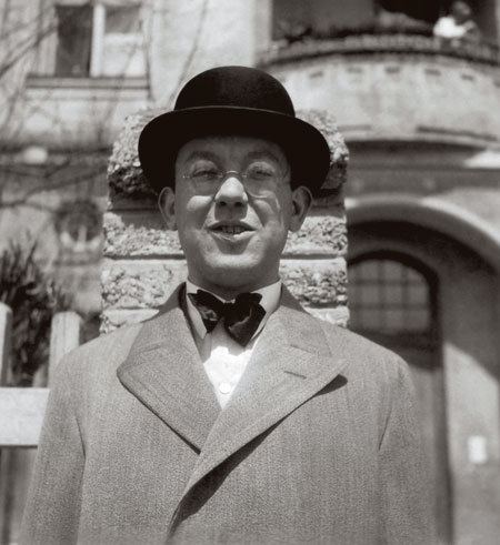
Jan Tschichold (2 April 1902 Leipzig, Germany – 11 August 1974 Locarno, Switzerland) (born as Johannes Tzschichhold, also Iwan Tschichold, Ivan Tschichold) was a calligrapher, typographer and a book designer. He designed posters, was a teacher and wrote books on typography.
Contents
- Jan tschichold biography motion graphic
- Jan tschichold typographic biography
- Life
- Design
- Typefaces
- References
He was one of the leaders of the movement Elementare Typografie or "Elementary Typography". Sometimes also referred to as "New Typography" of "Functional Typography". His most famous type font was Sabon.
Jan tschichold typographic biography
Life
Tschichold was the son of a provincial signwriter, and he was trained in calligraphy.
In 1919, he began in the class of Hermann Delitzsch a study on the "Leipzig Academy of the arts". Due to his extraordinary achievements, he soon became a master pupil of the rector of Walter Tiemann – a font designer for the Gebr.-Klingspor foundry and was commissioned to his fellow students. At the same time, he received the first orders in the framework of the "Leipziger Messe" and made in 1923 as a typographic consultant to a printing company independently.
This artisan background and calligraphic training set him apart from almost all other noted typographers of the time, since they had inevitably trained in architecture or the fine arts. It also may help explain why he never worked with handmade papers and custom fonts as many typographers did, preferring instead to use stock fonts on a careful choice from commercial paper stocks.
Up to this moment, only busy with historical and traditional typography, he changed his attitude after his first visit to the Bauhaus into a completely new direction: Tzschichhold met important artists such as László Moholy-Nagy, El Lissitzky, Kurt Schwitters and others know whose effort it was, in the context of the "New Typography" to the Bauhaus, to break the schemes of conventional typography, to find new ways of expression and to reach a much more experimental way of working. But at the same time, they wanted to standardize, simplify and a practical approach. Tzschichhold followed enthusiastically to the new set of principles, called himself "Ivan" because of the sympathy he felt for the predominantly eastern movement. Later he simplified his name to Tschichold. He became one of the most important representative of the "new typography" due to his enthusiasm and expertise. In contrast to others, he fell not completely out of the historic and technically reasonable frame, but made the avant-garde ideas ready for general use. In a famous special issue of 'typographic communications' by 1925 with the title of "Elemental typography", he put together the new approaches in the form of the thesis.
After the election of Hitler in Germany, all designers had to register with the Ministry of Culture, and all teaching posts were threatened for anyone who was sympathetic to communism. Soon after Tschichold had taken up a teaching post in Munich at the behest of Paul Renner, they both were denounced as "cultural Bolshevists". Ten days after the Nazis surged to power in March 1933, Tschichold and his wife were arrested. During the arrest, Soviet posters were found in his flat, casting him under suspicion of collaboration with communists. All copies of Tschichold's books were seized by the Gestapo "for the protection of the German people". After six weeks a policeman somehow found him tickets for Switzerland, and he and his family managed to escape Nazi Germany in August 1933.
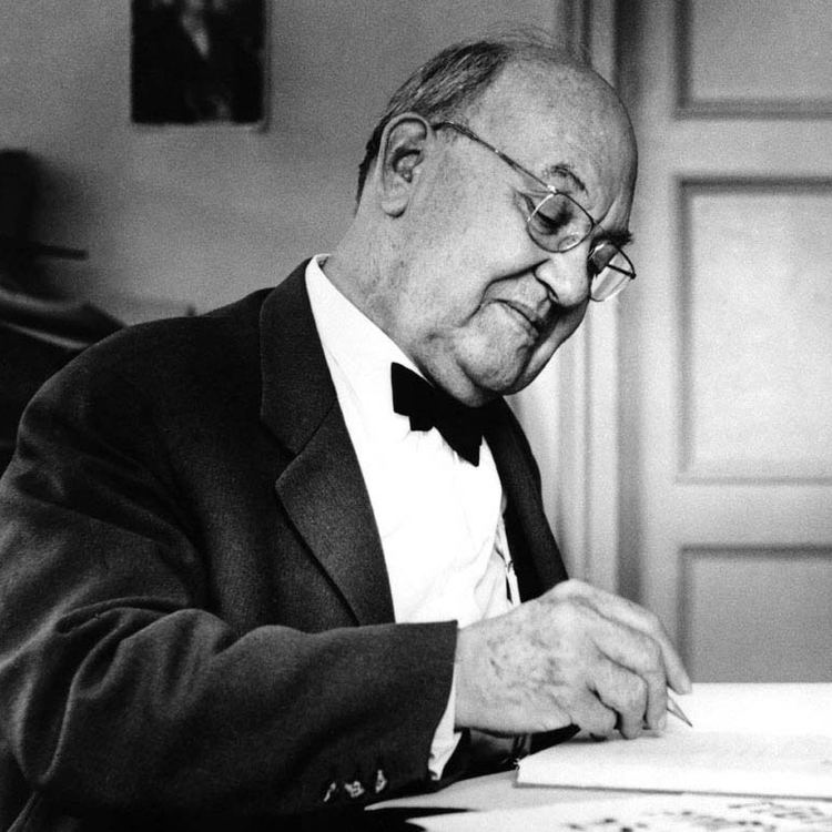
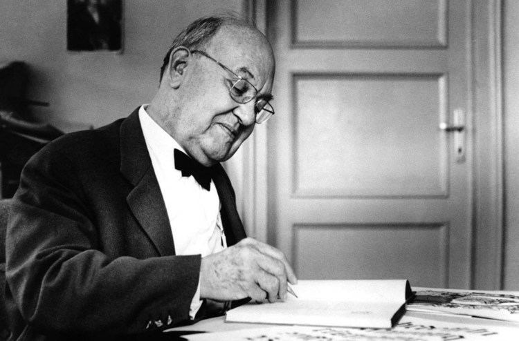
Apart from two longer stays in England in 1937 (at the invitation of the Penrose Annual), and 1947–1949 (at the invitation of Ruari McLean, the British typographer, with whom he worked on the design of Penguin Books), Tschichold lived in Switzerland for the rest of his life. Jan Tschichold died in the hospital at Locarno in 1974.
Design
Tschichold had converted to Modernist design principles in 1923 after visiting the first Weimar Bauhaus exhibition. He became a leading advocate of Modernist design: first with an influential 1925 magazine supplement; then a 1927 personal exhibition; then with his most noted work Die neue Typographie. This book was a manifesto of modern design, in which he condemned all typefaces but sans-serif (called Grotesk in Germany). He also favoured non-centered design (e.g., on title pages), and codified many other Modernist design rules. He advocated the use of standardised paper sizes for all printed matter, and made some of the first clear explanations of the effective use of different sizes and weights of type in order to quickly and easily convey information. This book was followed with a series of practical manuals on the principles of Modernist typography which had a wide influence among ordinary workers and printers in Germany. Yet, despite his visits to England just before the war, only about four articles by Tschichold had been translated into English by 1945.
Although Die neue Typographie remains a classic, Tschichold slowly abandoned his rigid beliefs from around 1932 onwards (e.g. his Saskia typeface of 1932, and his acceptance of classical Roman typefaces for body-type) as he moved back towards Classicism in print design. He later condemned Die neue Typographie as too extreme. He also went so far as to condemn Modernist design in general as being authoritarian and inherently fascistic.
Between 1947–1949 Tschichold lived in England where he oversaw the redesign of 500 paperbacks published by Penguin Books, leaving them with a standardized set of typographic rules, the Penguin Composition Rules. Although he gave Penguin's books (particularly the Pelican range) a unified look and enforced many of the typographic practices that are taken for granted today, he allowed the nature of each work to dictate its look, with varied covers and title pages. In working for a firm that made cheap mass-market paperbacks, he was following a line of work—in cheap popular culture forms (e.g. film posters)—that he had always pursued during his career.
His abandonment of Modernist principles meant that, even though he was living in Switzerland after the war, he was not at the centre of the post-war Swiss International Typographic Style. Unimpressed by the use of realist or neo-grotesque typefaces, which he saw as a revival of poorly-designed models, his survey of typefaces in advertising deliberately made no mention of such designs, save for a reference to 'survivals from the nineteenth-century which have recently enjoyed a short-lived popularity.'
Typefaces
Between 1926 and 1929, he designed a “universal alphabet” to clean up the few multigraphs and non-phonetic spellings in the German language. For example, he devised brand new characters to replace the multigraphs ch and sch. His intentions were to change the spelling by systematically replacing eu with oi, w with v, and z with ts. Long vowels were indicated by a macron below them, though the umlaut was still above. The alphabet was presented in one typeface, which was sans-serif and without capital letters.
Typefaces Tschichold designed include:
Sabon was designed to be a typeface that would give the same reproduction on both Monotype and Linotype systems and therewere also matrices made for typefoundries. All type produced could be interchanged. It was used early after its release by Bradbury Thompson to set the Washburn College Bible. A “Sabon Next” was later released by Linotype as an ‘interpretation’ of Tschichold's original Sabon.