
Category Sans-serif Date released 1975 | Classification Humanist Variations Frutiger Next | |
 | ||
Link linotype.com/1270238/frutiger-family.html Foundry | ||
Frutiger (pronounced with a hard g) is a series of typefaces named after its Swiss designer, Adrian Frutiger. Frutiger is a humanist sans-serif typeface, intended to be clear and highly legible at a distance or at small text sizes. A very popular design worldwide, type designer Steve Matteson described its structure as "the best choice for legibility in pretty much any situation" at small text sizes, while Erik Spiekermann named it as "the best general typeface ever".
Contents
- Distinctive characteristics
- History
- Frutiger Linotype
- ASTRA Frutiger
- Frutiger Next
- Frutiger Next Greek 2005
- Frutiger Next W1G 2009
- Frutiger Arabic 2007
- Frutiger Serif 2008
- Neue Frutiger 2009
- Neue Frutiger Condensed 2010
- Neue Frutiger W1G 2011
- Neue Frutiger 1450 2013
- Similar types
- Awards
- Use in branding
- Universities and colleges
- Companies and organizations
- Other uses
- Other Frutiger fonts
- Frutiger Stones 1998
- Frutiger Symbols 1998
- Frutiger Capitalis 2005
- References
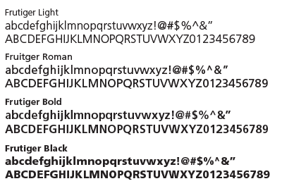
Distinctive characteristics
Characteristics of this typeface are:
History
Frutiger is a sans-serif typeface by the Swiss type designer Adrian Frutiger. It is the text version of Frutiger's earlier typeface Roissy, commissioned in 1970/71 by the newly built Charles de Gaulle Airport at Roissy, France, which needed a new directional sign system, which itself was based on Concorde, a font Frutiger had created in the early 1960s.
The beginning of Frutiger starts from Concorde, a sans-serif font Frutiger was commissioned to design in 1961-4 by the minor metal type company Sofratype. Frutiger was asked to create a design that would not be too similar to his previous Univers, a reinvention of classic 19th-century typefaces. In practice the design detail was partly created by his colleague (and fellow Swiss in Paris) André Gürtler as Frutiger was busy. Frutiger wrote of it: "I felt I was on the right track with this grotesque; it was a truly novel typeface." Gürtler too wrote of feeling that the design was innovative: "this style didn't exist in grotesques at the time, except for Gill Sans." Despite Frutiger and Gürtler's enthusiasm, the design failed to sell well and was discontinued with the end of the metal type period: Frutiger wrote that Linotype, who bought Sofratype, "weren't aware of the fact that with Concorde they had a totally up-to-date typeface."
Some years later, Frutiger was commissioned to develop a typeface for Roissy Airport. Frutiger had earlier created an alphabet inspired by Univers and Peignot for Paris Orly Airport, but found the experience a failure due to lack of control and the insistence that all text be in capitals only. As a result, he proposed a modified version of Concorde, refining it following research into legibility. The Roissy typeface was completed in 1972. Impressed by the quality of the Roissy airport signage, the typographical director of the Mergenthaler Linotype Company approached Frutiger in 1974 to turn it into a typeface for print.
In designing the typeface's predecessors Concorde and Roissy, Frutiger's goal had been to create a sans-serif typeface with the rationality and cleanliness of Univers but the organic and proportional aspects of Gill Sans. Frutiger: "What was important, was total clarity – I would even call it nudity – an absence of any kind of artistic addition.". Designing Frutiger as a print version of Roissy, this principle resulted in a distinctive and legible typeface. The letter properties originally suited to the needs of Charles de Gaulle: a modern appearance and legibility at various angles, sizes, and distances. Ascenders and descenders are very prominent, and apertures are wide to easily distinguish letters from one another. Improvements on Roissy included better spacing.
The Frutiger family was released publicly in 1976 by the Stempel type foundry in conjunction with Linotype. Frutiger's simple and legible yet warm and casual character has made it popular today in advertising and small print. Some major uses of Frutiger are in the corporate identity of Raytheon, PharMerica, O2, the British Royal Navy and British Army, the London School of Economics and Political Science, Deutsche Post and its subsidiary DHL Express, the Canadian Broadcasting Corporation, the Conservative Party of Canada, the Banco Bradesco in Brazil, and the Finnish Defence Forces, and on road signs in Switzerland. The typeface has also been used across the public transport network in Oslo, Norway, since the 1980s. In 2008 it was the fifth best-selling typeface of the Linotype foundry.
Frutiger was also released by Bitstream under the name Humanist 777 and by Fontsite as FrontPage.
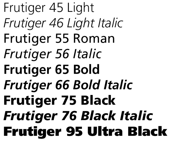
Frutiger Linotype
This is a version of the original Frutiger font family licensed to Microsoft. This family consists of Frutiger 55, 56, 65, and 66. It does not include OpenType features or kerning, but it adds support to Latin Extended-B and Greek characters, with Frutiger 55 supporting extra IPA characters and spacing modifier letters. Unlike most Frutiger variants, Frutiger Linotype features old-style figures as the default numeral style.
Frutiger Linotype can be found in Microsoft products featuring Microsoft Reader and in the standalone Microsoft Reader package.
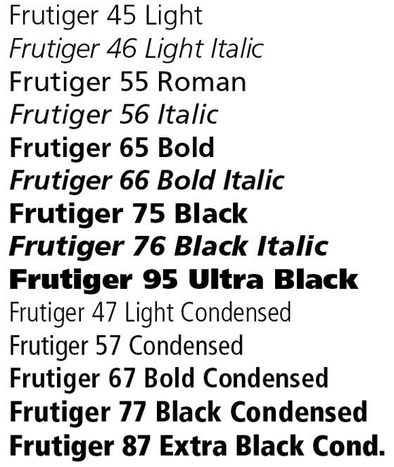
ASTRA-Frutiger
This is a variant of Frutiger used by ASTRA (acronym of the Amt für Strassen, the Swiss Federal Road Office) as the new font for traffic signs, replacing VSS in 2003. It is based on Frutiger 57 Condensed, but with widening ascenders and descenders, which are intended to give the eye a better hold than the earlier version did.
A family of two fonts were made, called ASTRA-Frutiger-Standard/standard and ASTRA-Frutiger-Autobahn/autoroute.
Frutiger Next
The Frutiger family was updated in 1997 for signage at the Alte Pinakothek in Munich. The new version, Frutiger Next, changed a number of details and added a true italic style in place of the oblique roman of the original.
Frutiger Next was commercially available in 2000 under Linotype. The family include six font weights, with a bonus Ultra Light weight in the OpenType version. It supports ISO Adobe 2, Adobe CE, and Latin Extended characters. OpenType features include small caps, old style figures, superscript and subscript, ordinals, proportional lining figures, and case forms. Font names are no longer numbered with the Frutiger system. Frutiger Black was renamed to Frutiger Next Heavy, and Frutiger Ultra Black was changed to Frutiger Next Black. Condensed fonts no longer include italic variants. In addition to italic type, characters such as the cent sign (¢), the copyright symbol (©), the ampersand (&), the at sign (@), the sharp S (ß), Omega (Ω), and the integral symbol (∫) were redesigned. Cyrillic letters had not been produced until Frutiger Next W1G.
While Frutiger Next added considerably to Frutiger's feature set, it added a modish true italic (not drawn by Frutiger) instead of the sharper oblique Frutiger preferred throughout his career. In his autobiography, Frutiger commented that in resigning himself to it "Maybe I was too soft to say what I really felt...I didn't have the strength and patience anymore."
Frutiger Next Greek (2005)
This is a variant of Frutiger Next designed with Eva Masoura for Linotype, originally published as a TDC2 2006 entry.
Frutiger Next W1G (2009)
This is an expanded version of Frutiger Next W1G. It added Greek (from Frutiger Next Greek) and Cyrillic character sets, but advertised OpenType features were reduced to superscript and subscript. Only an OpenType version has been produced.
Frutiger Arabic (2007)
This is a font family designed by Lebanese designer Nadine Chahine as a companion to Frutiger in consultation with Adrian Frutiger. It is based on the Kufic style, but incorporates aspects of Ruqʿah script and Naskh in the letter form designs, resulting in what Linotype called "humanist Kufi". The fonts consist of Basic Latin and ISO-Latin characters derived from the original Frutiger family, with Arabic characters supporting presentation forms A and B. Four font weights were produced.
Frutiger Serif (2008)
This is a serif font family designed by Adrian Frutiger and Akira Kobayashi. It is a re-envisioning of the metal type version of Meridien, a typeface first released by Deberny & Peignot during the 1950s.
The family consists of roman and italic fonts in five weights and two widths each.
Neue Frutiger (2009)
This is an expanded version of the original Frutiger family designed by Adrian Frutiger and Akira Kobayashi. Unlike the original family, the Frutiger numbering scheme is not used.
Initial release of the family has twenty fonts in ten weights and one width, with a complimentary oblique. It supports ISO Adobe, Adobe CE, and Latin Extended characters. OpenType features include subscript and superscript.
Neue Frutiger Condensed (2010)
On April 7, 2010, Monotype Imaging Holdings announced condensed versions of the Neue Frutiger fonts. Designed by Akira Kobayashi, the expansion of the family includes twenty fonts in the same weight and style combination as the original release, in OpenType Pro font format.
Neue Frutiger W1G (2011)
This version supports Greek and Cyrillic characters.
The family includes forty fonts in ten weights and two widths, with a complimentary oblique.
Neue Frutiger 1450 (2013)
It is a version of Neue Frutiger compliant with the German standard DIN 1450, designed by Akira Kobayashi.
The family includes eight fonts, in four weights (book, regular, medium, bold) and one width, with a complimentary oblique.
OpenType features include denominator/numerator, fractions, ligatures, localized forms, ordinals, proportional figures, subscript/superscript, scientific inferiors, stylistic alternates (two sets), ornaments, kerning.
Similar types
Adobe's Myriad and Microsoft's Segoe UI are two prominent typefaces whose similarities to Frutiger have aroused controversy. Frutiger described Myriad as 'not badly done' but said that the similarities had gone 'a little too far'. However, in an interview, Adrian Frutiger commended the work of Myriad's designer, Robert Slimbach: "except the unnecessary doubt concerning Myriad, his work is also very good." Additionally, the Italic style of Myriad is cursive, while the original version of Frutiger uses a slanted Roman style rather than a true Italic.
In the 1970s, Frutiger designed Icone, a wedge-serif design with mild stroke modulation, which has many similarities in basic letter structure to Frutiger, and in overall effect to Albertus.
Awards
Frutiger Next won the bukva:raz! competition in the Latin category.
Frutiger Next Greek won the TDC2 2006 award under the Type System / Superfamily category.
Use in branding
The Frutiger font is used as an official typeface by many institutions around the world. A number of these are listed here.
Universities and colleges
Companies and organizations
Other uses
Michael Bierut commented on its common use in signs where a highly readable but friendly font is required: "Frutiger has been used so much for signage programs in hospitals and airports that seeing it now makes me feel that I'm about to get diagnosed with a brain tumor or miss the 7:00 to O'Hare."
Other 'Frutiger' fonts
A number of other designs by Frutiger carry his name without having any connection to the Frutiger typeface itself. They are listed here for reference.
Frutiger Stones (1998)
This is a family of casual fonts inspired by natural elements. Using polished pebbles as the boundary, the family consists of regular, positive, and negative fonts. Frutiger Stones Positive is Regular without the stone outline, while Negative is a reverse fill of the Regular.
Frutiger Symbols (1998)
This is a family of symbol fonts. The fonts contain plants, animals, and stars, as well as religious and mythological symbols. The naming convention follows Frutiger Stones.
Frutiger Capitalis (2005)
This is a family of casual fonts that consists of regular, outline, and signs fonts. Frutiger Capitalis Outline is the outline version of Frutiger Capitalis Regular. Frutiger Capitalis contains ornamental glyphs of religions, hand signs, and astrological signs.