
 | ||
Oblique type is a form of type that slants slightly to the right, used for the same purposes as italic type. Unlike italic type, however, it does not use different glyph shapes; it uses the same glyphs as roman type, except slanted. Oblique and italic type are technical terms to distinguish between the two ways of creating slanted font styles; oblique designs may be labelled italic by companies selling fonts or by computer programs. Oblique designs may also be called slanted or sloped roman styles. Oblique fonts, as supplied by a font designer, may be simply slanted, but this is often not the case: many have slight corrections made to them to give curves more consistent widths, so they retain the proportions of counters and the thick-and-thin quality of strokes from the regular design.
Contents
- Obliques and italics
- Specific typefaces
- Serif fonts
- Sans serif fonts
- Automated obliques or fake italics
- References
Type designers have described oblique type as less organic and calligraphic than italics, which in some situations may be preferred. Contemporary type designer Jeremy Tankard stated that he had avoided a true italic 'a' and 'e' in his design Bliss due to finding them "too soft", while Hoefler and Frere-Jones have described obliques as more "keen and insistent".
Obliques and italics
Italic designs are not just the slanted version of the regular (roman) style; they are influenced by handwriting, with a single-story a and an f that descends below the line of text. Some may even link up, like cursive (joined-up) handwriting. Obliques by contrast are "simply" sloped. In addition, italic styles are often quite noticeably narrower than roman type, while oblique styles are not.
Specific typefaces
Few typefaces have both oblique and italic designs, as this is generally a fundamental design choice about how the font should look. A font designer normally decides to design their font with one or the other.
Serif fonts
Historically, it was normal for all Latin-alphabet serif fonts to have true italics, but in the late nineteenth century some "sloped romans" were created by European and American foundries, particularly for display type and headings. Notable typefaces in this style include Bookman Old Style in metal type (although not many recent versions), Linn Boyd Benton's "self-spacing" type and the Central Type Foundry's "De Vinne" wedge-serif display face. European examples included Genzsch Antiqua from Genzsch & Heyse.
The printing historian and executive Stanley Morison was for a time interested in the style, which he felt stood out in text less than a true italic. He made a late attempt to promote it around 1925 by commissioning the typeface Perpetua from Eric Gill with a sloped roman rather than an italic, but Monotype's management vetoed this in favour of a true italic. (A few other type designers followed his views for a time: Jan van Krimpen's Romulus and William Addison Dwiggins' Electra were both released with obliques.) Ultimately, he found the effect less pleasing than at first, and his Times New Roman typeface has a very traditional true italic in the style of the late eighteenth century. (Morison commented to his friend Jan van Krimpen that in developing Perpetua's italic "we did not give enough slope to it. When we added more slope, it seemed that the fount required a little more cursive to it.")
Sans-serif fonts
Many sans-serif typefaces use plainer oblique designs instead of italic ones. This is especially true with grotesque designs like Helvetica, which have a spare, industrial aesthetic, and geometric ones like Futura. (As many sans-serif fonts were intended for use on headings and posters, especially early ones, some were not designed with italics at all because these were considered unnecessary.)
Humanist sans-serif typefaces, however, often use true italic styles since they are more influenced by calligraphy and traditional serif fonts. Notable humanist sans-serif typefaces include Gill Sans, Goudy Sans, FF Meta and FF Scala Sans; all have italic designs. Adrian Frutiger and other prominent designers have defended obliques as more appropriate for the aesthetic of sans-serif fonts, while Martin Majoor has supported the use of true italics.
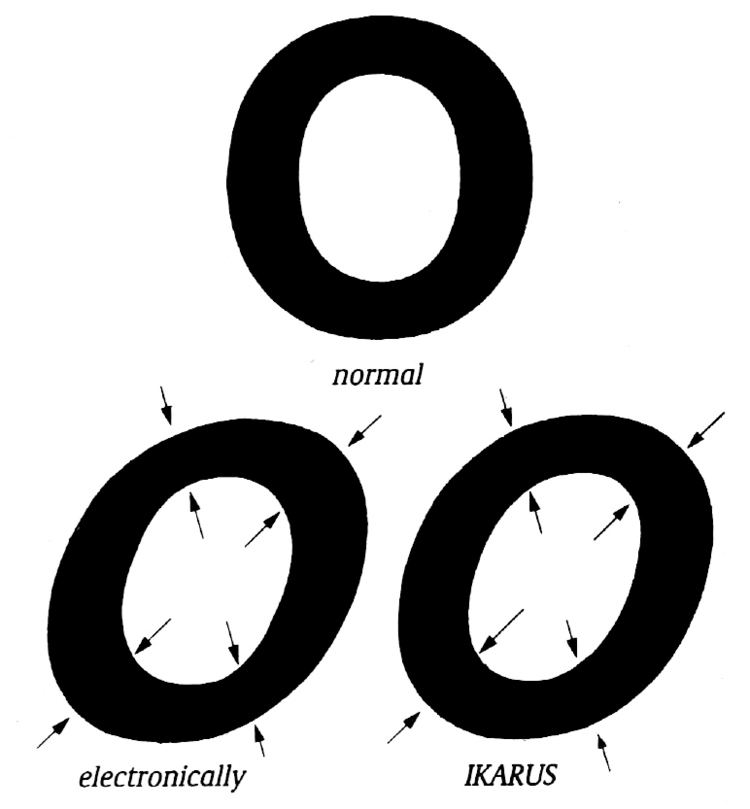
Automated obliques, or "fake italics"
Some computer programs handling text may simply generate an oblique form, a "fake italic" by slanting the normal font when they find no italic or oblique style installed. It may not be clear to the user where the oblique form comes from (whether it is a correctly installed oblique font or an automatically-slanted design, which may look worse) unless they check their installed fonts. Slanting the regular style to create an oblique was particularly often done on early computer and phototypesetting systems in the 1970s and -80s to save time and memory space, especially in lower-quality printing of ephemera and newspapers.