
Classification Old-style Date released 1978 | ||
 | ||
Foundry LinotypeInternational Typeface Corporation | ||
Galliard is the name of a serif typeface designed by Matthew Carter and issued in 1978 by the Mergenthaler Linotype Company. Galliard is based on the sixteenth-century type of Robert Granjon. According to Alexander Lawson, "The name Galliard stems from Granjon's own term for an 8-point font he cut about 1570. It undoubtedly refers to the style of the face, for the galliard was a lively dance of the period."
Contents
Mike Parker, Director of Typographic Development at Mergenthaler Linotype, had been inspired by seeing the types of Granjon at the Plantin-Moretus Museum in Antwerp. Matthew Carter, who joined Mergenthaler Linotype as a typeface designer in 1965, was also an admirer. Work continued on the typeface, sporadically, through the 1960s and 1970s. The typeface was released in 1978.
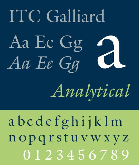
ITC Galliard (1978, 1982)
It is a version re-issued by International Typeface Corporation after Mike Parker had given ITC exclusive rights to Galliard. Matthew Carter drew the four roman weights and complementary italic designs while at Mergenthaler Linotype, and a suite of small caps for the Roman and Bold weights. ITC Galliard was introduced by Mergenthaler Linotype Company in 1978, with public availability for ITC subscribers beginning on 1982-01-15 (as announced in December 1981 (volume 8-4) issue of U&lc magazine).
The family includes 8 fonts in 4 weights and 1 width, with complementary italics. OpenType features include fractions, ligatures, ordinals, superscript.
ITC Galliard Pro (2010)
It is a version of ITC Galliard with characters that support Central European languages.
OpenType features include case sensitive forms, numerators/denominators, fractions, ligatures, lining/old style/proportional/tabular figures, localized forms, ordinals, scientific inferiors, superscript, small caps, diphthongs, stylistic alternates (set 1).
ITC Galliard eText (2013)
It is a version of ITC Galliard optimised for on-screen use, designed by Carl Crossgrove. Changes include increased lowercase heights, increased inter-character spacing, more open counters, adjusted thicks to thins ratio.
The family includes 4 fonts in 2 weights (regular, bold) and 1 width, with complementary italics. Character set support include. OpenType features include case sensitive forms, fractions, ligatures, lining/old style figures, localized forms, ordinals, small caps. Character set supports include Adobe Western 2.
Receptions
Galliard has robust strokes and sharp details. According to Lawson, "While the designers of the regenerated Garamonds were attempting to bring fidelity in their copies, Carter preferred simply to bring to Galliard his interpretation of the spirit of a Granjon original. . . . Galliard thus possesses the authentic sparkle that is lacking in the current Garamonds."
Usages
Galliard was a typeface used in the graphic identity and standards of Yale University until it was replaced in 2007 by Matthew Carter's Yale typeface which was itself inspired in part by Galliard.
Galliard was one of twenty-three typefaces acquired by the Museum of Modern Art in 2011 and subsequently exhibited in Standard Deviations.
Galliard is the house typeface of The New Criterion and of the Library of America series.