
Classification Old-style Date released 1948 | ||
 | ||
Link linotype.com/57056/palatino-linotype-family.html Variations Palatino Nova, Palatino Sans | ||
Palatino the natural history of a typeface
Palatino is the name of an old-style serif typeface designed by Hermann Zapf, initially released in 1948 by the Stempel foundry and later by other companies, most notably the Mergenthaler Linotype Company.
Contents
- Palatino the natural history of a typeface
- Palatino
- Aldus
- Michaelangelo
- Sistina
- Kompakt
- Zapf Renaissance Antiqua
- Digitisations
- Palatino Linotype
- Palatino nova
- Palatino Sans
- Palatino Sans Informal
- Palatino Arabic
- Palatino eText 2013
- Palatino clones
- Palazzo Original
- PostScript clones
- Book Antiqua
- Free and open source versions and derivatives
- Awards
- References
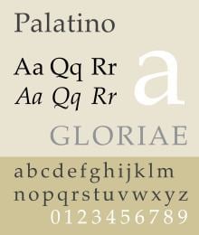
Named after 16th century Italian master of calligraphy Giambattista Palatino, Palatino is based on the humanist types of the Italian Renaissance, which mirror the letters formed by a broad nib pen; this gives a grace reflecting Zapf's expertise as a calligrapher. Its capital 'Y' is in the unusual 'palm Y' style, inspired by the Greek letter upsilon, a trait found in some of the earliest versions of the letter such as that of Aldus Manutius.
Unlike most Renaissance typeface revivals, which tend to have delicate proportions such as a low x-height (short lower-case letters and longer ascenders and descenders), Palatino has larger proportions, increasing legibility. Palatino was particularly intended as a design for trade or 'jobbing' use, such as headings, advertisements and display printing, and was created with a solid, wide structure and wide apertures that could appear clearly on poor-quality paper, when read at a distance or printed at small sizes.
It is one of several related typefaces by Zapf, each showing influence of Italian Renaissance letter forms, although Zapf was unable to visit Italy until after he had finished the Palatino roman. The group includes Palatino, Sistina, Michaelangelo Titling, and Aldus, which take inspiration from the Humanist forms of late 15th and early 16th Century Italy. Paul Shaw has described Michaelangelo, Sistina, Aldus and Kompakt, an ultra-bold display design from 1952, as "Palatino's extended family". However, Palatino rapidly became popular for book body text use, overshadowing the narrower and lighter Aldus, which Zapf had designed for this role. It has been cited as one of the ten most used serif typefaces. Since Palatino was not originally designed for body text, some of its characters were intended to stand out with quirky, calligraphic design features, and Zapf later redesigned them with more sober alternates, which have become the norm on most digital versions.
Linotype licensed Palatino to Adobe and Apple who incorporated it into the PostScript digital printing technology as a standard font. This guaranteed its importance in digital and desktop publishing and made it (or a variant of it) a preinstalled font on most computers. As with many popular fonts, knockoff designs and rereleases under different names are common. Zapf retained an interest in the design, and continued to collaborate on new versions into his eighties.
Palatino
Aldus
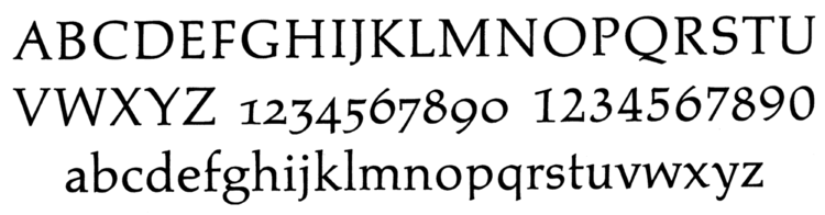
Aldus is an old-style serif design, popular for use in book printing. Compared to Palatino, released some years earlier, it has a more condensed design lighter in colour, more graceful and refined and better suited to the high average quality of book printing. Aldus has a non-kerning roman and italic f, allowing the typographer to avoid ligatures. It appeared in the D. Stempel AG catalog in 1954 and Zapf used it to set his own Manuale Typographicum, a history of letter design.
Aldus is named for the Venetian Renaissance printer Aldus Manutius. The decision annoyed Zapf (who preferred the name "Palatino Book") since it bears little direct resemblance to Aldus's typefaces.
Like Palatino, an upgraded digitisation, Aldus nova, has been released by Linotype.
Palatino
Palatino itself, as previously noted, has a solid structure, intended to read clearly on poor-quality paper and printing; Zapf's friend Alexander Lawson wrote that "the open counters that make Palatino such a legible letter were provided to overcome a then current printing problem in Germany, poor-quality paper. The weight of the type was also thickened beyond that of a normal roman in order to adapt to the lithographic and gravure printing processes of that period...Zapf has steadily maintained that he did not create Palatino as a book type but rather as a commercial face."
Due to Palatino's increasing popularity in body text, however multiple versions have been released for the changing technologies of handsetting, hot metal typesetting, phototypesetting and digital font design. Later versions often have regularised details such as a lower 't' and foot serifs on 'p' and 'q'. Hutner and Kelly have described Palatino as "distinctly modern...a modern type not copied from any specific early model."
Some releases of Palatino have had swash capitals in italic. These have not been found in digitisations, although digitisations of Zapf's Renaissance Antiqua design (discussed below) do include a different set.
Michaelangelo
A set of titling capitals, based on Roman square capitals. The design has a 'U' with a foot serif at bottom right, a 'double-V'-style 'W' with four top terminals and a 'palm Y' similar to that on Palatino, inspired by the Greek letter upsilon. It was renamed "Palatino Titling" in the Palatino nova release (see below), since the rights to the name were held by Berthold who also publish a digitisation.
Sistina
A slightly bolder set of titling capitals than Michaelangelo on the same basic structure. It was originally named 'Aurelia Titling' after the Roman road named Via Aurelia; Zapf would later use the name for another separate font. The Palatino nova version (see below) is renamed "Palatino Imperial" and has small capitals as a lower case. It was created following an artistically productive 1950 visit to Italy, which Zapf had been unable to visit before. Zapf was very interested in the quality of Italian art and lettering, and his sketches of stonecarving in Florence also inspired the humanist sans-serif Optima.
Kompakt
An ultra-bold display type, with a slight slope but roman rather than italic letter forms, somewhat similar to blackletter. Unlike Palatino, it is very unlike the style of roman type printing used during the Renaissance, which did not use bold type.
Zapf Renaissance Antiqua
A separate interpretation by Zapf of the same Renaissance models, initially created for Scangraphic and later digitised and sold by Linotype along with Palatino. Its digitisation is based on the versions prepared by Scangraphic for display use, with tight spacing and striking contrasts in stroke weight. It is also notable for including a full set of swash caps, something not included on digital versions of Palatino.
Digitisations
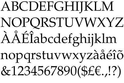
Palatino's early digitisation intended for PostScript use is very widely used or cloned. Later Palatino digitisations have different features and spacing. In 1999, Zapf revised Palatino for Linotype and Microsoft, called Palatino Linotype. The revised family incorporated extended Latin, Greek, and Cyrillic character sets. Linotype released a more complex redesign named Palatino nova, together with digitisations of some of Zapf's other Renaissance-inspired designs and Aldus. Zapf also created a matching Palatino Sans and Palatino Sans Informal design in 2006.
Palatino Linotype
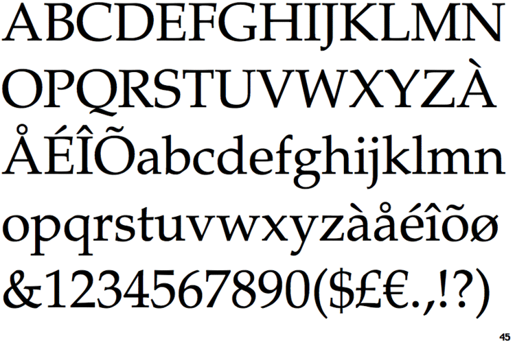
Palatino Linotype is the version of the Palatino family included with modern versions of Microsoft software. It incorporates extended Latin, Greek, Cyrillic characters, as well as currency signs, subscripts and superscripts, and fractions. The family includes roman and italic in text and bold weights.
Palatino Linotype was notable as being the first western OpenType font that Microsoft shipped; Palatino Linotype was bundled with Windows 2000. The OpenType version showcased some (then new) alternate features, including ligatures, true small caps, proportional and tabular figures, text figures and a variety of special alternate characters, such as the swash Capital Qu combination. This marks it out from earlier digitisations such as the OS X system version, which do not include ligatures such as Th and Qu. On release it was one of the few fonts to incorporate an interrobang.
Palatino nova
Palatino nova is a redesigned version of Palatino, by Hermann Zapf and Akira Kobayashi. This Palatino nova typeface family includes roman and italics in the light, text, medium, and bold weights, a new release of Aldus and versions of Michelangelo and Sistina under the name of "Palatino Titling" and "Palatino Imperial".
The font family was premiered on 2005-11-24, the same day as Hermann Zapf’s 87th birthday celebration. A new digitisation of Aldus named Aldus nova was created at the same time.
Palatino Sans
Palatino Sans is a sans-serif design with stroke width modulation, resembling Zapf's classic design Optima but with a softer, more organic feel. Unlike the serifed counterpart, the Sans families do not have full Greek or Cyrillic characters. Reviewing it for Typographica on release, font designer Hrant Papazian commented:
The confluence of competence, freedom and kiai...evident in Palatino Sans is breathtaking. The sober organicity, the bravado of the raised ‘r’, the confident flair of the italic; all done before, but never in such a usable, contemporary whole.
Palatino Sans Informal
Palatino Sans Informal incorporates informal characteristics to the Palatino Sans, such as asymmetrical A, K, N, W, X, Y, w.
Palatino Arabic
It is a family designed by Lebanese designer Nadine Chahine and Hermann Zapf. The design is based on the Al-Ahram typeface designed by Zapf in 1956 but reworked and modified to fit the Palatino nova family. The design is Naskh in style but with a strong influence of Thuluth style.
This family only comes in 1 font, with the Arabic characters based on Palatino nova Regular. It supports basic Latin, Arabic, Persian, and Urdu scripts. Chahine also created a version of Zapf's Zapfino.
Palatino eText (2013)
It is a family designed by Toshi Omagari of Monotype Imaging, optimised for on-screen use. It includes a larger x-height and wider spacing. It is the standard four-font family, with bolds and italics.
Palatino clones
As one of the most iconic typefaces of the twentieth century, derivative designs based on Palatino were rapidly developed, taking advantage of the lack of practical copyright and the easy copying possible in the phototypesetting font market of the 1960s and 70s onwards. Many of these are almost indistinguishable from Palatino, and some even had Zapf's involvement as a consultant.
Palazzo Original
Softmaker's clone of Palatino, Palazzo, is unique for being based on the original metal type of Palatino: as a result, it contains many design features not seen in the digital versions of Palatino endorsed by Zapf and most clones. These include a 'p' and 'q' without foot serif and no serif on the centre stroke of the 'E' and 'F', as well as a slightly more delicate design with a lower x-height. It has also been released as 'Marathon Serial'.
PostScript clones
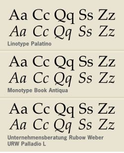
Most modern Palatino clones are set to match the spacing and design of the PostScript version of Palatino that was a standard font in early digital publishing. In the Bitstream font collection, the Palatino equivalent is called "Zapf Calligraphic."
URW++ sells its version as "URW Palladio L." A version of this font was later released by URW under a free and open-source licence as part of the Ghostscript project to develop an open-source alternative to PostScript. As a result, it (or a derivative) is used by much open-source software such as R as a system font.
Book Antiqua
One of the best-known Palatino PostScript clones is "Book Antiqua" (originally by Monotype), distributed with much Microsoft software. It is one of many clone PostScript typefaces distributed by Microsoft and Monotype around this time, including Arial (a clone of Helvetica), Century Gothic (ITC Avant Garde) and Bookman Old Style (ITC Bookman). Book Antiqua resembles Palatino extremely closely and is almost indistinguishable from the original apart from a few detail differences. ("Antiqua" is another word for the "Roman" style of typefaces that Palatino is based on, as opposed to blackletter. The genre, inspired by Italian traditions of handwriting and calligraphy, has been a dominant influence on most typefaces and lettering created in the Western world since the Renaissance.)
In 1993, Zapf resigned from l'Association Typographique Internationale (ATypI) over what he viewed as its hypocritical attitude toward unauthorized copying by prominent ATypI members (namely Monotype). In the United States, the abstract design of a typeface is not protected by copyright, and can be imitated freely (unless the typeface is protected by a design patent, which is of much more limited duration and rarely applied for). Copyright protection is available for the representation of a typeface in software (a computer font), and the names of typefaces can be protected by trademark.
Microsoft has since licensed and distributes Linotype's version of Zapf's original design called Palatino Linotype in all versions of Windows since Windows 2000. During the Palatino Linotype development process, Zapf and Linotype requested that Microsoft cease to include Book Antiqua with Office, but Microsoft concluded that this was impossible as too many documents had already been created using it. A custom version of Book Antiqua was created by Monotype as a corporate font by the Parliament of the UK.
Free and open-source versions and derivatives
The only legal free version of the typeface is URW Palladio L. The open-source community greatly extended the character sets of the fonts and releases new, updated versions under new names.
Awards
Palatino Sans and Palatino Sans Informal won Type Directors Club Type Design Competition 2007 award under Type System / Superfamily category.
Palatino Arabic won 2008 Type Directors Club TDC2 2008 award under Text / Type Family category.