
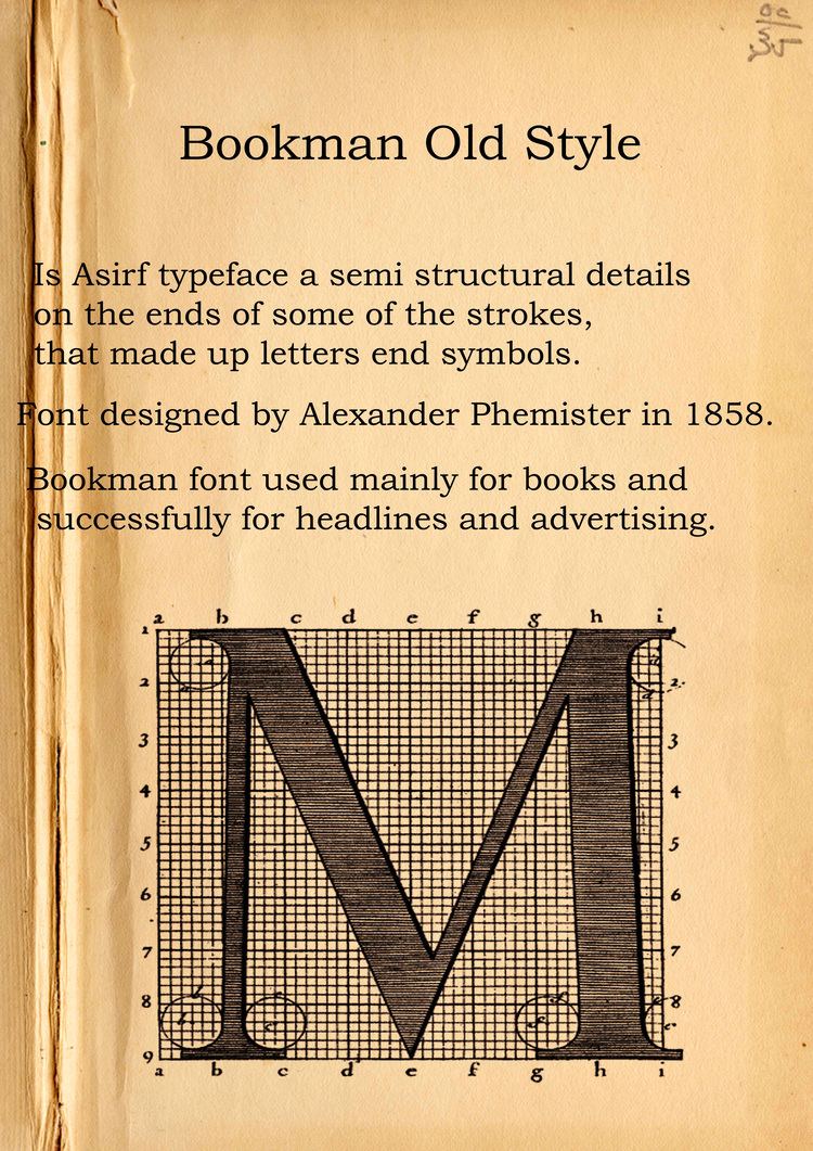
Design based on Old Style Antique Classification Transitional | Date created 1858 | |
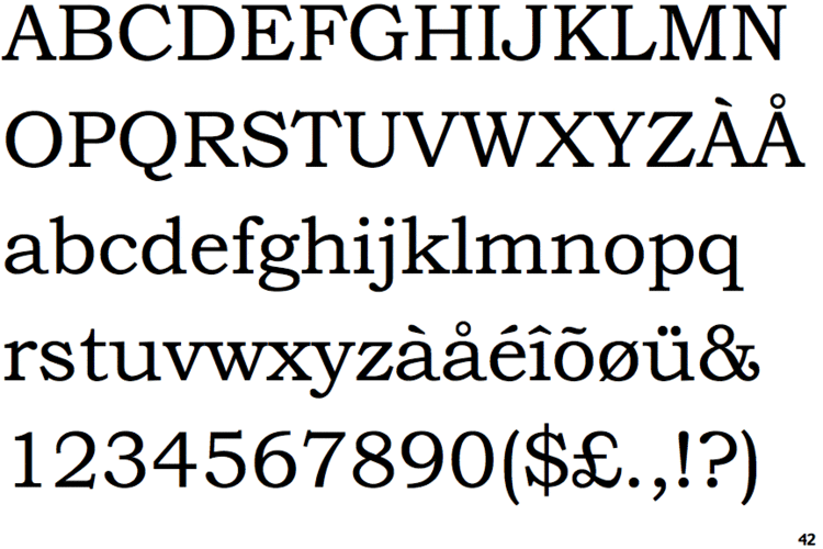 | ||
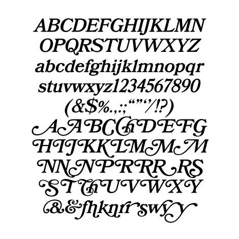
Shown here Bookman Oldstyle by Monotype Imaging Re-issuing foundries American Type Founders, Lanston Monotype Company, Bruce Type Foundry | ||
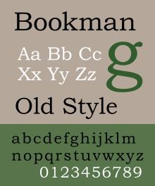
Bookman or Bookman Old Style is a serif typeface. It evolved from derivatives of the "Old Style" design created by Alexander Phemister around the 1850s for the Miller & Richard foundry. It is particularly associated with the graphic design of the 1960s and 1970s, when revivals of it were very popular.
Contents
- History
- Phototypesetting period
- ITC Bookman
- Digitisations
- Monotype version
- Jukebox Bookman
- Bookmania 2011
- References
Bookman (as it became) was designed as an alternative to Caslon, with a more even and regular structure, a wide and tall lower-case, little contrast in line width and considerably greater weight, almost to the point of being a slab serif. It maintains its legibility at small sizes, and has been used extensively for headlines and in advertising.
History
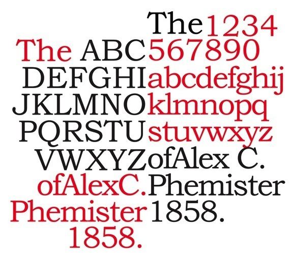
The ancestor of Bookman Old Style is Miller & Richard's "Old Style" cut by Alexander Phemister. Sometimes called a "modernised old style", it is a redesign of true old-style serif faces from the eighteenth century such as Caslon with a quite wide design and larger lower-case letters. It became popular in the USA and one of a wide range of loose revivals and adaptations of the Caslon design, visible in the wide-spreading arms of the T and the sharp half-arrow serifs on many letters.
The direct ancestor of Bookmans were several fonts from around 1869 named "Old Style Antique" somewhat bolder than Miller & Richard's first old-styles. "Antique" was a common name given to bolder typefaces of the time, now often called slab serifs, and identifies the aim of creating a complementary bolder design on the oldstyle model for uses such as emphasis. However, the oldstyle antique designs then became used for body text. Although old-style antiques were bolder than the original old-style face, the difference was not great enough that they could not be used for body text.
G. Willem Ovink, a historian of type, writes in his history of the style in 1971 that:
A bold Old Style was needed. This was indeed produced, almost simultaneously in Philadelphia and in Edinburgh [around 1869] in two distinct designs, both under the name of Old Style Antique. The term 'Antique' probably refers less to historical forms than to the boldness and the stubby serifs of the Egyptians, which were also called antiques. In the 1890s, when such faces as Caslon and Jenson had introduced the notion that all historic romans were bold, their colour and old-style basic forms made the old-style Antiques in the words of De Vinne...'now often used as fair substitutes for older styles of text types,' regardless of their unhistoric origin. The course of development is difficult to trace."
These designs were then copied and bought up by a series of American type foundries, according to Ovink in a mixture of sizes based on the Philadelphia and Edinburgh designs. (During the period many fonts once created were copied by other foundries, in some cases probably illegally by electrotyping, making the evolution of styles complicated to track.) Ovink describes the "Philadelphia" Oldstyle Antique as being different for being slightly less bold and having an 'a' with a rounded top and a 'T' with slight curves on top. Theodore De Vinne wrote of the style in 1902 that it was "in marked favour as a text letter for books intended to have more of legibility." It was also used to emulate the solid style of printing favoured by William Morris at his Kelmscott Press. At least one printer of the period noted the confusion of the apparently tautologous name, saying that it reminded him of the joke about the man "who ordered café au lait with milk."
By 1903 it was sold by American Type Founders under the name of Bookman Old Style, with an added italic. ATF did not offer a normal italic, instead featuring an oblique, or "sloped roman", in which the letters are simply slanted. Serif typefaces which use an oblique are now quite rare but the style was relatively common in the nineteenth and early twentieth centuries, especially for display typefaces.
Bookman was popular in twentieth-century American printing for its solid colour, wide characters and legibility: one 1946 review commented that it "can stand a lot of mauling". Fine printers and those more interested in the pre-nineteenth century typefaces from which it descended, however, were less impressed by it, finding it dull for its wide, large lower-case and lack of elegance. It was most popular in the USA: by the mid-twentieth century, Old Style, Bookman and Old-Style Antique typefaces had become almost totally eclipsed in British printing except as a backup choice, partly as a result of the dominance of the British Monotype Corporation's extremely successful series of more balanced book faces and Linotype's similar series. Philip Larkin described the use of Old Style Antique in 1960 for John Betjeman's autobiography Summoned By Bells in terms suggesting that he found its use archaic and somewhat ridiculous. One 1959 British study of typefaces - albeit one strongly connected to Monotype and carried out by the controversial Cyril Burt - described Monotype's Oldstyle Antique as "seldom used for ordinary book work" and treated it as a design most appropriate for books for young children under 12.
Chauncey H. Griffith of the American Linotype foundry developed a revival for Linotype's hot metal typesetting system (which was named "Bookman"), and Monotype also offered one. (Linotype's has been digitised by Bitstream based on its design from this period form, making it one of the few digital versions not based on post-war versions.) Other Old Style Antique releases were common in American printing during the nineteenth and twentieth centuries.
Phototypesetting period
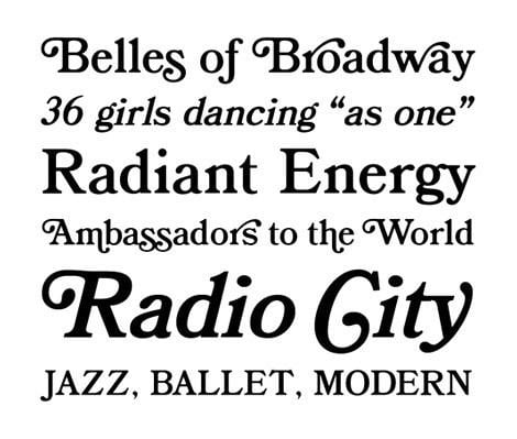
Many Bookman revivals appeared for phototypesetting systems in the 1960s and 1970s, often including an extensive repertoire of swash characters, meaning that the design is commonly associated with the graphic design of the period. These large character repertoires took advantage of the new phototypesetting technology, which allowed characters to be stored on film or glass phototype master disks and printed at any desired size, rather than bulky metal type. Letraset created one revival during this period. The separation of type designs from the complex manufacturing process of metal type also allowed for easier cloning of typefaces, meaning that many fonts sold during the period were unauthorised copies or modifications of other companies' designs.
Mark Simonson, who has designed a revival of the Bookmans of this period, has commented on the most common version used in the 1960s
I have so far been unable to find out who designed and produced it. I think of it as the “Sixties Bookman.”...It’s closest to the larger sizes of ATF Bookman Oldstyle, but significantly bolder, with more contrast between the thicks and thins than other Bookmans and with smaller serifs...I’ve yet to see a credit for the designer or maker of this version. The best theory I have is that it was a custom font created for an ad campaign in the mid-sixties. Someone who had access to it made copies. And before long, every typesetting shop had it. Whatever the story is, this version of Bookman was everywhere. I had Sixties Bookman on rub-down type sheets when I was in high school in the early Seventies discovering type.
One of the most famous results of this period is the 1975 ITC's revival from which many modern versions are descended.
Typographer Matthew Butterick has written that as a result of its use in this period Bookman 'evokes the Ford administration. If fonts were clothing, this would be the corduroy suit.'
ITC Bookman
ITC Bookman is a revival designed by Ed Benguiat in 1975, for the International Typeface Corporation. Benguiat developed a full family of four weights plus complementary cursive designs: unlike previous Bookman versions, these are true italics in which the letters take on handwriting forms. Benguiat also drew a suite of swash and alternate characters for each of the members of the family. While Bookman's x-height was quite high already, this enlarges the lower-case even more, in the fashion of the period. Fonts for swash and alternate characters were eventually released in OpenType versions of the fonts, or separately as ITC Bookman Swash.
ITC licensed the design to Adobe and Apple, guaranteeing its importance in digital printing by making it one of the core fonts of the PostScript page description language as part of the Adobe PostScript 3 Font Set. (The weights licensed were Light, Light Italic, Demi, Demi Italic.)
Digitisations
Most digitisations of Bookman are based on the Bookman revivals of the 1960s and 1970s. An exception is Bitstream's digitisation of the Linotype Bookman of the 1930s.
Because of Bookman's status as a basic part of the Postscript standard, many modern Bookman revivals and variants were created as a "metrically identical" alternative, or copy it due to its popularity. These include 'Revival 711' by Bitstream, and 'BM' by Itek.
Monotype version
The contemporary iteration of Bookman by Monotype is known as Monotype Bookman Old Style, or commercially as Bookman Old Style. This version, designed by Ong Chong Wah, draws inspiration from previous models by Lanston Monotype and ATF, undergoing redesign to align with the ITC version's aesthetics. It is included with numerous Microsoft products, rendering it one of the most frequently utilized versions of Bookman.
In Monotype Bookman the italic was redrawn to be a true italic similar to ITC Bookman. Though the face's name includes the phrase 'Old Style,' the near-vertical stress of the face places it more in the transitional classification. This version include support of Cyrillic, Greek, and extended Latin characters.
It was bundled with Microsoft Office products since version 4.3, except in Windows 7 Starter, and in TrueType Font Pack. A retail version of the font is also sold.
URW++ donated their PostScript alternative, known as URW Bookman L, to the Ghostscript project as a free software replacement for the ITC version. It was further enhanced by the Polish GUST foundry as part of their TeX Gyre project and named Bonum.
Jukebox Bookman
It is a revival of the original Bookman family, designed by Jason Walcott and published by Veer.
This family includes 6 fonts, with complementary italic, and 2 swash designs for each of the roman and italic fonts.
Bookmania (2011)
It is a revival of Bookman Oldstyle and the Bookmans of the 1960s, designed by Mark Simonson. The design was started from a custom font designed by Mark Simonson back in 2006, which was based on Bookman Bold Italic with Swash, and a Bookman Bold with Swash font designed by Miller & Richard (as credited by Letraset). The italic fonts were redesigned to include optical correction. Unlike the ITC and Monotype revivals, Simonson chose to use the obliques preferred by ATF, offering true italic characters as an alternate.
The family contains a large number of alternate characters, such as swashes and unicase characters.