
Designer(s) William Caslon I Variations many | Classification Old-style | |
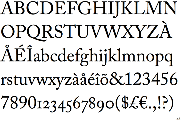 | ||
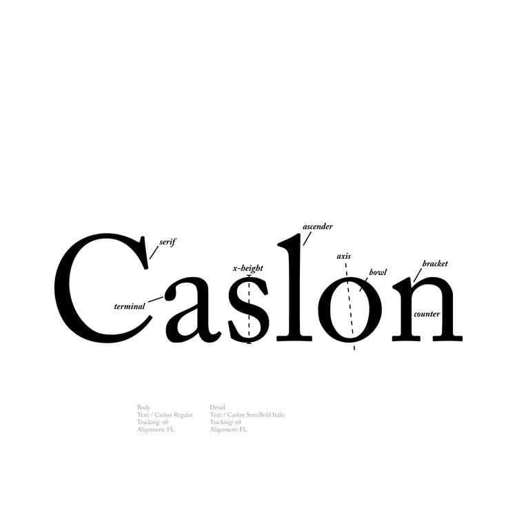
Shown here Adobe Caslon by Carol Twombly | ||
Untold caslon
Caslon is the name given to Serif typefaces designed by William Caslon I (c. 1692–1766) in London, or inspired by his work.
Contents
- Untold caslon
- Maryantini jouzar by caslon
- History
- Eclipse
- Resurgence
- Caslon Old Face
- Ludlow Typograph Company Chicago Illinois USA
- Imprint
- The Monotype Corporation Limited at Salford UK
- Caslon 471
- Caslon 540
- Caslon 3
- Caslon Openface
- Caslon 641
- Caslon 224
- Adobe Caslon 1990
- Big Caslon 1994
- LTC Caslon 2005
- Williams Caslon Text 2010
- Distressed revivals
- ITC Founders Caslon 1998
- H W Caslon version
- NotCaslon 1995
- Wyld 2002
- Franklin Caslon 2006
- Caslon Antique
- References
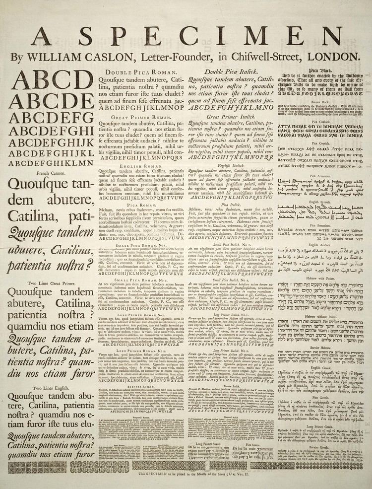
Caslon worked as an engraver of punches, the masters used to stamp the moulds or matrices used to cast metal type. He worked in the tradition of what is now called old-style serif letter design, that produced letters with a relatively organic structure resembling handwriting with a pen. Caslon established a tradition of engraving type in London, which previously had not been common, and so he was influenced by the imported Dutch Baroque typefaces that were popular in England at the time. His typefaces established a strong reputation for their quality and their attractive appearance, suitable for extended passages of text.
Caslon's fonts show an 'A' has a concave hollow at top left, the 'G' is without a downwards-pointing spur at bottom right and the sides of the 'M' are straight. The 'W' has three terminals at the top and the 'b' has a small tapered stroke ending at bottom left. Ascenders and descenders are short and the level of stroke contrast is modest in body text sizes. However, Caslon created subtly different designs of letter at different sizes, with increasing levels of fine detail and sharp contrast in stroke weight at larger sizes. In italic, Caslon's types have a varied angle of slant, with particularly sharp slanting on the A. The Q, v, w, and z all have flourishes or swashes in the original design, something not all revivals follow.
Caslon's typefaces were popular in his lifetime and beyond, and after a brief period of eclipse in the early nineteenth century remain very commonly used, particularly for setting printed body text and books. Many revivals exist, with varying faithfulness to Caslon's original design. Modern Caslon revivals also often add features such as a matching bold and 'lining' numbers at the height of capital letters, neither of which were used in Caslon's time. William Berkson, designer of a revival of Caslon, describes Caslon in body text as "comfortable and inviting".
Maryantini jouzar by caslon
History
Caslon began his career in London as an engraver of ornamental designs on firearms and other metalwork. According to his friend and executor John Nichols, the main source on his life, the accuracy of his work came to the attention of prominent London printers, who advanced him money to carve steel punches for printing, first for exotic languages and then as his reputation developed for the Latin alphabet. Punchcutting was a very difficult technique and many of the techniques used were kept secret by punchcutters or passed on from father to son. Caslon would later follow this practice himself, according to Nichols teaching his son his methods privately while locked in a room where nobody could watch them. As British printers had little success or experience of making their own types, they were forced to use equipment bought from the Netherlands, or France.
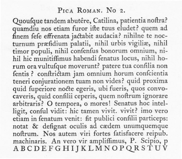
Caslon's type designs were therefore strongly influenced by Dutch models. James Mosley summarises his early work: "Caslon's pica, of which the first known use is an Anacreon printed by [Caslon's client, printer William] Bowyer in 1725, was based very closely indeed on a pica roman and italic that appears on the specimen sheet of the widow of the Amsterdam printer Dirck Voskens, c.1695, and which Bowyer had used for some years. Caslon's pica replaces it in his printing from 1725. This use of the pica is the first that has been traced of all Caslon's roman types…Caslon's Great Primer roman, first used in 1728, a type that was much admired in the twentieth century, is clearly related to the Text Romeyn of Voskens, a type of the early seventeenth century used by several London printers and now attributed to the punch-cutter Nicolas Briot of Gouda." He describes several other Caslon faces as "intelligent adaptations" of the Voskens Pica. Caslon's type rapidly built up a reputation for workmanship, being described by Henry Newman in 1733 as "the work of that Artist who seems to aspire to outvying all the Workmen in his way in Europe, so that our Printers send no more to Holland for the Elzevir and other Letters which they formerly valued themselves much." Mosley describes Caslon's Long Primer No. 1 type as "type with generous proportions and and it was normally cast with letter-spacing that was not too tight, characteristics that are needed in types on a small body. And yet it is so soundly made that words that are set in it keep their shape and are comfortably readable...It is a type that works best in the narrow measure of a two-column page or in quite modest octavos." Caslon sold a French Canon face he did not engrave that may to have been the work of Joseph Moxon with some modifications, and his larger-size faces follow this high-contrast model.
While not used extensively outside Britain, Caslon types were distributed throughout the British Empire, including British North America, where they were used on the printing the U.S. Declaration of Independence. After William Caslon I’s death, the use of his types diminished, but had a revival between 1840–80 as a part of the British Arts and Crafts movement. The Caslon design is still widely used today.
Caslon's original designs do not include a bold weight, as bold type did not exist in his time, although some of his titling-size fonts are quite bold.For emphasis, italics or a larger point size, and sometimes caps and small caps would be used instead.
Besides regular text fonts, Caslon offered blackletter types, which were also printed on his specimen. These could be used for purposes such as title pages and drop caps.
One criticism of some Caslon-style typefaces has been a concern that the capitals are too thick in design and stand out too much, making for an uneven colour on the page. Printer and typeface designer Frederic Goudy was one supporter of this view, feeling that "the strong contrast between the over-black stems of the capitals and the light weight stems in the lower-case...makes a 'spotty' page". He cited dissatisfaction with the style as an incentive for becoming more involved in type design around 1911, when he created Kennerley Old Style as an alternative.
Eclipse
Caslon's types fell out of interest in the late eighteenth century, due to the arrival of transitional typefaces like Baskerville and then Didone design, and his foundry split into successor companies, which began to sell alternative and additional designs. However, a successor company remained in business under the Caslon name and his reputation remained. The printer and social reformer Thomas Curson Hansard wrote in 1825:
At the commencement of the 18th century the native talent of the founders was so little prized by the printers of the metropolis, that they were in the habit of importing founts from Holland, ...and the printers of the present day might still have been driven to the inconvenience of importation had not a genius, in the person of William Caslon, arisen to rescue his country from the disgrace of typographical inferiority.
Many of Caslon's original punches and matrices survived in the collection of the Caslon company's descendants, and are now part of the St Bride Library and Type Museum collections in Britain. Copies held by the Paris office of the Caslon company, the Fonderie Caslon, were transferred to the collection of the Musée de l'Imprimerie in Nantes.
Resurgence
Interest in eighteenth-century printing returned in the nineteenth century with the rise of the arts and crafts movement, and Caslon's types returned to popularity in books and fine printing among companies such as the Chiswick Press, as well as display use in situations such as advertising. Some printing was done using Caslon's original matrices or electrotyped copies, while other releases used new designs in the same style to achieve a similar but cleaner appearance, making use of the improved technology of hot metal typesetting at the close of the 19th century.
In the USA, Caslons became almost a genre (many recut or expanded with bold, condensed, and inline styles), with many foundries cutting their own design. By the 1920s, American Type Founders offered a large range of styles, some numbered rather than named. (Bookman Old Style is a descendant of one of these American Caslon revivals. A series of modifications has given most modern Bookman digitisations a somewhat exaggerated appearance with extremely high x-height very unlike the original Caslon.)
Caslon again entered a new technology with phototypesetting, mostly in the 1960s and 1970s, and then again with digital typesetting technology, mostly since the mid-1980s. There are many typefaces called "Caslon" as a result of that and the lack of an enforceable trademark on the name "Caslon" by itself, which reproduce the original designs in varying degrees of faithfulness.
Caslon Old Face
Caslon's company had long been based in Chiswell Street, but it had a somewhat chaotic history after his death in 1766, with a large number of successor companies and branches. These began to sell alternative designs quite unlike the original Caslon's style, reflecting the new tastes in printing. One of these successors was bought up by what became Stephenson Blake in 1818.
Caslon’s types began to attract the attention of fine printers, so the H.W. Caslon & Sons foundry reissued Caslon’s original types as Caslon Old Face from the original matrices. The last lineal descendent of Caslon, Henry William Caslon, brought in Thomas White Smith as a new manager shortly before his death in 1874. Smith instructed his sons to change their surnames to Caslon in order to provide an appearance of continuity.
Some Caslon typefaces were augmented by adding new features such as swash capitals, recut and more regular designs, bold type, and condensed and inline styles. Due to the cachet of the Caslon name, some of these recuttings and modifications were apparently not publicly admitted.
The H.W. Caslon company also licensed to other printers matrices made by electrotyping (although some companies may also have made unauthorized copies or made completely new designs in the same style), and the type become popular in American printing. In 1937, the H.W. Caslon & Sons foundry was also acquired by Stephenson Blake & Co, who thereafter added 'the Caslon Letter Foundry' to their name.
Linotype and other companies offered "Caslon Old Face" releases that were based (or claimed to be based) on Caslon's original typefaces. Linotype's has been digitised and released by Bitstream.
A variety of typefaces are available commercially called Caslon Old Face. Visual differences exist between typefaces from different companies, and the authenticity is debatable of some of these typefaces.
Ludlow Typograph Company, Chicago, Illinois, USA
Ludlow had a wide variety of Caslon-types.
Imprint
A more regular adaptation of Caslon by the British branch of Monotype was commissioned by the London publishers of The Imprint, a short-lived printing trade periodical that published during 1913. It had a higher x-height and was intended to offer an italic more complementary to the roman. It has remained popular since and has been digitised by Monotype.
The Monotype Corporation Limited at Salford, UK
This company produced three Caslon revivals:
1903, Series 20 Old Face (special) after 1967 out of production1906, Series 45 Old Face Standard, after 1967 out of production1915, Series 128 & 209, Caslon & Caslon Titling.Caslon 471
Caslon 471 was designed by the staff of American Type Founders, one of several revivals of Caslon they produced. It is based on the Old Style No. 1 typeface used in an 1865 specimen book from the L.J. Johnson foundry in Philadelphia.
Caslon 540
Caslon 540 was designed by the staff of American Type Founders and released in 1902. The typeface was originally intended for use in advertising and is based on Caslon 471 with shortened descenders. In use at large sizes it is more even than Caslon's original display faces or more faithful renditions of them such as Big Caslon (see below), quite light in colour. Its italic is extremely sharply slanted. The italic was distributed by Letraset, whose designer Freda Sack created a matching set of swashes. As a result, this often became sold or used without the regular or roman style of this revival.
Caslon 3
A slighter bolder version of Caslon 540, released by American Type Founders in 1905. BitStream sells Caslon 3 under the name of Caslon Bold with its Caslon 540 release. Russian studio ParaType have released both with Cyrillic glyphs.
Caslon Openface
A decorative openface serif typeface with very high ascenders, popular in the United States. Despite the name, it has no connection to Caslon: it was an import of the French typeface "Le Moreau-le-Jeune", created by Fonderie Peignot in Paris, by ATF branch Barnhart Brothers & Spindlers.
Caslon 641
A heavy version of Caslon 540, released by American Type Founders in 1966.
Caslon 224
Caslon 224 was designed by Ed Benguiat of ITC, and released in 1983. A classic advertising and display typeface, it features a large x-height, smooth weight transitions, and careful structuring of hairline strokes, offered in four weights (book, medium, bold, and black) each with a matching italic.
In lectures, Benguiat has frequently said he chose the number 224 because it was the address of the building where he did most of his work.
Adobe Caslon (1990)
Adobe Caslon is a very popular revival designed by Carol Twombly. It is based on Caslon's own specimen pages printed between 1734 and 1770 and is a member of the Adobe Originals programme. It added many features now standard in high-quality digital fonts, such as small caps, old style figures, swash letters, ligatures, alternate letters, fractions, subscripts and superscripts, and matching ornaments.
Adobe Caslon is the typeface used for body text in The New Yorker and is one of the two official typefaces of the University of Virginia. A modification is used on U. VA's logo. It is also available with Adobe's Typekit programme, in some weights for free.
Big Caslon (1994)
Big Caslon by Matthew Carter is inspired by the "funkiness" of the three largest sizes of type from the Caslon foundry. These have a unique design with dramatic stroke contrast, complementary but very different to Caslon's text faces; one may have been created by Joseph Moxon rather than Caslon. The typeface is intended for use at eighteen point and above. The standard weight is bundled with Apple's macOS operating system in a release including small caps and alternates such as the long s. Initially published by his company Carter & Cone, in 2014 Carter revisited the design adding bold and black designs with matching italics, and republished it through Font Bureau. It is used by Boston magazine and the Harvard Crimson.
LTC Caslon (2005)
LTC Caslon is a digitisation of the Lanston Type Company's 14 point size Caslon 337 of 1915 (itself a revival of the original Caslon types). This family include fonts in regular and bold weights, with fractions, ligatures, small caps (regular and regular italic only), swashes (regular italic weight only), and Central European characters. An notable feature is that like some hot metal releases of Caslon, two separate options for descenders are provided for all styles: long descenders (creating a more elegant designs) or short (allowing tighter linespacing).
To celebrate its release, LTC included in early sales a CD of music by The William Caslon Experience, a downtempo electronic act, along with a limited edition upright italic design, 'LTC Caslon Remix'.
Williams Caslon Text (2010)
A modern attempt to capture the spirit of Caslon by William Berkson, intended for use in body text. Although not aimed at being fully authentic in every respect, the typeface closely follows Caslon's original specimen sheet in many respects. The weight is heavier than many earlier revivals, to compensate for changes in printing processes, and the italic is less slanted (with variation in stroke angle) than on many other Caslon releases. Berkson described his design choices in an extensive article series.
Released by Font Bureau, it includes bold and bold italic designs, and a complete feature set across all weights, including bold small caps and swash italic alternates as well as optional shorter descenders and a 'modernist' italic option to turn off swashes on lower-case letters and reduce the slant on the 'A' for a more spare appearance. It is currently used in Boston magazine and by Foreign Affairs.
A notable feature of Caslon's structure is its widely splayed T, which can space awkwardly with an 'h' afterwards. Accordingly, an emerging tradition among digital releases is to offer a 'Th' ligature, inspired by a tradition in calligraphy, to achieve tighter letterspacing. Adobe Caslon, LTC Caslon, Williams Caslon and Big Caslon (italics only, in the Font Bureau release) all offer a 'Th' ligature as default or as an alternate.
Distressed revivals
A number of Caslon revivals are 'distressed' in style, adding intentional irregularities to capture the worn, jagged feel of metal type.
ITC Founder's Caslon (1998)
ITC Founder's Caslon was digitized by Justin Howes. He used the resources of the St. Bride Printing Library in London to thoroughly research William Caslon and his types. Unlike previous digital revivals, this family closely follows the tradition of building separate typefaces intended for different sizes, despite the use of scalable typefaces in the digital counterpart. Distressing varies by style, matching the effect of metal type, with large optical sizes offering the cleanest appearance.
This family was released by ITC in December 1998. It includes separate fonts for 12 point, 30 point, 42 point, and Poster sizes, and a typeface for ornaments. Also following the original Caslon types, it does not include bold typefaces, but uses old style figures for all numbers.
Another feature in the Windows TrueType version of the typeface is the allocation of extra ligatures and alternate forms to Basic Latin and ISO Latin-1 blocks, replacing |, <, >, =.
The OpenType Std version of the typeface adds small caps to the family and updates the character set to support the Adobe Western 2 character set.
H. W. Caslon version
Following the release of ITC Founder's Caslon, Justin Howes revived the H.W. Caslon & Company name, and released an expanded version of the ITC typefaces under the Founders Caslon name.
Caslon Old Face is a typeface with multiple optical sizes, including 8, 10, 12, 14, 18, 22, 24, 30, 36, 42, 48, 60, 72, 96 points. Each font has small capitals, long esses and swash characters. The 96 point font came in roman only and without small capitals. Caslon Old Face was released in July 2001.
Caslon Ornaments is a typeface containing ornament glyphs.
These typefaces are packaged in the following formats:
However, following the death of Justin Howes, the revived H.W. Caslon & Company went out of business, and the expanded Founders Caslon is no longer offered in the retail market.
NotCaslon (1995)
An exuberant parody of Caslon italics created by Mark Andresen, this 1995 Emigre font was created by blending together samples of Caslon from "bits and pieces of dry transfer lettering: flakes, nicks, and all".
Wyld (2002)
A somewhat distressed modern day recreation of Caslon by David Manthey which is intended to exactly match the typeface found in The Practical Surveyor, by Samuel Wyld, published in London in 1725. The typeface contains a regular and italic style, with glyphs for several ligatures commonly used in printing during the early 18th century. It was released by Mathey as freeware for private use.
Franklin Caslon (2006)
This 2006 creation by P22 is based on the pages produced by Benjamin Franklin circa 1750. It has a distressed appearance.
Caslon Antique
This decorative serif typeface was originally called Fifteenth Century, but later renamed Caslon Antique. It is not generally considered to be a member of the Caslon family of typefaces, because its design appears unrelated, and the Caslon name was only applied retroactively.