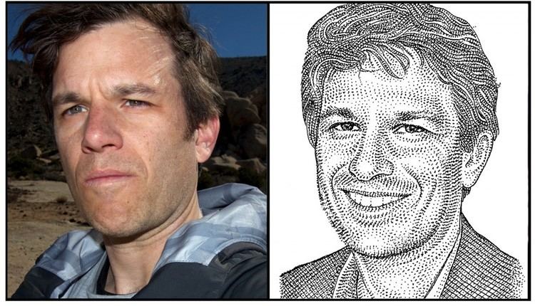
Tripti Joshi (Editor)

Matthew Butterick

Updated on
Edit
Like
Comment
Share on FacebookTweet on TwitterShare on LinkedInShare on Reddit
Name
  
Matthew Butterick

Role
  
Writer

Books
  
Typography for Lawyers


Matthew Butterick Matthew Butterick The Bomb in the Garden

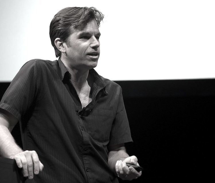
fourth racketcon matthew butterick like a blind squirrel in a ferrari


Matthew Butterick is an American typographer, lawyer, writer, and computer programmer. He received the 2012 Golden Pen Award from the Legal Writing Institute for his book Typography for Lawyers, which started as a website in 2008 based on his experience as a practicing attorney. He has worked for The Font Bureau and founded his own website design company, Atomic Vision (purchased by Red Hat in 1999). Expanding Typography for Lawyers, Butterick published Practical Typography as a "web-based book" in July 2013.

Contents

Matthew Butterick TYPO Talks Blog Archiv Contrast Conversations with

Butterick graduated with a BA in visual and environmental studies from Harvard University. He later earned a JD at the University of California, Los Angeles and was admitted to the State Bar of California in 2007.

Matthew Butterick wwwfontbureaucommediaimagespeoplebutterickgif

Matthew butterick


Typefaces

Matthew Butterick typographyforlawyerscomimagesmbhedcutjpg

Butterick’s typeface designs include:

For Font Bureau

  • Wessex (1993), transitional text serif inspired by Bulmer and Caledonia
  • Herald Gothic (1993), a bevelled sans-serif
  • Berlin Sans (1994, part), a flared sans-serif
  • Hermes (1995), a blocky sans-serif loosely inspired by Berthold Block
  • Alix, a typewriter font
  • Self-released

  • Equity, an updating of the 1930s body text serif design Ehrhardt. Features grades designed to suit different types of paper and printers, and separate small caps fonts intended for use in Word.
  • Concourse, loosely inspired by Dwiggins' geometric sans-serif design Metro. Features stylistic alternates and small caps.
  • Triplicate, a monospaced slab serif design inspired by typewriter fonts such as the default face used in the IBM Selectric. Essentially a further development of Alix, with more variants including a proportional version and a style designed specifically for displaying code.
  • Advocate, a caps-only slab and sans serif design. Reminiscent of mid-century American college sports team lettering, corporate logos and Bank Gothic. Somewhat resembles an expansion of Herald Gothic.
  • References

    Matthew Butterick Wikipedia