
Designer Fritz Stelzer Date created 1913 | Classification Old style serif Foundry Monotype Imaging | |
 | ||
Link catalog.monotype.com/family/monotype/plantin | ||
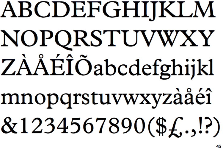
Plantin is an old-style serif typeface named after the printer Christophe Plantin. It was created in 1913 by the design office of the British Monotype Corporation for their hot metal typesetting system, and is based on a Gros Cicero face cut in the 16th century by Robert Granjon. The font was designed and engraved into metal at the Monotype factory in Salfords, Surrey, which was led by American engineer Frank Hinman Pierpont and draughtsman Fritz Stelzer. Both were recruits to Monotype from the German printing industry.
Contents
Plantin was one of the first Monotype Corporation revivals that was not simply a copy of a typeface already popular in British printing; it paved the way for the many Monotype revivals of classic typefaces that followed in the 1920s and 30s. Plantin was used as one of the main models for the creation of Times New Roman in the 1930s.
Inspiration
The intention behind the design of Plantin was to create a font with thicker letterforms than were often used at the time: previous type designers had reduced the weight of their fonts to make up for the effect of ink spread or to achieve a more elegant image, but by 1913 innovations in smoothing and coating paper had led to reduced ink spread. Pierpont was inspired to use Granjon's designs by a visit to the Plantin-Moretus Museum in Antwerp, Belgium, provided him with a printed specimen. At the time, Monotype's hot metal typesetting system, which cast new type for each printing job, was developing a reputation for practicality in trade and mass-market printing, but the designs offered by Monotype were relatively basic choices, such as a "modern" face, an "old style" and a Clarendon. It has been suggested that the existence of a c. 1910 Shanks family known as "Plantin Old Style" (not obviously based on Plantin's printing) may have prompted the choice of design and name. The Plantin-Moretus Museum, created in 1876 from Plantin's collection which had been preserved and added to by his successors, is the world's only institution with a significant collection of sixteenth century roman and italic fonts.
The Granjon font on which Pierpont's design was based was listed as one of the types used by the Plantin-Moretus Press beginning in the 17th century, long after Plantin had died and his press had been inherited by the Moretus family.
The choice of Monotype to revive a French renaissance design was unusual for the time, since most British fine printers of the period preferred either Caslon or revivals of the style of Nicolas Jenson, following the lead of William Morris's Golden Type. However, other revivals of Aldine/French renaissance typefaces followed from several hot metal typesetting companies in the following decades, including Monotype's own Bembo and Garamond, Linotype's Granjon and others, becoming very popular in book printing for body text.
Design
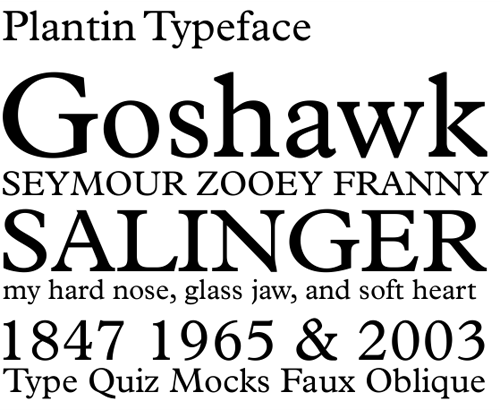
The design for Plantin preserved the large x-height of Granjon's designs, but shortened the ascenders and descenders and enlarged the counters of the lowercase 'a' and 'e'. Not all the letters were Granjon's: the letters 'J', 'U' and 'W', not used in French in the sixteenth century, were not his, and a different 'a' in an eighteenth-century style had been substituted into the font by the time the specimen sheet was printed.
Reception and usage
With its relatively robust, solid design compared to the Didone and "Modernised Old Style" faces popular in the early twentieth century (which Monotype already had made versions of), Plantin proved popular and was often particularly used by trade and newspaper printers using poor-quality paper in the metal type period and beyond.
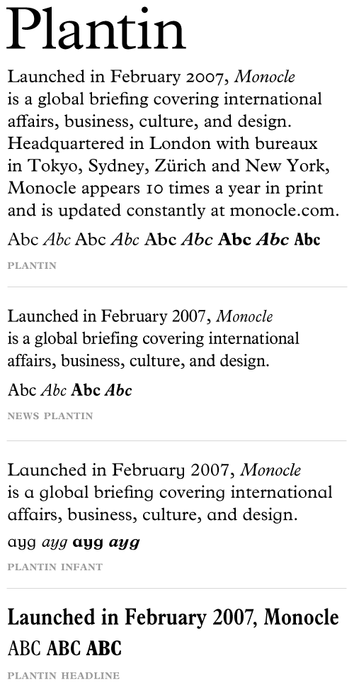
During the interwar period the face was adopted and popularized by Francis Meynell's Pelican Press and by C. W. Hobson's Cloister press, and also used occasionally by Cambridge Press. A custom version, "Nonesuch Plantin" was also cut for Meynell's Nonesuch Press, one of the first fine printers to use Monotype machines, with extended ascenders and descenders on the lower-case. Typographer Walter Tracy noted that he was surprised by the extent to which this changed the type's appearance: "it look[s] not only more refined but as if it derived from another period: Fournier's, say [in the eighteenth century], not Granjon's." It was appropriately used by the Bodley Head to print Meynell's autobiography. An infant variety of the typeface also exists, with single-story versions of the letters a and g.
The font was used as the signature font for ABC News from 1978 until the late 1990s. In more recent usage, the magazine Monocle is set entirely in Plantin and Helvetica.
Plantin was the basis for the general layout of Monotype's most successful typeface of all, Times New Roman. Times is similar to Plantin but "sharpened" or "modernised", with increased contrast (particularly resembling designs from the eighteenth and nineteenth century) and greater "sparkle". Monotype executive Allan Haley described Times as looking "like Plantin on a diet".