
 | ||
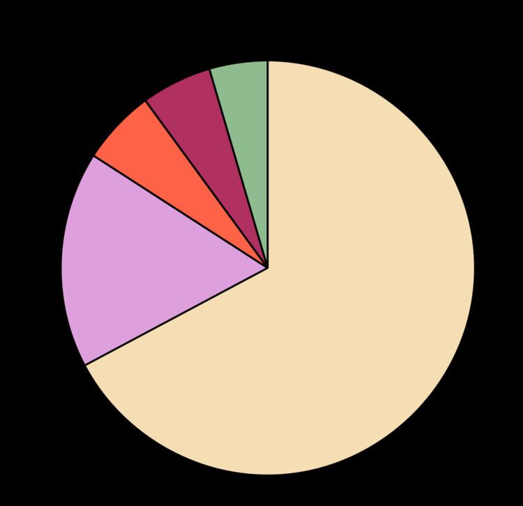
A pie chart (or a circle chart) is a circular statistical graphic which is divided into slices to illustrate numerical proportion. In a pie chart, the arc length of each slice (and consequently its central angle and area), is proportional to the quantity it represents. While it is named for its resemblance to a pie which has been sliced, there are variations on the way it can be presented. The earliest known pie chart is generally credited to William Playfair's Statistical Breviary of 1801.
Contents
- History
- 3d pie cake Perspective pie cake
- Doughnut chart
- Exploded pie chart
- Polar area diagram
- Ring chart Sunburst chart Multilevel pie chart
- Spie chart
- Square chart
- Example
- Use and effectiveness
- References
Pie charts are very widely used in the business world and the mass media. However, they have been criticized, and many experts recommend avoiding them, pointing out that research has shown it is difficult to compare different sections of a given pie chart, or to compare data across different pie charts. Pie charts can be replaced in most cases by other plots such as the bar chart, box plot or dot plots.
History
The earliest known pie chart is generally credited to William Playfair's Statistical Breviary of 1801, in which two such graphs are used. Playfair presented an illustration, which contained a series of pie charts. One of those charts depicting the proportions of the Turkish Empire located in Asia, Europe and Africa before 1789. This invention was not widely used at first;
The French engineer Charles Joseph Minard was one of the first to use pie charts in 1858, in particular in maps. Minard's map, 1858 used pie charts to represent the cattle sent from all around France for consumption in Paris (1858).
Playfair thought that pie charts were in need of a third dimension to add additional information. It has been said that Florence Nightingale invented it, though in fact she just popularised it and she was later assumed to have created it due to the obscurity of Playfair's creation.
3d pie cake / Perspective pie cake
A 3d pie cake, or perspective pie cake, is used to give the chart a 3D look. Often used for aesthetic reasons, the third dimension does not improve the reading of the data; on the contrary, these plots are difficult to interpret because of the distorted effect of perspective associated with the third dimension. The use of superfluous dimensions not used to display the data of interest is discouraged for charts in general, not only for pie charts.
Doughnut chart
A doughnut chart (also spelled donut) is a variant of the pie chart, with a blank center allowing for additional information about the data as a whole to be included.
Exploded pie chart
A chart with one or more sectors separated from the rest of the disk is known as an exploded pie chart. This effect is used to either highlight a sector, or to highlight smaller segments of the chart with small proportions.
Polar area diagram
The polar area diagram is similar to a usual pie chart, except sectors are equal angles and differ rather in how far each sector extends from the center of the circle. The polar area diagram is used to plot cyclic phenomena (e.g., count of deaths by month). For example, if the count of deaths in each month for a year are to be plotted then there will be 12 sectors (one per month) all with the same angle of 30 degrees each. The radius of each sector would be proportional to the square root of the death count for the month, so the area of a sector represents the number of deaths in a month. If the death count in each month is subdivided by cause of death, it is possible to make multiple comparisons on one diagram, as is seen in the polar area diagram famously developed by Florence Nightingale.
The first known use of polar area diagrams was by André-Michel Guerry, which he called courbes circulaires, in an 1829 paper showing seasonal and daily variation in wind direction over the year and births and deaths by hour of the day. Léon Lalanne later used a polar diagram to show the frequency of wind directions around compass points in 1843. The wind rose is still used by meteorologists. Nightingale published her rose diagram in 1858. The name "coxcomb" is sometimes used erroneously: this was the name Nightingale used to refer to a book containing the diagrams rather than the diagrams themselves.
Ring chart / Sunburst chart / Multilevel pie chart
A ring chart, also known as a sunburst chart or a multilevel pie chart, is used to visualize hierarchical data, depicted by concentric circles. The circle in the centre represents the root node, with the hierarchy moving outward from the center. A segment of the inner circle bears a hierarchical relationship to those segments of the outer circle which lie within the angular sweep of the parent segment.
Spie chart
A variant of the polar area chart is the spie chart designed by Dror Feitelson. This superimposes a normal pie chart with a modified polar area chart to permit the comparison of two sets of related data. The base pie chart represents the first data set in the usual way, with different slice sizes. The second set is represented by the superimposed polar area chart, using the same angles as the base, and adjusting the radii to fit the data. For example, the base pie chart could show the distribution of age and gender groups in a population, and the overlay their representation among road casualties. Age and gender groups that are especially susceptible to being involved in accidents then stand out as slices that extend beyond the original pie chart.
Square chart
Square charts are a rare form of pie charts that use squares instead of circles to represent percentages. Similar to basic circular pie charts, square pie charts take each percentage out of a total 100%.
Example
The following example chart is based on preliminary results of the election for the European Parliament in 2004. The table lists the number of seats allocated to each party group, along with the derived percentage of the total that they each make up. The values in the last column, the derived central angle of each sector, Is found by multiplying the percentage by 360°.
*Because of rounding, these totals do not add up to 100 and 360.
The size of each central angle is proportional to the size of the corresponding quantity, here the number of seats. Since the sum of the central angles has to be 360°, the central angle for a quantity that is a fraction Q of the total is 360Q degrees. In the example, the central angle for the largest group (European People's Party (EPP)) is 135.7° because 0.377 times 360, rounded to one decimal place, equals 135.7.
Use and effectiveness
An obvious flaw exhibited by pie charts is that they cannot show more than a few values without separating the visual encoding (the “slices”) from the data they represent (typically percentages). When slices become too small, pie charts have to rely on colors, textures or arrows so the reader can understand them. This makes them unsuitable for use with larger amounts of data. Pie charts also take up a larger amount of space on the page compared to the more flexible bar charts, which do not need to have separate legends, and can display other values such as averages or targets at the same time.
Statisticians generally regard pie charts as a poor method of displaying information, and they are uncommon in scientific literature. One reason is that it is more difficult for comparisons to be made between the size of items in a chart when area is used instead of length and when different items are shown as different shapes.
Further, in research performed at AT&T Bell Laboratories, it was shown that comparison by angle was less accurate than comparison by length. This can be illustrated with the adjacent diagram, showing three pie charts, and, below each of them, the corresponding bar chart representing the same data. Most subjects have difficulty ordering the slices in the pie chart by size; when the bar chart is used the comparison is much easier. Similarly, comparisons between data sets are easier using the bar chart. However, if the goal is to compare a given category (a slice of the pie) with the total (the whole pie) in a single chart and the multiple is close to 25 or 50 percent, then a pie chart can often be more effective than a bar graph.
The example (left) is of a pie chart with 18 values, having to separate the data from its representation. Note also that several values are represented with the same color, making interpretation difficult.
Several studies presented at the European Visualization Conference analyzed the relative accuracy of several pie chart formats, reaching the conclusion that pie charts and doughnut charts produce similar error levels when reading them, and square pie charts provide the most accurate reading.