
Foundry Monotype Imaging Date released 1929 | Variations Perpetua Titling | |
 | ||
Link catalog.monotype.com/family/monotype/perpetua | ||
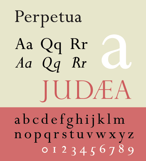
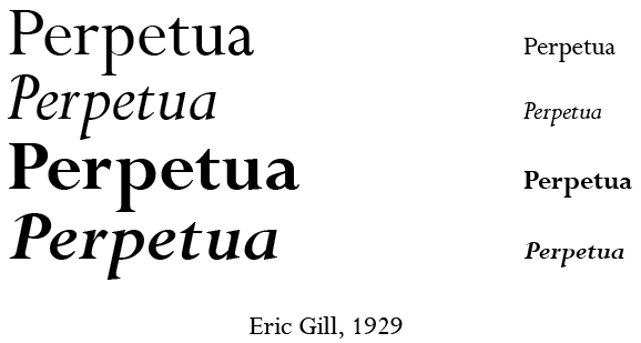
Perpetua is a serif typeface that was designed by English sculptor and stonemason Eric Gill for the British Monotype Corporation. Perpetua was commissioned at the request of Stanley Morison, an influential historian of printing and adviser to Monotype around 1925, at a time when Gill's reputation as a leading artist-craftsman was high.
Contents
With a delicate structure influenced by Gill's experience of carving lettering for monuments and memorials, Perpetua is commonly used for covers and headings and also sometimes for body text. Perpetua was released with characters for the Greek alphabet and a matching set of titling capitals for headings.
Perpetua is named for the Christian martyr Vibia Perpetua, a text by whom was used in one of its first showings; its companion italic is named "Felicity" for her companion of that name. The choice had appeal to Morison and Gill, both converts to Catholicism.
Design
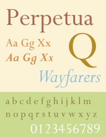
Perpetua is often classified as a transitional serif font, with a delicate structure somewhat similar to British fonts from the eighteenth century such as Baskerville and stonecarved (lapidary) inscriptions in the same style. However, it does not directly revive any specific historical model. Characteristic "transitional" features in Perpetua include considerable contrast in stroke width, crisp horizontal serifs, a delicate colour on the page and a reasonably vertical axis, with letters such as ‘O’ having their thinnest points at the top and bottom.
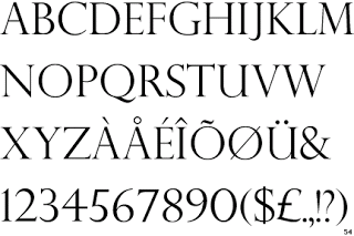
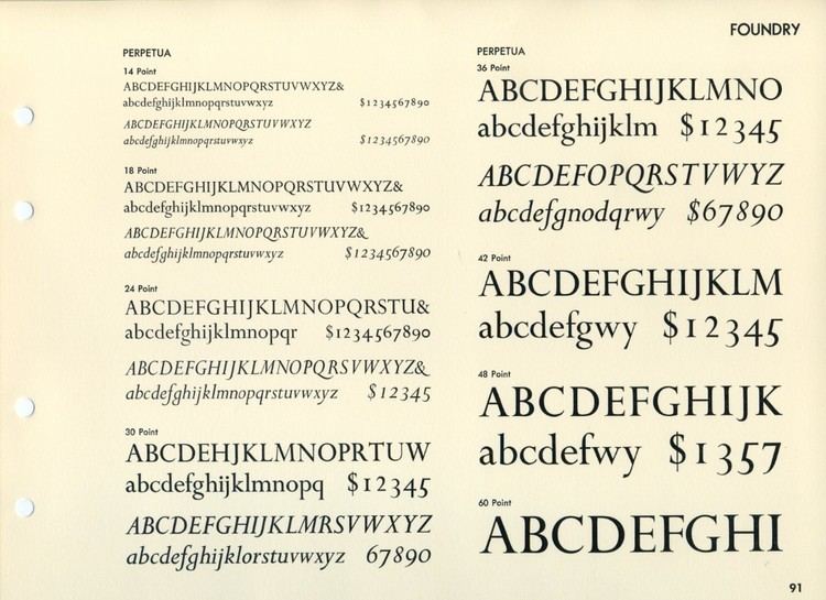
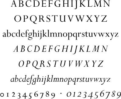
Along with these characteristics, Perpetua bears the distinct personality of Gill's characteristic preferences in carving monumental lettering for uses such as tombstones, dedications and war memorials. Fine book printer Christopher Sandford of the Chiswick Press, who knew Gill, commented that "all Gill's types…are variants of Gill's own very lovely, very personal hand-lettering." Letter designs in Perpetua common in Gill's work include the 'a' that forms a sharp point without serif, the extended leg of the 'R' and the flat-topped 'A'. In italic, the 'a' has a smooth top and the 'g' is a "single-storey" design recalling handwriting. The top of the 'f' has a wedge-shaped serif. Historian James Mosley suggests that a rubbing of a 1655 engraving at Rye may have been an influence on the design. Perpetua's italic also has some flourishes in the capitals, but rather than being fully cursive in style some characters resemble oblique type or the "sloped roman" style, a style rarely used for serif fonts in which letters are slanted but do not take on as many handwriting characteristics as in a "true italic". Examples of this are the flat foot serifs on letters like 'h', 'm' and 'n', where most body text italics would have a curl or no serif at all. In structure, Perpetua appears relatively light in colour and rather "small" on the page, although this is less problematic in the carefully designed metal type, in which every size was carefully drawn differently, than in digital facsimile.
Usage
Mosley, in an article on Perpetua's development, comments that the design's:
openness and small x-height make it far from economical in use, and the delicacy - even spindliness - of its cutting are a severe handicap. It reveals its qualities best in the richly-inked and crisply machined first specimen text [of 1930].
Ultimately, despite Morison's high hopes for Perpetua, it has remained something of a niche face, particularly popular for high-quality printing projects and uses such as headings. Morison late in life conceded that
the question whether the sizes 8- to 14-point fully realise the ambition with which they were begun, i.e. to create an original type serviceable for all kinds of books, does not permit of an answer in the unqualified affirmative. Perpetua, it may be said at once, is eminently suitable for certain kinds of books...with which a certain obvious degree of 'style' is desired, as for example, the semi-private printing with which Gill was for a long time intimately associated.
Perpetua's appeal to fine book printers has been long-standing since its release, both in the UK and abroad. Christopher Sandford wrote of Perpetua and Gill’s similar type for the Golden Cockerel Press that “it is important that type in combination with finely cut engravings should not be so ‘bold’ as to 'kill' the artists' work, it is also important that it should not be too light to make a comfortable combination. While Gill's Perpetua is probably better suited to combine with line-engravings in copper, etchings, mezzotints or watercolour paintings, the [somewhat bolder] 'Golden Cockerel' type undoubtedly fulfilled Gill's intention for it to combine most charmingly with surface printing from wood-blocks." Vivian Ridler, some years later to become Printer to the University of Oxford, was so inspired by Gill's work around this time that he named his side printing project the Perpetua Press after the font in 1933.
Two connected designs created around and after the time of its project at Morison's instigation became among the most popular typefaces ever designed. Morison was consulted to advise on a custom typeface for the Times around the end of Perpetua's convoluted development. One of several options proposed was a modified version of Perpetua, increased in bulk for the conditions of newspaper printing. (Robin Kinross has noted that Perpetua's basic design is "hardly robust enough for newspaper printing.") In the end Monotype created a new font, Times New Roman, for that project instead, basing it on an earlier typeface named Plantin, but one of the key modifications was sharpening Times's serifs, similar to Perpetua's design; Morison's cited reason for the change was to resemble the previous fonts used. Times New Roman when released to general use rapidly became one of the most popular fonts in the history of printing. In Monotype's sales chart through to 1984 Times ranks top of all, with Perpetua eighteenth out of forty-three. The Times did use Perpetua Titling for some sections in the metal type period.
While working on the project Morison engaged Gill also to begin work on a sans-serif project, which became the extremely successful Gill Sans series, ranking fifth on Monotype's sales chart. Mosley describes this as "a best-selling design whose sales record must have compensated Monotype for many well-meaning failures."
Background
Gill began work on Perpetua in 1925 at the request of Stanley Morison, typographical advisor to Monotype; they had met in 1913. Morison sought Gill's talent to design a new typeface for the foundry, asking for a "roman letter suitable for book reading, which while being new, was to be of general utility and in no respect unusual." In his memoir and assessment of Monotype's work, A Tally of Types (1953, after Gill's death), Morison claimed that he had chosen to collaborate with Gill because of an impression that previous artistically inclined typefaces cut as niche products for the private use of fine press printing companies had been too eccentric:
it still remained desirable to cut…an original face [which] required a living artist capable of the work. There was no lack of fine calligraphers or fine printers in Britain and Germany [but] the possibility was remote of securing from this source a satisfactory set of drawings of a new roman and italic suitable for work of every sort…with the possible exceptions of the Doves and Golden Type, their efforts had been new and peculiar...
Morison wrote that he felt that Gill as a sculptor, with a trade of work more akin to the engraving process used to sculpt the master punches traditionally used to make metal type, could succeed where these designers, mostly trained in calligraphy, had not:
The finely bracketed serif with which the sculptors of the roman inscriptions dignified their alphabet is symbolic; it signified their sense of the fundamental difference between private and public writing; between script and inscription. Thus the function of the serif must be understood by the artist if his book-type is to have a chance of succeeding. The fine serif is not in origin calligraphic but epigraphic; not written but sculptured. It follows that a set of drawings of a finely serifed type by a contemporary practitioner of lettering could best be made by [a sculptor] and Gill was the obvious man to solve it. He was asked to make drawings of the letters he had long been habitually carving.
Morison engaged Gill to develop drawings for the face around 1925.
Development
The process of Perpetua's development was extremely convoluted. After Gill had produced his drawings, Morison decided not to send them to the Monotype engineering department at Salfords, Surrey, with which he had had disagreements. Instead, he commissioned at his own expense for the punchcutter Charles Malin of Paris in 1926 to manually engrave punches which were used to cast trial metal type. Manually cutting punches was the standard method of creating the matrices, or moulds used to cast metal type, in the previous century, but was now effectively a niche artisanal approach replaced by machine pantograph engraving.
Once the Malin type had been cast, Gill found some of his decisions unsatisfying seen in extended passages of text, leading him to propose changes and corrections. These were ultimately used to develop a final set of working drawings for commercial release.
Gill made several attempts at designing a companion italic face for Perpetua. One was a sloped roman, in which the regular style is slanted without the different letterforms of italic type. This unusual design decision was done under the influence of Morison's opinion that a sloped roman form was preferable to that of cursive italics for use in book text, providing less of a contrast with the roman. However, the oblique was not accepted by Monotype management, who went so far as to declare it "worthless." Ultimately a more conventional italic was used instead. Morison commented to his friend Jan van Krimpen that "we did not give enough slope to it. When we added more slope, it seemed that the fount required a little more cursive to it." A slightly condensed italic alphabet Gill had drawn for Gerald Meynell of the Westminster Press was also considered as a basis for its italic.
An early showing of Perpetua in The Fleuron, a journal edited by Morison, suggested that Gill might design a script or calligraphic font, "Felicity Script", as a companion, but this was never developed. Perpetua was set in a limited edition of a new translation by Walter H. Shewring of The Passion of Perpetua and Felicity, giving birth to the name of the typeface and its companion italic. The book was printed in 1929. The same type and illustrations (also done by Gill) for that book subsequently appeared in the journal on printing Fleuron (number 7) which was edited by Morison and printed in 1930; Gill Sans was also promoted in an issue of it. Also set in Perpetua and published in 1929 was Gill's Art Nonsense and Other Essays.
While some sources give Perpetua a release date of 1929 based on these early uses, Perpetua was not to enter full commercial sale until 1932. Once on sale, it was sold for Monotype's typesetting machines, which cast metal type under the control of a keyboard, and also sometimes offered in metal type for hand-setting for the use of larger sizes and smaller printers.
Users
Digitisations and adaptations
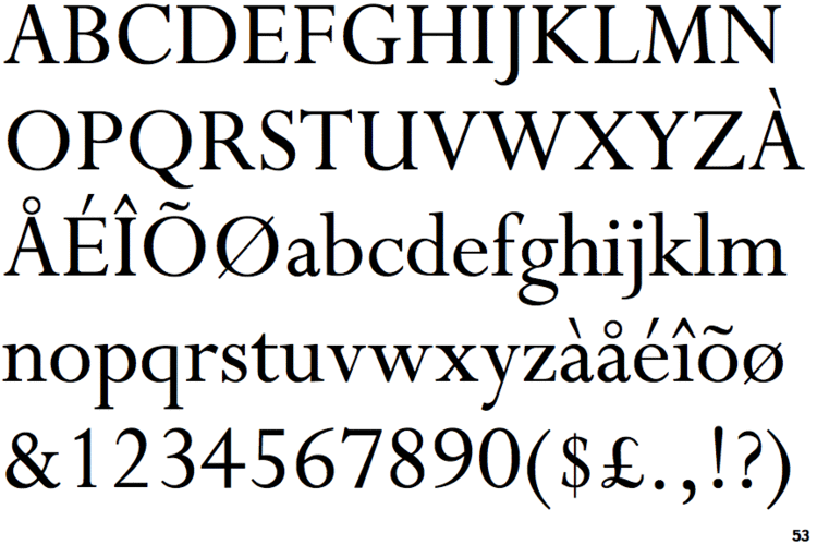
Perpetua has been digitised by Monotype and a basic release is included with Microsoft Office. The professional release adds additional features likely to be used in professional printing, such as small capitals and text figures. Lapidary 333 by Bitstream is an unofficial digitisation.
As many of Gill's faces and lettering projects show characteristic features, many of Gill's other families are similar in spirit. Joanna has similarities to Perpetua but a more robust colour on the page with regular slab serifs and an only slightly slanted italic; Gill described it as "a book face free from all fancy business". Gill's family for the Golden Cockerel Press, which has been digitised as ITC Golden Cockerel, also has similarities. Monotype's Gill Facia family from the digital period, reviving Gill's lettering projects such as for WH Smith, is a more festive and decorative family in the same style particularly intended for display-size text.
Financier, by Kris Sowersby, is a respected revival influenced by Perpetua and other Gill designs, in particular the more solid Solus and Joanna. Particularly acclaimed for being released in optical sizes for small and large text unlike the official Monotype digitisations, it was commissioned by the Financial Times and has also been commercially released.