
Name Jan Krimpen | Role Graphic designer | |
 | ||
Books Variations on First Principles of Typography | ||
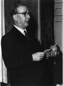
Jan van Krimpen (12 February 1892, in Gouda – 20 October 1958, in Haarlem) was a Dutch typographer and type designer. He worked for the printing house Koninklijke Joh. Enschedé; he also worked with Monotype in England, who issued or reissued many of his designs outside the Netherlands.
Contents
Type designs
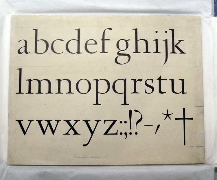
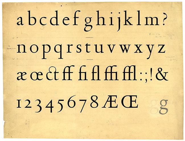
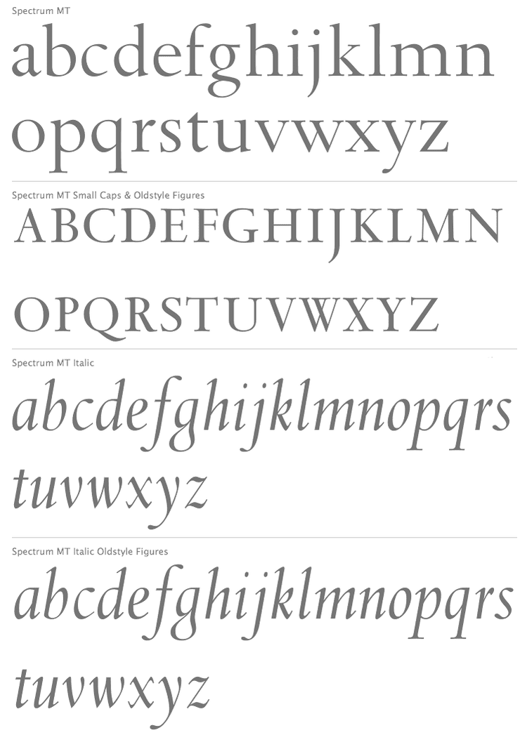
Van Krimpen's type designs are elegant book typefaces, originally made for manual printing and the Monotype machine. Although a good few have been digitised (Romulus, Haarlemmer, Spectrum), the typefaces are only rarely used in publications. Van Krimpen had a strong interest in the sharp-seriffed designs of traditional Dutch Baroque type design, although he preferred to avoid direct revivals. His approach was continued by Sem Hartz, his successor at Enschedé, and has been of interest to more recent Dutch designers such as Martin Majoor.
Of special note is the Romulus 'superfamily', consisting of a seriffed font, a cursive, a chancery italic (Cancelleresca Bastarda), a sans-serif, and a Greek in a range of weights. Such an extensive family would have been a first, comparable to today's Scala family by Majoor. The outbreak of the Second World War disrupted the project before completion. After the war, Van Krimpen was not interested in resuming it.
Foundry Type
These foundry types were designed by Jan van Krimpen:
Some initials designed by van Krimpen for the Curwen Press have also been digitised by ARTypes of Chicago. ARTypes also digitised some sets of van Krimpen initial designs that are no longer on sale.
Van Krimpen was renowned for his perfectionism and temper. Monotype's archives preserve a letter to Stanley Morison to say that 'I do not want to be taken for the man who designed something so ridiculously poor as the sloped Romulus bold' that Monotype had produced without his involvement while he was trapped in the Netherlands during the war. Some of his papers are held by the University of Amsterdam.