
Spouse(s) Mabel Hoyle Dwiggins | Name William Dwiggins | |
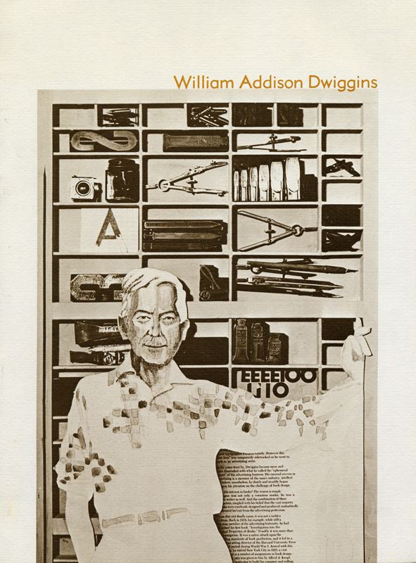 | ||
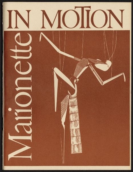
Full Name William Addison Dwiggins Occupation Type designer, calligrapher, book designer Died December 25, 1956, Massachusetts, United States Books Marionette in Motion: The Puterschein System Diagrammed, Described | ||
Other names W. A. DwigginsW.A.D. | ||
William addison dwiggins black white smith
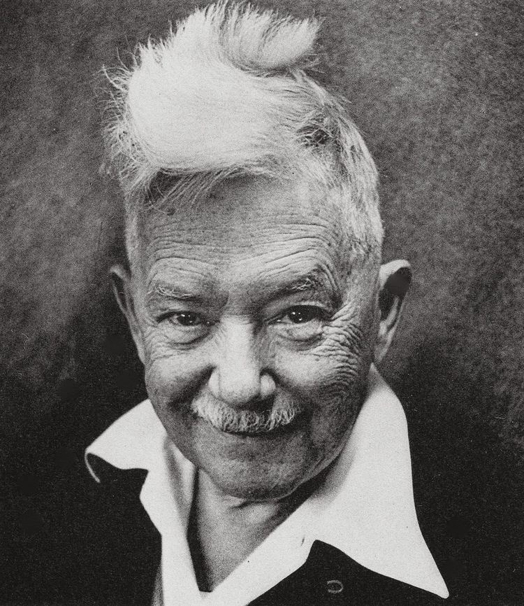
William Addison Dwiggins (June 19, 1880 Martinsville, Ohio – December 25, 1956 Hingham Center, Massachusetts), was an American type designer, calligrapher, and book designer. He attained prominence as an illustrator and commercial artist, and he brought to the designing of type and books some of the boldness that he displayed in his advertising work. His work can be described as ornamented and geometric, similar to the Art Moderne and Art Deco styles of the period, using Oriental influences and breaking from the more antiquarian styles of his colleagues and mentors Updike, Cleland and Goudy.
Contents
- William addison dwiggins black white smith
- Marina william addison dwiggins
- Career
- Typefaces
- Marionettes
- Legacy
- Books illustrated or designed
- References
Dwiggins is credited with coining the term 'graphic designer' in 1922 to describe his various activities in printed communications, like book design, illustration, typography, lettering and calligraphy (his first typeface designs were released much later). The term did not achieve widespread usage until after the Second World War.
Marina william addison dwiggins
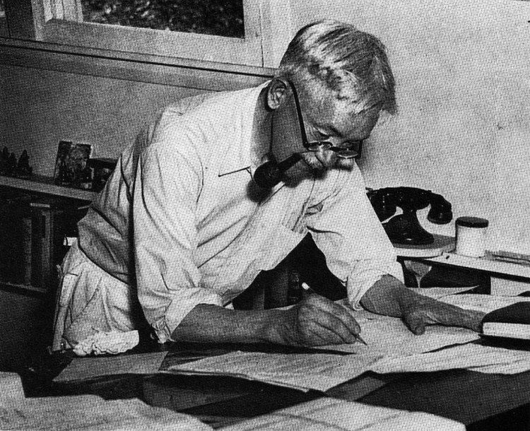
Career
Dwiggins began his career in Chicago, working in advertising and lettering. With his colleague Frederic Goudy, he moved east to Hingham, Massachusetts, where he spent the rest of his life. He gained recognition as a lettering artist and wrote much on the graphic arts, notably essays collected in MSS by WAD (1949), and his Layout in Advertising (1928; rev. ed. 1949) remains standard. During the first-half of the twentieth century he also created pamphlets using the pen name "Dr. Puterschein".
His scathing attack on contemporary book designers in An Investigation into the Physical Properties of Books (1919) led to his working with the publisher Alfred A. Knopf. Alblabooks, a series of finely conceived and executed trade books followed and did much to increase public interest in book format. Having become bored with advertising work, Dwiggins was perhaps more responsible than any other designer for the marked improvement in book design in the 1920s and 1930s. An additional factor in his transition to book design was a 1922 diagnosis with diabetes, at the time often fatal. He commented "it has revolutionised my whole attack. My back is turned on the more banal kind of advertising...I will produce art on paper and wood after my own heart with no heed to any market."
In 1926, the Chicago Lakeside Press recruited Dwiggins to design a book for the Four American Books Campaign. He said he welcomed the chance to "do something besides waste-basket stuff" which would be "promptly thrown away" and chose the Tales of Edgar Allan Poe. The Press considered his fee of $2,000 to be low for an illustrator of his commercial power. Many of Dwiggins' designs used celluloid stencils to create repeating units of decoration.
He and his wife Mabel Hoyle Dwiggins (February 27, 1881 – September 28, 1958) are buried in the Hingham Center Cemetery, Hingham Center, Massachusetts, near their home at 30 Leavitt Street, and Dwiggins' studio at 45 Irving Street. After Dwiggins' wife's death, many of Dwiggins' works and assets passed to his assistant Dorothy Abbe.
A full-length biography of Dwiggins by Bruce Kennett, believed to be the first, will be published in 2017 by the Letterform Archive museum of San Francisco.
Typefaces
Dwiggins' interest in lettering led to the Linotype, sensing Dwiggins' talent and knowledge, hiring Dwiggins in March 1929 as a consultant to create a sans-serif typeface, which became Metro, in response to similar type being sold from European foundries such as Erbar, Futura, and Gill Sans, which Dwiggins felt failed in the lower-case. Dwiggins went on to have a successful working relationship with Chauncey H. Griffith, Linotype's Director of Typographic Development, and all his typefaces were created for them. His most widely used book typefaces, Electra and Caledonia, were specifically designed for Linotype composition and have a clean spareness.
The following list of his typefaces is thought to be complete. Dwiggins was unfortunate to enter the genre of type design in a period for new metal type designs that encompassed successively the Great Depression and Second World War, and so many of his designs did not progress beyond experimental castings.
The Metro series was redesigned on entering production, with several characters changed to better echo the then-popular Futura. This formed the Metro No. 2 series. Some revivals return to Dwiggins' original design choices or offer them as alternates.
Other fonts have been created after his death inspired by Dwiggins' lettering projects, although these were not authorised by Dwiggins in his lifetime.
A trick used by Dwiggins to create dynamic-looking letter shapes was to design letters so the curves on the inside of the letter do not match those on the outside. This intentional irregularity was inspired by the difficulty of carving marionettes for his puppet theatre. It has since been used by other serif font designers such as Martin Majoor.
Besides Dwiggins' type design, a text written by Dwiggins in Layout in Advertising on choosing a font, beginning "Why do the pace-makers in the art of printing rave over a specific face of type? What do they see in it?", has been used by many font designers as a filler text, similar to Quousque tandem or lorem ipsum.
Marionettes
Dwiggins' love of wood carving led to his creation of a marionette theatre in a garage at 5 Irving Street, which was behind his home at 30 Leavitt Street in Hingham, Massachusetts. He also created a puppet group named the Püterschein Authority. In 1933 he performed his first show there, "The Mystery of the Blind Beggarman." Dwiggins built his second theatre under his studio at 45 Irving Street. Further productions of the Püterschein Authority included "Prelude to Eden," "Brother Jeromy," "Millennium 1," and "The Princess Primrose of Shahaban in Persia." Most of his marionettes were twelve inches tall. The marionettes were donated to the three-room Dwiggins Collection at the Boston Public Library in 1967.
Legacy
In 1957, a year after his death, Bookbuilders of Boston, an organization of book publishing professionals that Dwiggins helped to establish, renamed their highest award the W.A. Dwiggins Award.