Date created 1929 | Classification Humanist Foundry Lanston MonotypeITC Variations ITC Goudy Sans | |
 | ||
Goudy Sans is a sans-serif typeface designed by Frederic Goudy around 1929-1931 and published by Lanston Monotype.
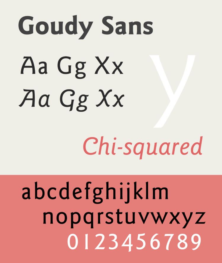
Unlike many sans-serifs, which often have an unadorned appearance with a geometric or industrial aesthetic, Goudy Sans has a more organic and decorative structure resembling painted lettering, with reduced use of straight lines and flared stroke ends. Goudy gave the design a "true" italic with letterforms inspired by handwriting and decorative features such as swashes and curls (some in alternate characters) inspired in part by uncial script. This exemplifies his taste towards designs with an organic feel. Goudy described the design as influenced by writing in the Greek alphabet. Lewis Blackwell in 20th-Century Type describes it as "something of a sport...with pronounced tendency to the inscriptional in its 'chiselled' junctions". The proportions of the lower-case are slightly condensed.
Goudy described the design as not popular in his lifetime and did not give it a specific name; it was published as "Goudy Sans Serif" in his lifetime. However, it has been re-released and digitised several times, mostly under the shortened name of Goudy Sans.
Digitisations
Goudy Sans has been digitised by P22 under its LTC imprint in a version relatively similar to the original metal type. During the phototypesetting period of printing, Compugraphic developed a new version with adjusted proportions and an expanded range of weights. This was re-released and expanded by ITC to form a popular four-weight version, shown in the sample for this article. The ITC release was also re-released by Adobe.
