
 | ||
Letter case (or just case) is the distinction between the letters that are in larger upper case (also uppercase, capital letters, capitals, caps, large letters, or more formally majuscule) and smaller lower case (also lowercase, small letters, or more formally minuscule) in the written representation of certain languages. The writing systems that distinguish between the upper and lower case have two parallel sets of letters, with each letter in one set usually having an equivalent in the other set. Basically, the two case variants are alternative representations of the same letter: they have the same name and pronunciation and will be treated identically when sorting in alphabetical order.
Contents
- Terminology
- Typographical properties
- Bicameral script
- Capitalization
- Exceptional letters and digraphs
- Related phenomena
- Case styles
- Headings and publication titles
- Multi word proper nouns
- Special case styles
- Unit symbols in the metric system
- Case folding
- Methods in word processing
- Methods in programming
- Unicode case folding and script identification
- History
- Type cases
- References
Letter case is generally applied in a mixed-case fashion, with both upper and lower case letters appearing in a given piece of text. The choice of case is often prescribed by the grammar of a language or by the conventions of a particular discipline. In orthography, the upper case is primarily reserved for special purposes, such as the first letter of a sentence or of a proper noun, which makes the lower case the more common variant in regular text. In mathematics, letter case may indicate the relationship between objects, with upper-case letters often representing "superior" objects (e.g. X could be a set containing the generic member x). In some contexts, it is conventional to use only one case. For example, engineering design drawings are typically labelled entirely in upper-case letters, which are easier to distinguish than the lower case, especially when space restrictions require that the lettering be small.
In the character sets developed for computing, each upper and lower case letter is encoded as a separate character. In order to enable case folding, the software needs to link together the two characters representing the case variants of a letter. Some old character-encoding systems, such as the Baudot code, are restricted to one set of letters, usually represented by the upper-case variants.
Terminology
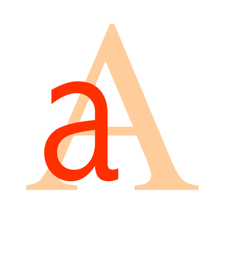
The terms upper case and lower case can be written as two consecutive words, connected with a hyphen (upper-case and lower-case), or as a single word (uppercase and lowercase). These terms originated from the common layouts of the shallow drawers called type cases used to hold the movable type for letterpress printing. Traditionally, the capital letters were stored in a separate case that was located above the case that held the small letters, and the name proved easy to remember since capital letters are taller.
Majuscule, (/məˈdʒʌskjuːl/ or /ˈmædʒəskjuːl/), for palaeographers, is technically any script in which the letters have very few or very short ascenders and descenders, or none at all (for example, the majuscule scripts used in the Codex Vaticanus Graecus 1209, or the Book of Kells). By virtue of their visual impact, this made the term majuscule an apt descriptor for what much later came to be more commonly referred to as uppercase letters.
Minuscule refers to lower-case letters. The word is often spelled miniscule, by association with the unrelated word miniature and the prefix mini-. This has traditionally been regarded as a spelling mistake (since minuscule is derived from the word minus), but is now so common that some dictionaries tend to accept it as a nonstandard or variant spelling. Miniscule is still less likely, however, to be used in reference to lower-case letters.
Typographical properties
The glyphs of lower-case letters can resemble smaller forms of the upper-case glyphs restricted to the base band (e.g. "C/c" and "S/s", cf. small caps) or can look hardly related (e.g. "D/d" and "G/g"). Here is a comparison of the upper and lower case variants of each letter included in the English alphabet (the exact representation will vary according to the typeface and font used):
Typographically, the basic difference between the majuscules and minuscules is not that the majuscules are big and minuscules small, but that the majuscules generally have the same height (although, depending on the typeface, there may be some exceptions, particularly with Q and sometimes J having a descending element; also, various diacritics can add to the normal height of a letter). There is more variation in the height of the minuscules, as some of them have parts higher (ascenders) or lower (descenders) than the typical size. In Times New Roman, for instance, b, d, f, h, k, l, t are the letters with ascenders, and g, j, p, q, y are the ones with descenders. In addition, with old-style numerals still used by some traditional or classical fonts, 6 and 8 make up the ascender set, and 3, 4, 5, 7 and 9 the descender set.
Bicameral script
Writing systems using two separate cases are bicameral scripts. Languages that use the Latin, Cyrillic, Greek, Coptic, Armenian, Adlam, Varang Kshiti, Cherokee, and Osage scripts use letter cases in their written form as an aid to clarity. Other bicameral scripts, which are not used for any modern languages, are Old Hungarian, Glagolitic, and Deseret. The Georgian alphabet has several variants, and there were attempts to use them as different cases, but the modern written Georgian language does not distinguish case.
Many other writing systems make no distinction between majuscules and minuscules – a system called unicameral script or unicase. This includes most syllabic and other non-alphabetic scripts.
In scripts with a case distinction, lower case is generally used for the majority of text; capitals are used for capitalisation and emphasis. Acronyms (and particularly initialisms) are often written in all-caps, depending on various factors.
Capitalization
Capitalisation is the writing of a word with its first letter in uppercase and the remaining letters in lowercase. Capitalisation rules vary by language and are often quite complex, but in most modern languages that have capitalisation, the first word of every sentence is capitalised, as are all proper nouns.
Capitalisation in English, in terms of the general orthographic rules independent of context (e.g. title vs. heading vs. text), is universally standardised for formal writing. Capital letters are used as the first letter of a sentence, a proper noun, or a proper adjective. The names of the days of the week and the names of the months are also capitalised, as are the first-person pronoun "I" and the interjection "O" (although the latter is uncommon in modern usage, with "oh" being preferred). There are a few pairs of words of different meanings whose only difference is capitalisation of the first letter. Honorifics and personal titles showing rank or prestige are capitalised when used together with the name of the person (for example, "Mr. Smith", "Bishop O'Brien", "Professor Moore") or as a direct address, but normally not when used alone and in a more general sense. It can also be seen as customary to capitalise any word – in some contexts even a pronoun – referring to the deity of a monotheistic religion.
Other words normally start with a lower-case letter. There are, however, situations where further capitalisation may be used to give added emphasis, for example in headings and publication titles (see below). In some traditional forms of poetry, capitalisation has conventionally been used as a marker to indicate the beginning of a line of verse independent of any grammatical feature.
Other languages vary in their use of capitals. For example, in German all nouns are capitalised (this was previously common in English as well), while in Romance and most other European languages the names of the days of the week, the names of the months, and adjectives of nationality, religion and so on normally begin with a lower-case letter. On the other hand, in some languages it is customary to capitalise formal polite pronouns, for example Du, Den (Danish), Sie (German), and Vd or Ud (short for usted in Spanish).
Informal communication, such as texting, instant messaging or a handwritten sticky note, may not bother to follow the conventions concerning capitalisation, but that is because its users usually do not expect it to be formal.
Exceptional letters and digraphs
Related phenomena
Similar orthographic and graphostylistic conventions are used for emphasis or following language-specific rules, including:
Case styles
In English, a variety of case styles are used in various circumstances:
The standard case used in English prose. Only the first character of the sentence is capitalised, except for proper nouns and other words which are required by a more specific rule to be capitalised. Generally equivalent to the baseline universal standard of formal English orthography mentioned above.
"The Quick Brown Fox Jumps over the Lazy Dog."
(depending on how the house style treats four-letter prepositions). The first character in all words capitalised, except for certain subsets defined by rules that are not universally standardised. The standardisation is only at the level of house styles and individual style manuals. (See further explanation below at § Headings and publication titles.)
A simplified variant of the title case, start case capitalises all words, including articles, prepositions, and conjunctions.
Capital letters only. This style can be used in headings and special situations, such as for typographical emphasis in text made on a typewriter. With the advent of the Internet, all-caps is more often used for emphasis; however, it is considered poor netiquette by some to type in all capitals, and said to be tantamount to shouting. Long spans of Latin-alphabet text in all upper-case are harder to read because of the absence of the ascenders and descenders found in lower-case letters, which can aid recognition.
Capital letters at the size of a lowercase "x". Slightly larger small-caps can be used in a Mixed Case fashion. Used for acronyms, names, mathematical entities, computer commands in printed text, business or personal printed stationery letterheads, and other situations where a given phrase needs to be distinguished from the main text.
No capital letters. This style is sometimes used for artistic effect, such as in poetry. Also commonly seen in computer commands, and in SMS language (avoiding the shift key, to type more quickly).
Headings and publication titles
In English-language publications, various conventions are used for the capitalisation of words in publication titles and headlines, including chapter and section headings. The rules differ substantially between individual house styles.
The convention followed by many British publishers (including scientific publishers, like Nature, magazines, like The Economist and New Scientist, and newspapers, like The Guardian and The Times) and also U.S. newspapers, is sentence-style capitalisation in headlines, i.e. capitalisation follows the same rules that apply for sentences. This convention is usually called sentence case. It may also be applied to publication titles, especially in bibliographic references and library catalogues. An example of a global publisher whose English-language house style prescribes sentence-case titles and headings is the International Organization for Standardization.
For publication titles it is, however, a common typographic practice among both British and U.S. publishers to capitalise significant words (and in the United States, this is often applied to headings, too). This family of typographic conventions is usually called title case. For example, R. M. Ritter's Oxford Manual of Style (2002) suggests capitalising "the first word and all nouns, pronouns, adjectives, verbs and adverbs, but generally not articles, conjunctions and short prepositions". This is an old form of emphasis, similar to the more modern practice of using a larger or boldface font for titles. The rules which prescribe which words to capitalise are not based on any grammatically inherent correct/incorrect distinction and are not universally standardised; they differ between style guides, although most style guides tend to follow a few strong conventions, as follows:
Title case is widely used in many English-language publications, especially in the United States. However, its conventions are sometimes not followed strictly – especially in informal writing.
In creative typography, such as music record covers and other artistic material, all styles are commonly encountered, including all-lowercase letters and special case styles, such as studly caps (see below). For example, in the wordmarks of video games it is not uncommon to use stylised upper-case letters at the beginning and end of a title, with the intermediate letters in small caps or lower case (e.g., ArcaniA, ArmA, and DmC).
Multi-word proper nouns
Single-word proper nouns are capitalised in formal written English, unless the name is intentionally stylised to break this rule (such as the first or last name of danah boyd).
Multi-word proper nouns include names of organisations, publications, and people. Often the rules for "title case" (described in the previous section) are applied to these names, so that non-initial articles, conjunctions, and short prepositions are lowercase, and all other words are uppercase. For example, the short preposition "of" and the article "the" are lowercase in "Steering Committee of the Finance Department". Usually only capitalised words are used to form an acronym variant of the name, though there is some variation in this.
With personal names, this practice can vary (sometimes all words are capitalised, regardless of length or function), but is not limited to English names. Examples include the English names Tamar of Georgia and Catherine the Great, "van" and "der" in Dutch names, "de", "los", and "y" in Spanish names, "de" or "d'" in French names, and "ibn" in Arabic names. Some surname prefixes also affect the capitalisation of the following internal letter, for example "Mac" in Celtic names and "Al" in Arabic names.
Special case styles
Some case styles are not used in standard English, but are common in computer programming, product branding, or other specialised fields:
Spaces and punctuation are removed and the first letter of each word is capitalised. If this includes the first letter of the first word ("CamelCase", "PowerPoint", "TheQuick...", etc.), the case is sometimes called upper camel case (or, when written, "CamelCase"), Pascal case or bumpy case. When, otherwise, the first letter of the first word is lowercase ("camelCase", "iPod", "eBay", etc.), the case is usually known as camelCase and sometimes as lower camel case. This is the format that has become popular in the branding of information technology products.
Punctuation is removed and spaces are replaced by single underscores. Normally the letters share the same case (e.g. "UPPER_CASE_EMBEDDED_UNDERSCORE" or "lower_case_embedded_underscore") but the case can be mixed. When all upper case, it may be referred to as "SCREAMING_SNAKE_CASE".
As per snake_case above, except hyphens rather than underscores are used to replace spaces. If every word is capitalised, the style is known as Train-Case.
Mixed case with no semantic or syntactic significance to the use of the capitals. Sometimes only vowels are upper-case, at other times upper and lower case are alternated, but often it is just random. The name comes from the sarcastic or ironic implication that it was used in an attempt by the writer to convey their own coolness. (It is also used to mock the violation of standard English case conventions by marketers in the naming of computer software packages, even when there is no technical requirement to do so – e.g. Sun Microsystems' naming of a windowing system NeWS.)
Unit symbols in the metric system
In the International System of Units (SI), a letter usually has different meanings in upper and lower case when used as a unit symbol. Generally, unit symbols are written in lower case, but if the name of the unit is derived from a proper noun, the first letter of the symbol is capitalised (nevertheless, the name of the unit, if spelled out, is always considered a common noun and written accordingly):
For the purpose of clarity, the symbol for litre can optionally be written in upper case even though the name is not derived from a proper noun:
The letter case of a prefix symbol is determined independently of the unit symbol to which it is attached. Lower case is used for all submultiple prefix symbols and the small multiple prefix symbols up to "k" (for kilo, meaning 103 = 1000 multiplier), whereas upper case is used for larger multipliers:
Case folding
Case-insensitive operations are sometimes said to fold case, from the idea of folding the character code table so that upper- and lower-case letters coincide. The conversion of letter case in a string is common practice in computer applications, for instance to make case-insensitive comparisons. Many high-level programming languages provide simple methods for case folding, at least for the ASCII character set.
Methods in word processing
Most modern word processors provide automated case folding with a simple click or keystroke. For example, in Microsoft Office Word, there is a dialog box for toggling the selected text through UPPERCASE, then lowercase, then Title Case (actually start caps; exception words must be lowercased individually). The keystroke ⇧ Shift+F3 does the same thing.
Methods in programming
In some forms of BASIC there are two methods for case folding:
C and C++, as well as any C-like language that conforms to its standard library, provide these functions in the file ctype.h:
Case folding is different with different character sets. In ASCII or EBCDIC, case can be folded in the following way, in C:
This only works because the letters of upper and lower cases are spaced out equally. In ASCII they are consecutive, whereas with EBCDIC they are not; nonetheless the upper-case letters are arranged in the same pattern and with the same gaps as are the lower-case letters, so the technique still works.
Some computer programming languages offer facilities for converting text to a form in which all words are first-letter capitalised. Visual Basic calls this "proper case"; Python calls it "title case". This differs from usual title casing conventions, such as the English convention in which minor words are not capitalised.
Unicode case folding and script identification
Unicode defines case folding through the three case-mapping properties of each character: upper case, lower case and title case (in this context, "title case" relates to ligatures and digraphs encoded as single characters in which the first component looks like an upper-case letter and the second component like a lower-case letter). These properties relate all characters in scripts with differing cases to the other case variants of the character.
As briefly discussed in Unicode Technical Note #26, "In terms of implementation issues, any attempt at a unification of Latin, Greek, and Cyrillic would wreak havoc [and] make casing operations an unholy mess, in effect making all casing operations context sensitive […]". In other words, while the shapes of letters like A, B, E, H, K, M, O, P, T, X, Y and so on are shared between the Latin, Greek, and Cyrillic alphabets (and small differences in their canonical forms may be considered to be of a merely typographical nature), it would still be problematic for a multilingual character set or a font to provide only a single codepoint for, say, uppercase letter B, as this would make it quite difficult for a wordprocessor to change that single uppercase letter to one of the three different choices for the lower-case letter, b (Latin), β (Greek), or в (Cyrillic). Without letter case, a "unified European alphabet" – such as ABБCГDΔΕZЄЗFΦGHIИJ…Z, with an appropriate subset for each language – is feasible; but considering letter case, it becomes very clear that these alphabets are rather distinct sets of symbols.
History
Originally alphabets were written entirely in majuscule letters, spaced between well-defined upper and lower bounds. When written quickly with a pen, these tended to turn into rounder and much simpler forms. It is from these that the first minuscule hands developed, the half-uncials and cursive minuscule, which no longer stayed bound between a pair of lines. These in turn formed the foundations for the Carolingian minuscule script, developed by Alcuin for use in the court of Charlemagne, which quickly spread across Europe. The advantage of the minuscule over majuscule was improved, faster readability.
In Latin, papyri from Herculaneum dating before 79 AD (when it was destroyed) have been found that have been written in old Roman cursive, where the early forms of minuscule letters "d", "h" and "r", for example, can already be recognised. According to papyrologist Knut Kleve, "The theory, then, that the lower-case letters have been developed from the fifth century uncials and the ninth century Carolingian minuscules seems to be wrong." Both majuscule and minuscule letters existed, but the difference between the two variants was initially stylistic rather than orthographic and the writing system was still basically unicameral: a given handwritten document could use either one style or the other but these were not mixed. European languages, except for Ancient Greek and Latin, did not make the case distinction before about 1300.
The timeline of writing in Western Europe can be divided into four eras:
Traditionally, certain letters were rendered differently according to a set of rules. In particular, those letters that began sentences or nouns were made larger and often written in a distinct script. There was no fixed capitalisation system until the early 18th century. The English language eventually dropped the rule for nouns, while the German language kept it.
Similar developments have taken place in other alphabets. The lower-case script for the Greek alphabet has its origins in the 7th century and acquired its quadrilinear form in the 8th century. Over time, uncial letter forms were increasingly mixed into the script. The earliest dated Greek lower-case text is the Uspenski Gospels (MS 461) in the year 835. The modern practice of capitalising the first letter of every sentence seems to be imported (and is rarely used when printing Ancient Greek materials even today).
Type cases
The individual type blocks used in hand typesetting are stored in shallow wooden or metal drawers known as "type cases". Each is subdivided into a number of compartments ("boxes") for the storage of different individual letters.
The Oxford Universal Dictionary on Historical Advanced Proportional Principles (reprinted 1952) indicates that case in this sense (referring to the box or frame used by a compositor in the printing trade) was first used in English in 1588. Originally one large case was used for each typeface, then "divided cases", pairs of cases for majuscules and minuscules, were introduced in the region of today's Belgium by 1563, England by 1588, and France before 1723.
The terms upper and lower case originate from this division. By convention, when the two cases were taken out of the storage rack, and placed on a rack on the compositor's desk, the case containing the capitals and small capitals stood at a steeper angle at the back of the desk, with the case for the small letters, punctuation and spaces being more easily reached at a shallower angle below it to the front of the desk, hence upper and lower case.
Though pairs of cases were used in English-speaking countries and many European countries in the seventeenth century, in Germany and Scandinavia the single case continued in use.
Various patterns of cases are available, often with the compartments for lower-case letters varying in size according to the frequency of use of letters, so that the commonest letters are grouped together in larger boxes at the centre of the case. The compositor takes the letter blocks from the compartments and places them in a composing stick, working from left to right and placing the letters upside down with the nick to the top, then sets the assembled type in a galley.