
Category Sans-serif Date created 1916 | Classification Humanist | |
 | ||
Variations New JohnstonJohnston Delf SmithJohnston 100P22 UndergroundITC Johnston Also known as Underground, Johnston's Railway Type Link linotype.com/152282/itc-johnston-family.html Foundry Mergenthaler Linotype Company | ||
Johnston (or Johnston Sans) is a sans-serif typeface designed by and named after Edward Johnston. The typeface was commissioned in 1913 by Frank Pick, commercial manager of the Underground Electric Railways Company of London (also known as 'The Underground Group'), as part of his plan to strengthen the company's corporate identity. Johnston was originally created for printing (with a planned height of 1 inch or 2.5 cm), but it rapidly became used for the enamel station signs of the Underground system as well.
Contents
- Features
- History
- New Johnston
- Johnston Delf Smith
- Johnston 100
- Digitisations
- ITC Johnston
- P22 Underground
- Railway Sans
- Paddington
- Usages
- Similar fonts
- References
It has been the corporate font of public transport in London since the foundation of the London Passenger Transport Board in 1933, and of predecessor companies since its introduction in 1916, making its use one of the world's longest-lasting examples of corporate branding. It remains a copyrighted property of the LPTB's successor, Transport for London.
Johnston's work originated the genre of the humanist sans-serif typeface, typefaces that are sans-serif but take inspiration from traditional serif fonts and Roman inscriptions. His student Eric Gill, who worked on the development of the typeface, later used it as a model for his own Gill Sans, released from 1928. As Johnston, a corporate font, was until recently not available for public licensing, Gill Sans would become used much more widely.
Features
The capitals of the typeface are based on Roman square capitals such as those on the Column of Trajan, and the lower-case on traditional serif fonts. Johnston greatly admired Roman capitals, writing that they "held the supreme place among letters for readableness and beauty. They are the best forms for the grandest and most important inscriptions." Justin Howes, author of the leading work on the Johnston Sans design, Johnston's Underground Type, has highlighted the similarity of the design to the eighteenth-century Caslon type designed by William Caslon in particular, noting that Johnston had worked on a book printed using this typeface shortly before starting work on his design and reproduced their structure in a textbook.
Johnston's alphabet marked a break with the kinds of sans serif then popular, now normally known as grotesques, which tended to have squarer shapes inspired by signpainting and Didone type of the period. Some aspects of the alphabet are geometric: the letter O is a nearly perfect circle and the 'M', unlike Roman capitals (but like Caslon) straight-sided. As with most serif fonts, the 'g' is a 'two-story' design. The 'l' copies the curl of the 't' and produces a rather wide letter compared to most sans-serif fonts. The lower case i and j have diagonally-placed square dots or tittles, a motif that in some digitisations is repeated in the full stop, commas, apostrophes and other punctuation marks.
Johnston's design process considered a variety of eccentricities, such as a capital-form 'q' in the lower-case and a single-story 'a' like that later seen on Futura, before ultimately discarding them in favour of a clean, simplified design. However, many early versions of Johnston's "alphabet" included a Garamond-style W formed of two crossed 'V's, and some early renderings as hand-lettering showed variation.
Unlike many sans-serifs of the period, Johnston's design (while not slender) is not particularly bold. Gill would later write of his admiration for how Johnston had "redeemed" the sans-serif from its "nineteenth-century corruption" of extreme boldness.
As an alphabet intended for signage, Johnston was designed without any italics. Any italic design seen is therefore an invention of a later designer, intended to match Johnston's design. Different designers have chosen different approaches to achieve this: some offering a 'true' italic, others an oblique in which the letters are simply slanted, and some declining to offer one, perhaps concluding that an italic is inappropriate to the purpose of the original design.
History
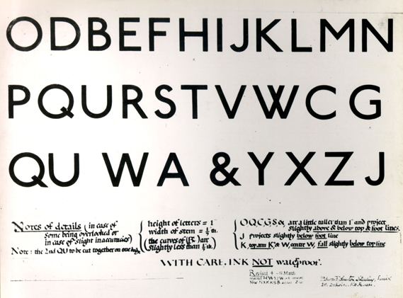
Johnston had become interested in sans-serif letters some years before the commission: although best known as a calligrapher, he had written and worked also on custom lettering, and in his 1906 textbook Writing and Illuminating and Lettering had noted "It is quite possible to make a beautiful and characteristic alphabet of equal-stroke letters, on the lines of the so-called 'block letter' [the sans-serif letters of contemporary trade] but properly proportioned and finished." He had also written in spring 1913 that new books should "bear some living mark of the time in which we live." Johnston had previously unsuccessfully attempted to enter type design, a trade which at the time normally made designs in-house. Howes wrote that Johnston's font was "the first typeface to have been designed for day-to-day use by a leading artist-craftsman."
Pick specified to Johnston that he wanted a typeface that would ensure that the Underground Group's posters would not be mistaken for advertisements; it should have "the bold simplicity of the authentic lettering of the finest periods" and belong "unmistakably to the twentieth century". Pick considered a sans-serif best suited to transport use, concluding that the Column of Trajan capitals were not suited to reproduction on flat surfaces.
In 1933, The Underground Group was absorbed by the London Passenger Transport Board and the typeface was adopted as part of the London Transport brand. As early as 1937, the LPTB mentioned it as a package promoting the system's billboards to advertisers as an example of its commitment to stylish design, along with its commission of art from Feliks Topolski. Johnston's drawings survive in the Victoria and Albert Museum.
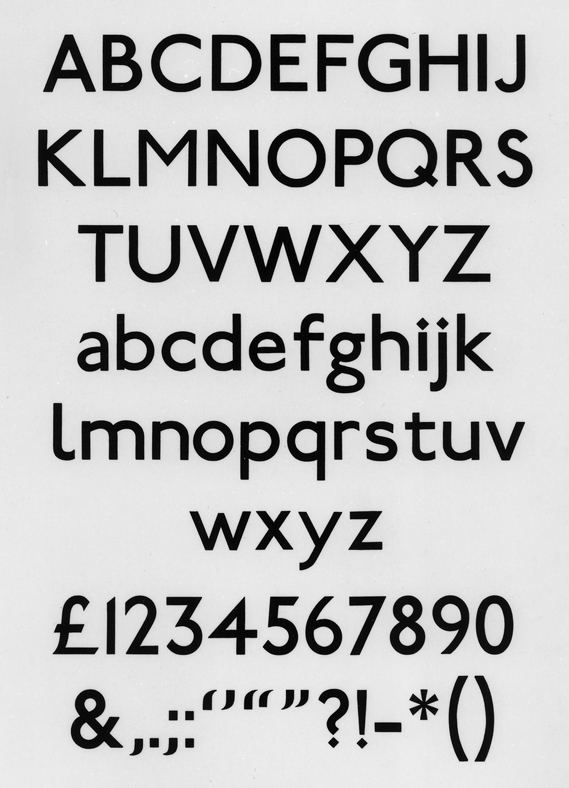
Johnston's original design came with two weights, ordinary and bold, and condensed letters for uses such as the sides of buses. Heavy does not contain lower-case letters. Johnston also worked on other lettering and branding for the Underground system, most famously the 'bar and circle' roundel that the Underground continues to use (refined from earlier designs where the roundel was solid red) .
The font family was called a variety of names in its early years, such as Underground or Johnston's Railway Type, before later being generally called simply Johnston. (A similar problem exists with Gill Sans, which was at first often referred to by other names such as its order number, Series 238, Gill Sans-serif, or Monotype Sans-serif.)
New Johnston
Johnston was originally printed using wood type for large signs and metal type for print. (London Transport often did not use Johnston for general small printing, with many documents such as bus timetables using other typefaces such as Gill Sans). By the 1970s, as cold type was becoming the norm for printing, Johnston had become difficult for printers to use. Signs and posters of the period started to use other, more easily sourced typefaces such as Helvetica, Univers and News Gothic. To maintain London Transport's old corporate identity, Johnston was rendered into cold type.
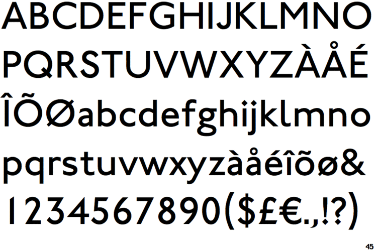
Rather than simply producing a phototype of the original design, Johnston was redesigned in 1979 by Eiichi Kono at Banks & Miles to produce New Johnston. The new family comes in eight members: Light, Medium, Bold weights with corresponding Italics, Medium Condensed and Bold Condensed (the old family had only two weights: Regular and Bold, and the latter had no lowercase letters). After all precisely hand-drawn letters (nearly 1,000) were completed and sent to AlphaType for digitisation in the USA in 1981–82, New Johnston finally became ready for Linotron photo-typesetting machine, and first appeared in London's Underground stations in 1983. It is the official typeface exclusively used by Transport for London and The Mayor of London ever since.
The New Johnston Medium as the new standard is slightly heavier or bolder than the original Johnston Regular (or sometimes confusingly called Medium) and lighter than the original Bold, and has a larger x-height, made suitable for main text setting as well as large display sizes. The average x-height of the New Johnston is roughly 7% larger than the original as the limit for keeping the original Johnston flavour, which was fundamental. The larger x-height allowed larger counters, and type size (size of x-height in particular) and weight are reciprocal factors for legibility, but enlarging x-height can affect style and appearance. Since the original Johnston weights, Regular and Bold, were maintained as closely as possible, inevitably New Johnston Medium appears very close to Light and Bold. This is the whole point of this particular solution because New Johnston Medium works as the one-fits-all standard font for virtually every application from large type sizes for posters and signs to minute type sizes for pocket map maintaining much improved legibility. Punctuation marks are matched the diamond tittle, differing from Johnston's original design, enhancing the identity of London Transport.
In 1990–1992 Banks and Miles, in partnership with Signus Limited digitised the first PostScript Type 1 fonts for the then London Transport under the auspices of the corporate design manager, Roger Hughes. Hughes and Jeremy Rewse-Davies, LT's design director, also commissioned New Johnston Book, a special weight with distinctive modifications to allow better representation on low-resolution laser printers. The New Johnston Book weight was designed specifically for high volume publications and its usage was intended to be restricted to sizes below 12pt. In 2002 the typeface was digitised on behalf of Transport for London by Agfa Monotype Corporation, with the addition of two further weights, Book and Book Bold, as well as corresponding italic variants. The revised font family – not commercially available – is known as 'New Johnston TfL'. In the early stages of digitisation, there was the chronic problem in letter-spacing, which seems to be solved more or less by now.
A further change occurred in 2008 when Transport for London removed the serif from the numeral '1' and also altered the '4', in both cases reverting these to their original appearance. New Johnston's numerals are originally designed to fit for setting tabular matters, which was requested by TfL.
As a proprietary typeface (one of the first ever), Johnston did not become commercially available in metal type. However, capitalising on the popularity of the design style after Gill Sans had become popular, the typefounders Stephenson Blake, who cast the Johnston metal type, created a similar but not identical design, Granby for sale. According to Mike Ashworth of TfL, London Transport itself made some use of Granby by the 1960s due to the limited availability of Johnston metal type. It also used Gill Sans for printed ephemera, such as timetables.
Johnston Delf Smith
This variant was commissioned by Frank Pick as a wedge-serif variation of the organisation's standard sans-serif Johnston face and was designed by Percy Delf Smith, a former pupil of Edward Johnston; Johnston had considered a wedge-serif design during the early stages of the commission. The typeface was originally used for the headquarters building at 55 Broadway, SW1, and some early 1930s Underground stations. It can still be seen on some signs at Sudbury Town and Arnos Grove on the Piccadilly line.
In early 2007, a digitisation of the typeface was developed by TfL under the name Johnston Delf Smith for its own use on historic signs. It remains the property of TfL. Designer Matthieu Cortat has released an unrelated implementation of the design commercially, under the name Petit Serif.
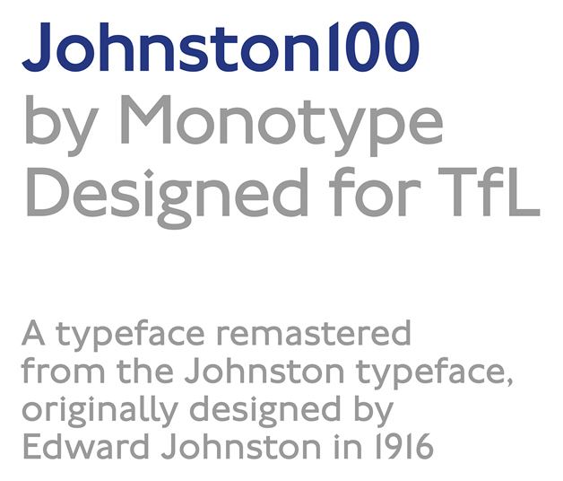
Johnston 100
A new version, known as Johnston 100, was commissioned by Transport for London from Monotype in 2016 to commemorate the 100th anniversary of the introduction of the typeface. It includes two new weights, 'Hairline' and 'Thin', for digital use, as well as symbols such as the hash character #. Several characters have been changed, such as the restoration of the diagonal bowl on the lowercase 'g' which was lost in New Johnston. The font is designed to reflect Johnston's original intentions, and to be closer to the original version of the Johnston typeface.
Digitisations
Several digitisations of the Johnston type exist.
ITC Johnston
International Typeface Corporation released a variant in 1999 called ITC Johnston. It originally included three font weights like New Johnston, however it does not include the hooked 1 and uses side-pointed 4.
In November 2002, the typeface was rereleased in OpenType format, which also expanded the font family to include italic fonts (resembling those of Gill Sans) in all weights. OpenType features include alternates, case forms, small caps (romans only), old style figure. Separate small caps (romans only) and old style figure faces were also released for each weight in TrueType and PostScript formats, for a total of fifteen typefaces.
P22 Underground
In 1997, London Transport Museum licensed the original Johnston typeface exclusively to P22 Type Foundry, available commercially, first under the name of Johnston Underground and then in an expanded version called Underground Pro. P22's design is not based on New Johnston, having principally the goal of digitising and expanding on the original Johnston designs.
The full Underground Pro Set contains nineteen Pro OpenType fonts and 58 Basic OpenType fonts, covering extended Latin, Greek, Cyrillic character sets. Weights are expanded to six: Thin, Light, Book, Medium, Demi, Heavy. Underground, Underground CY, Underground GR support extended Latin, Cyrillic, Greek characters respectively. The Latin sub-family contains medium weight Titling fonts, which feature underscored and/or overscored Latin small letters. Pro fonts include extensive OpenType features, including eleven stylistic sets with stylistic alternates inspired by early signs, Johnston's calligraphy and draft designs for Johnton and geometric sans designs such as Futura. Following the lead of Johnston's original, P22 decided not to offer an italic.
The original Johnston Underground digitisation included Regular, Bold, and Extras weights, with the Extra containing only ornamental symbols.
Railway Sans
An open-source interpretation of Johnston's original by Justin Howes and Greg Fleming. Intended for non-commercial use, including a number of alternate glyphs such as a Garamond-inspired W (used on old signs at West Brompton station), ligatures and a characteristic arrow design.
Paddington
A basic public domain digitisation by Stephen Moye, including an italic and bold designs.
Usages
Its use has included the Tube map (sometimes hand-lettered), nameplates and general station signing, as well as much of the printed material issued by the Underground Group and its successors; also by the nationalised British Road Services in the immediate post-war era.
It was also used for wayfinding signs at the London 2012 Summer Olympics and Summer Paralympics, including venues outside London. It is also used in the overlays of the BBC TV show Sherlock. New Johnston is used for signage in the fictional Princeton–Plainsboro Teaching Hospital in the Fox TV show House, although in later seasons the similar font Gill Sans was used, most noticeably on Wilson's door during season 8. It is also used in the way finding signage at Westfield London.