
Classification Geometric | ||
 | ||
Designer(s) original unknown; current release David Vereschagin Date created circa 1954recreated 2004 | ||
Toronto Subway is a geometric sans-serif typeface designed for the original section of the Toronto Transit Commission’s Yonge subway. It is today used at station entrances, fare booths and track level signage throughout the system.
Contents
History
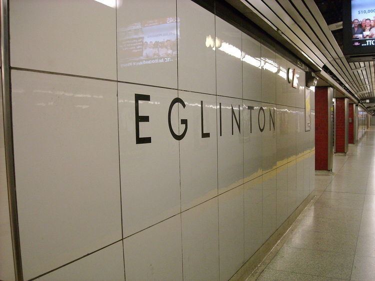
The font is a distinctive rectangular font composed of capital letters etched into the tiles of the Toronto subway stations opened between 1954 and 1974, as well as on signs. Over time, it was replaced by other fonts on the original Yonge line (from Union to Eglinton) as a result of renovations to all stations along that line, except for Eglinton, trim lettering at Queen, and various sporadic directional signs. A "bold" version of this font can be seen at every station along the Bloor–Danforth line from Islington to Warden, which were the termini stations from 1968 to 1980, when Kipling and Kennedy stations were built (these two stations do not have the Toronto subway font). It can also be seen at various stations along the northern part of the Yonge line, the University line, and was incorporated into the renovated Bloor, Wellesley, and Union stations. The font is used on all Sheppard line stations, as well as on all stops and stations along the 512 St. Clair streetcar line, with the exception of St. Clair West station.
The font was recreated by David Vereschagin in 2004. Because the original designer of the font is unknown, and no documentation of the font had been kept, Vereschagin digitized the font by visiting stations and making rubbings of the letters on the original Vitrolite glass tiles as well as taking photographs. This is now used by the TTC as their font for station names. Vereschagin designed a matching lowercase, inspired by Futura and other similar designs. As one of the few typeface designs to have originated in Canada, it was used in a number of zines as a mark of local pride.
In 2011, Dominion Modern ran an exhibit on Toronto Subway at George Brown's School of Design.
On October 23, 2013, the TTC announced new wayfinding standards, including using Toronto Subway "on more signage – at station entrances, fares booths and track level signage." This decision was made in conjunction with adding subway numbers to the subway and RT lines. The wayfinding team also created an overhauled version of the Subway typeface called Bloor–Yonge, which includes missing numbers and punctuation, as well as correcting some design issues with the existing glyphs.
Features
Notable features:
Similar fonts
Often misidentified as Gill Sans, the Toronto Subway Font is based on Futura. Somewhat similar typefaces include Johnston (used by Transport for London), Verlag, Bernhard Gothic, Metro, Brandon Grotesque, Neutraface, and Eagle.