
Date released 1908 | ||
 | ||
Link Linotype.com/1274/news-gothic-family.html | ||
News gothic font download
News Gothic is a realist Sans-serif typeface designed by Morris Fuller Benton, and released by the American Type Founders (ATF) in 1908. The typeface was originally drawn in two lighter weights, a medium text weight using the title News Gothic, and a closely related light weight marketed under the name Lightline Gothic. The typeface family was enlarged in 1958 with the addition of two bold weights. News Gothic is similar in proportion and structure to Franklin Gothic, also designed by Benton, but lighter.
Contents
- News gothic font download
- Hot metal release
- Cold type copies
- Digital releases
- Similar designs
- Usages
- References
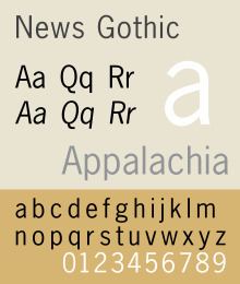
News Gothic, like other Benton Sans serif typefaces, follows the grotesque model. Shapes that distinguish it from the neo-grotesque are the two-story lowercase a and the two-story lowercase g. Also distinctive are the blunt terminus at the apex of the lowercase t, and the location of the tail of the uppercase Q completely outside the bowl. The letter forms are compact, and descenders are shallow. The typeface differs from other realist sans-serifs in its organic shapes and subtle transitions of stroke width, all contributing to a less severe, humanist tone of voice. For much of the twentieth century News Gothic was used in newspaper and magazine publishing. For use in headlines, it was designed with condensed and extra-condensed styles.
'Gothic' was an early twentieth century term for sans-serifs, found mostly in the United States and Canada. It was also used in the UK, along with 'grotesque'. In Germany the term 'Grotesk' was used.
Hot metal release
As with Franklin Gothic, the foundry expanded the line sometime later, adding two more variants:
Cold type copies
Virtually all producers of cold type offered their own versions of News Gothic under different names:
Digital releases
Because there is no active descendant of the American Type Founders Corporation making digital typefaces, News Gothic has been revived in digital form in many different versions from different sources.
Benton Sans is a greatly expanded font family based on News Gothic by Font Bureau, adding additional features such as wide styles and extra-bold weights. At 80 styles, it is one of the most comprehensive digital renditions of the News Gothic style. Its users include Newsweek, Fortune magazine, the Boston Globe and Sotheby's.
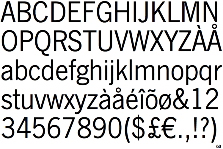
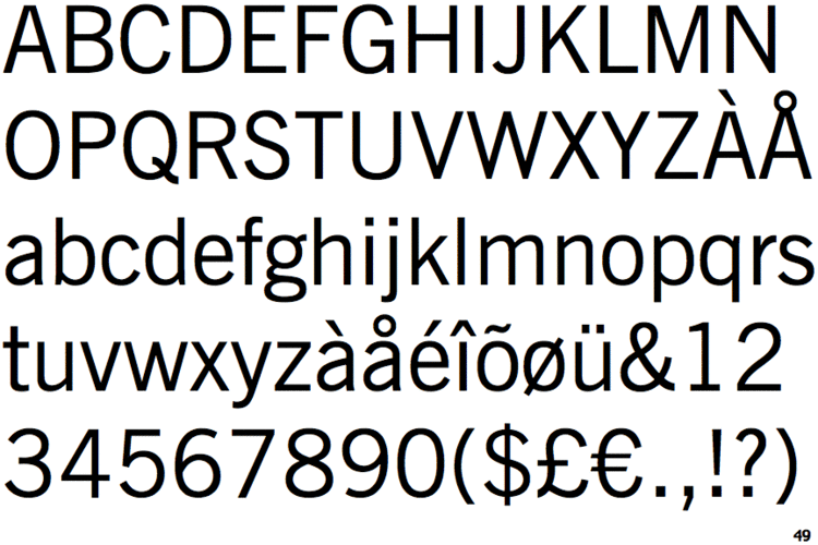
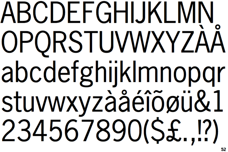
Digital releases actually named News Gothic have a variety of features, often adding in weights not present in the original design or removing some less popular ones. For example, Bitstream's release is rare in including the extra-condensed styles. URW++'s (also sold by Fontsite) is only sold in one width but in a wide range of weights and with italics for every weight, while Linotype's lacks a light weight or any condensed styles. Monotype's revival, a subset of which is included with many Microsoft products, features the condensed style but not extra-condensed, and has wider spacing than several others. Adobe, Monotype, Linotype and Bitstream have their own versions. The Bitstream version of News Gothic was extended with Cyrillic glyphs in 2005 and Greek glyphs in 2009 by Dmitry Kirsanov for ParaType, and is sold by them separately.
News Gothic No. 2 is an enhanced version of News Gothic produced by the D. Stempel AG type foundry in 1984. It adds more weights to the News Gothic family than were available in other versions.The OpenType version of the No. 2 family comes in 6 weights with complementary italic fonts, supports ISO Adobe 2, Adobe CE, Latin Extended character sets. Adobe, Monotype, Linotype and Bitstream have their own versions. The Bitstream version of News Gothic was extended with Cyrillic glyphs in 2005 and Greek glyphs in 2009 by Dmitry Kirsanov for ParaType.
Adobe Source Sans Pro is a single-width design based on the ATF version of News Gothic from their 1923 type specimen catalog, but differs in having true italics and a larger x-height for use with onscreen display. It was released in 2012 as Adobe's first open source font under the SIL Open Font License.
News Cycle is an open-source variant by Nathan Willis based on 1908 specimens of News Gothic typeface from ATF extended with full Latin, Greek, and Cyrillic glyphs. It is an open source typeface licensed under the SIL Open Font License.
Similar designs
Linotype called their similar design Trade Gothic while the Ludlow version was known as Record Gothic. Intertype copied the face under the same name and added a variant, News Gothic Bold (1955). Baltimore Type’s copy was called Balto Gothic, while their copy of Inland Type Foundry’s Inland Gothic No. 6 was perversely sold under the name News Gothic.
In 1916, Sol Hess made alternate rounded characters for News Gothic Extra Condensed and the resulting face was sold by Lanston Monotype as Jefferson Gothic, which was also sold by Baltimore Type as Tourist Extra Condensed In 1935, M.F. Benton did much the same thing for A.T.F. and the face was called Phenix.
Ludlow’s Record Gothic began as a mere knock-off but, between 1956 and 1961, their in-house designer, R. Hunter Middleton made many original additions to the family including:
Record Gothic is, again, a very inconsistent family, and has never been fully digitised.
Usages
Heidelberg Gothic, a variant of News Gothic, is the house font of the Heidelberg Gruppe.
JCP News Gothic commissioned by JC Penney consists of two new weights coordinated with Monotype News Gothic, and is designed for use in advertising campaigns.