
Designer Frederic Goudy Date released 1915 | Classification Old style | |
 | ||
Link linotype.com/497/goudy-family.html | ||
Goudy old style font download
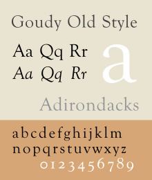
Goudy Old Style (also known as just Goudy) is a classic old-style serif typeface originally created by Frederic W. Goudy for American Type Founders (ATF) in 1915.
Contents
- Goudy old style font download
- History
- Hot metal copies
- Cold type copies
- Digital copies
- Usage
- Other Goudy typefaces
- References
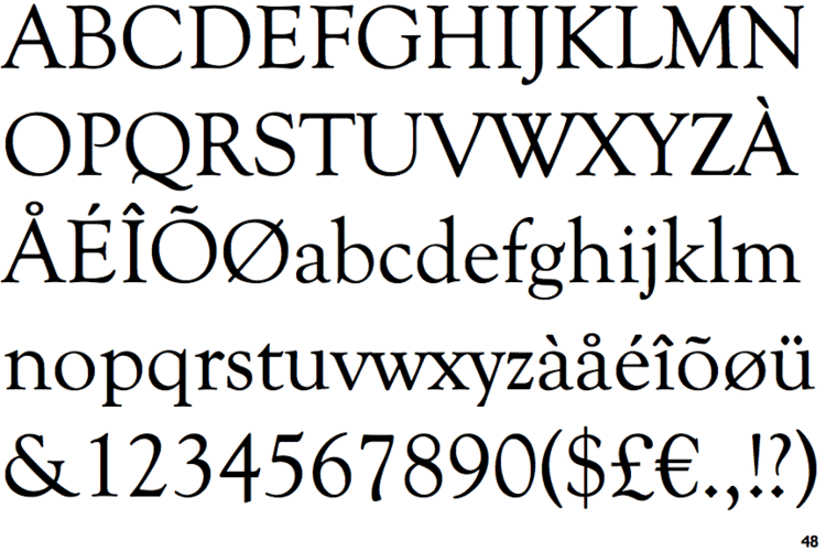
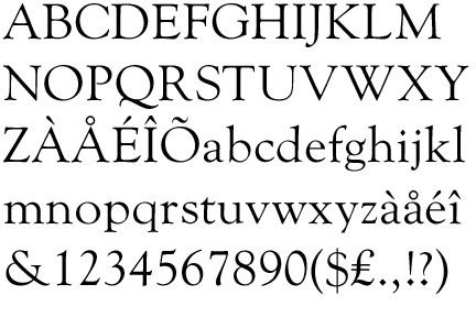
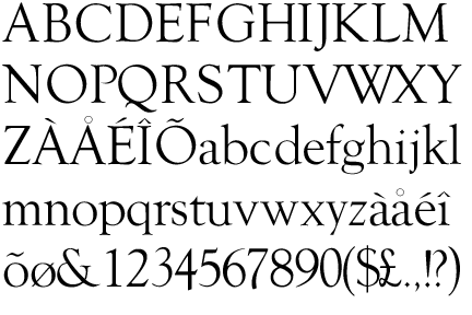
Suitable for both text and display applications, Goudy Old Style is a graceful, balanced design with a few eccentricities, including the upward-curved ear on the g and the diamond shape of the dots of the i, j, and the points found in the period, colon and exclamation point, and the sharply canted hyphen. The uppercase italic Q has a strong calligraphic quality. Generally classified as a Garalde (sometimes called Aldine) face, certain of its attributes—most notably the gently curved, rounded serifs of certain glyphs—suggest a Venetian influence. The design is relatively light in colour, and has been described as particularly suitable for titles and headings.
History
Several variants, designed by several designers, were released in the ensuing years (all faces ATF unless otherwise specified). By Goudy:
By others:
The face was an instant best seller, prompting ATF to issue a special 124-page specimen book of the series in 1927. The descenders of Goudy Old Style were kept short at ATF's insistence to allow tight line setting on their common line system, which irritated Goudy. In addition, he sold the design to ATF for fifteen-hundred dollars and received no royalty on the type, causing his relationship with the foundry to deteriorate.
Over time, because graphic designers came to see the face as more suitable for display, the bold became the most enduringly popular of the family.
In his 1946 autobiography, Goudy wrote that:
I had at some time or other copied a few letters of classic form from a portrait painting - I have always said "by Hans Holbein" but later search has never brought these particular pattern letters to light. [Goudy does not say which.] Anyway, I decided that I would attempt to complete an alphabet of capitals along the lines of the letters I had copied. Then came the difficult task of designing a lower-case in perfect harmony.
Regarding the italic, Goudy wrote:
I studied many of the older italics and came to the conclusion that...some of the outstanding italics of the sixteenth century had little or no inclination and yet preserved their italic character... Taking the Aldine italic as a starting point [I] succeeded in producing an original letter which, I believe, constituted the first distinctive italic in modern times.
Hot metal copies
The face was immediately licensed to Lanston Monotype and some of the weights were issued by Intertype as well. Ludlow called its 1924 knock-off the Number Eleven series. Monotype's designer F.H. Pierpont, better known for Rockwell and Monotype Grotesque, designed a similar face named Horley Old Style, adding a distinct influence of Caslon designs.
Cold type copies
As the face was a "classic" almost from the day of its issue, producers of cold type offered their own versions of Goudy Old Style under the following names:
Digital copies
Commercial releases have been made by Monotype, Fontsite, DTP Types, Electric Typographer, Lanston Type, Bitstream, URW++ (bundled with Microsoft Office), Adobe, and Linotype. As many early digitisations were sublicensed, several of these may represent the same digitisation marketed by different rights-holders, possibly upgraded with modern features such as contextual ligature substitution and small caps. LTC's digitisation includes the calligraphic and swash alternate characters, as well as small caps. Goudy Catalog has been copied by Scangraphic, Bitstream, URW++, and Elsner+Flake. A version called Goudy Schoolbook also exists, with single-story versions of the letters a and g, but it is not for sale to the general public. (The digitisation bundled with Microsoft Office lacks all these features; it does include ligatures, but they must be inserted manually.)
'Sorts Mill Goudy' is an open-source revival created by Barry Schwartz as part of the League of Movable Type project, which contains small capitals and other OpenType features. Bhikkhu Pesala expanded this under the name 'Sukhumala', adding bold, bold italic and handtooled styles.
ATF's other related fonts, Goudy Handtooled and Goudy Catalog, have also been digitised, again with a variety of companies holding some rights although only LTC's release includes Handtooled Italic. Goudy Title has not been digitised under that name.
Usage
Goudy Old Style is the text typeface used in Harper's Magazine. It is the official typeface of Emory University in Atlanta, Georgia, Lewis & Clark College in Portland, Oregon, Moravian College in Bethlehem, Pennsylvania, Northwestern University in Evanston, Illinois, and Clemson University in Clemson, South Carolina. It is also used by the National University of Colombia. It is also the standard body text font for Key Club publications. The bold italic weight is used for the wordmark of Whittard's.
Other Goudy typefaces
Frederic Goudy's name is associated with many other typefaces designed by Goudy, but not related to Goudy Oldstyle, including: