
Date released 1991 | Classification Geometric Date created 1991 | |
 | ||
Link catalog.monotype.com/family/monotype/century-gothic | ||
Century Gothic is a Sans-serif typeface in the geometric style, released by Monotype Imaging in 1991. It is strongly influenced by the font Futura, though with a higher x-height, and its design history also derives from two separate typefaces intended as Futura competitors. It is a digital typeface that has never been made into actual foundry type.
Contents
- Century gothic
- Design
- Sources
- Design characteristics
- Printer ink usage
- Related fonts
- Selected usages
- References
Century gothic
Design
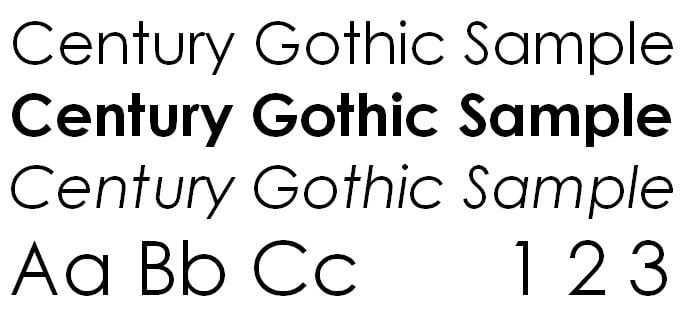
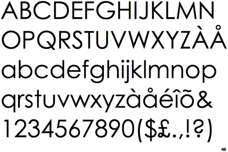
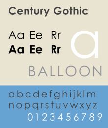
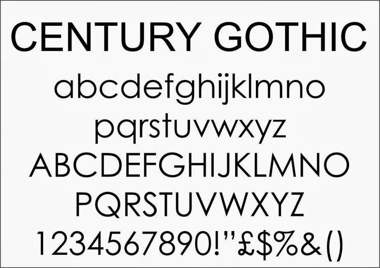
Like many geometric sans-serifs, Century Gothic's design has a single-story "a" and "g", and an "M" with slanting sides resembling an upturned "W". Century Gothic has a high x-height (tall lower-case characters). Its origins (see below) come from a design intended for large-print uses such as headings and signs, and so it has a reasonably purely geometric design closely based on the circle and square, with less variation in stroke width than fonts designed for small sizes tend to show, and a relatively slender design in its default weight. Its default spacing is quite tight in the style popular in American post-war display typefaces. Characters are quite wide; Monotype have described it as a "spacious" design.
Sources
While many geometric sans-serif typefaces have been released to compete with the popular typeface Futura, Century Gothic is perhaps unique in its origin: it redraws one to match the design proportions of a second. Century Gothic was created to be a substitute font for ITC Avant Garde, designed by Herb Lubalin, and released by the International Typeface Corporation (ITC) in 1970, so a document created in one can be displayed in the other with no change to copyfit. This allows it to substitute interchangeably for Avant Garde in documents, an important feature since Avant Garde is a standard font in some forms of the PostScript digital printing standard, and so Century Gothic allowed Microsoft to use it in preference to paying for an ITC Avant Garde license.
Additionally, Century Gothic's design was based on Monotype's own Twentieth Century, which was drawn by Sol Hess between 1937 and 1947 for the Lanston Monotype Company. Century Gothic is similar to ITC Avant Garde in its pure geometry, and does not possess the subtle variation in stroke width found in either Futura or Twentieth Century. However, it differs from ITC Avant Garde in that like Futura and Twentieth Century, Century Gothic does not have a descender at bottom right of the "u" (making it appear like a Greek upsilon υ), whereas Avant Garde does. Century Gothic also has larger, rounder tittles on the letters i and j, whereas Avant Garde keeps the tittles square and the same width as the letter strokes. Most notably, it lacks the extreme stylistic alternates of Avant Garde, such as highly slanted letters designed to fit together closely in kerning.
Design characteristics
ITC Avant Garde was intended as a display design for large headings and advertisements (although it is somewhat usable for body text because of the high x-height) and as a result Century Gothic is quite a light typeface, especially in default weight, with the classic display typeface feature of tight spacing and quite wide characters, in contrast to Twentieth Century which was intended more for small-size applications with a more solid stroke weight and open spacing. While its structure is similar to Futura, its regular style is between Futura and Twentieth Century's regular and light weights.
Century Gothic was one of several clones of PostScript standard fonts created by Monotype in collaboration with or sold to Microsoft around this time, including Arial (a clone of Helvetica), Book Antiqua (Palatino) and Bookman Old Style (ITC Bookman). It was bundled with Microsoft Office 4.3 in 1994 and subsequently provided with Plus! 95, Windows 98, Microsoft Works, and various versions of Microsoft Office up to 2010. A version of Century Gothic, Levenim, that includes Hebrew alphabet characters has been included in later versions of Windows.
Printer ink usage
According to the University of Wisconsin-Green Bay, Century Gothic uses much less ink than other, similar sans-serif typefaces. It was found that Century Gothic uses about 30% less ink than Arial. In order to save money that would be spent on printer ink for other typefaces, the university reportedly switched their default e-mail and printing typeface from Arial to Century Gothic. However, the typeface has also been found to use more paper—due to its wider letters—meaning that the savings on ink are offset by an increase in paper costs.
Along with the serif typeface Garamond, Century Gothic is one of the two typefaces that PrintWise, an initiative of the U.S. government's General Services Administration, recommends U.S. government workers use for printed documents.
Related fonts
Apart from Avant Garde and Futura, a number of other fonts based on Avant Garde have been created to substitute for it in PostScript implementations. A particular case of this is an open-sourced set of fonts developed by URW and donated to the Ghostscript project to create a free PostScript alternative. This includes an AvantGarde clone known as "Gothic L". It (or a derivative) is used by much open-source software such as R as a system font. A derivative of this family known as "TeX Gyre Adventor" has been prepared for use in the TeX scientific document preparation software.