
Date released 1970-1977 | Category Sans-serif | |
 | ||
Foundry International Typeface Corporation | ||
Itc avant garde gothic
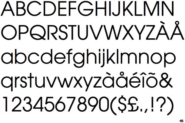
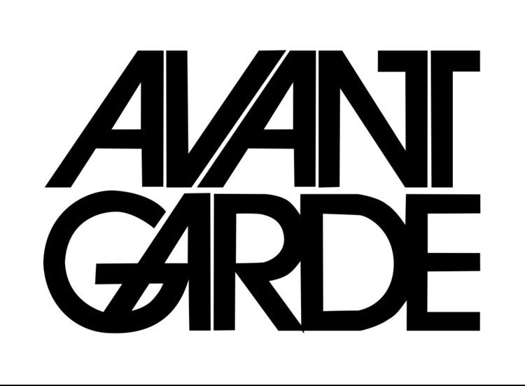
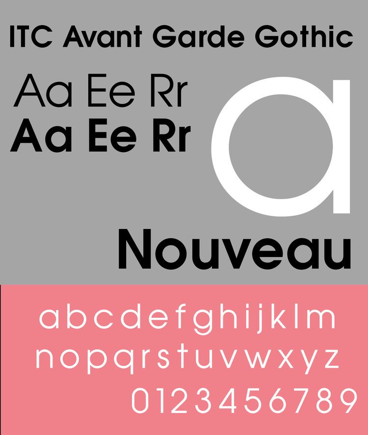
ITC Avant Garde Gothic is a font family based on the logo font used in the Avant Garde magazine. Herb Lubalin devised the logo concept and its companion headline typeface, and then he and Tom Carnase, a partner in Lubalin's design firm, worked together to transform the idea into a full-fledged typeface.
Contents
- Itc avant garde gothic
- Cold Type versions
- ITC Avant Garde Std
- ITC Avant Garde Multilingual
- ITC Avant Garde Gothic Pro
- ITC Avant Garde Mono
- William Sans LET
- Selected usage
- Derivatives
- Similar
- References
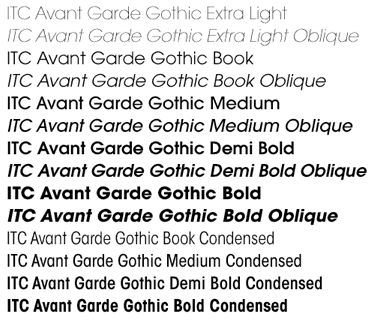
The condensed fonts were drawn by Ed Benguiat in 1974, and the obliques were designed by André Gürtler, Erich Gschwind and Christian Mengelt in 1977.
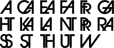
The original designs include one version for setting headlines and one for text copy. However, in the initial digitization, only the text design was chosen, and the ligatures and alternate characters were not included.
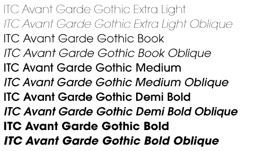
The font family consists of 5 weights (4 for condensed), with complementary obliques for widest width fonts.
When ITC released the OpenType version of the font, the original 33 alternate characters and ligatures, plus extra characters were included.
Elsner+Flake also issued the ligatures and alternate characters separately as Avant Garde Gothic Alternate.
Cold Type versions
ITC Avant Garde was never cast into actual Foundry type, appearing first only in cold type. Alphatype, Autologic, Berthold, Compugraphic, Dymo, Star/Photon, Harris, Mergenthaler, MGD Graphic Systems, and Varityper all sold the face under the name Avant Garde, while Graphic Systems Inc. offered the face as Suave.
ITC Avant Garde Std
This OpenType font version, offered by Adobe, comprises a family of 5 weights along with matching obliques for each weight and width. It supports the Adobe Western 2 character set. However, it does not include the alternate characters, ligatures (with the exception of linguistic ones), and extra characters that are available in the ITC fonts.
ITC Avant Garde Multilingual
It is a version with Cyrillic support from ParaType. Cyrillic glyphs were developed at ParaType (ParaGraph) in 1993 by Vladimir Yefimov. Alternates and ligatures were added in 2008 by Olga Umpeleva.
The family consists of 4 fonts in 2 weights (book and demi) in 1 width, with complementary obliques.
ITC Avant Garde Gothic Pro
It is an OpenType variant of the original ITC Avant Garde Gothic, plus a suite of additional cap and lowercase alternates, new ligatures, unicase glyphs. It supports ISO Adobe 2, Adobe CE, Latin Extended character sets.
In addition, the obliques are altered from the original, where optical corrections are no longer used.
ITC Avant Garde Mono
It is a monospaced version designed by Ned Bunnel in 1983.
Digital version was produced by Elsner+Flake. The family consists of 4 fonts in 2 weights (bold and light) in 1 width, with complementary italics.
William Sans LET
William Sans LET is a very similar font, but the "regular" typeface is known as "Plain 1.0".
Selected usage
Derivatives
ITC Lubalin Graph is a slab-serif version of ITC Avant Garde, also designed by Lubalin.