
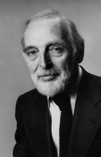
Name Herb Lubalin Role Graphic designer | ||
 | ||
Full Name Herbert F. (Herb) Lubalin Died May 24, 1981, New York City, New York, United States | ||
Herb lubalin
Herbert F. (Herb) Lubalin (pron. "loo-ba'-len"; March 17, 1918 – May 24, 1981) was an American graphic designer. He collaborated with Ralph Ginzburg on three of Ginzburg's magazines: Eros, Fact, and Avant Garde, and was responsible for the creative visual beauty of these publications. He designed a typeface, ITC Avant Garde, for the last of these; this font could be described as a reproduction of art-deco, and is seen in logos created in the 1990s and 2000s.
Contents
- Herb lubalin
- Education and early career
- Eros Magazine and Fact Magazine
- Logo
- Page design
- Ulc magazine
- References
Herb lubalin
Education and early career

Herb Lubalin entered Cooper Union at the age of seventeen, and quickly became entranced by the possibilities presented by typography as a communicative implement. Gertrude Snyder notes that during this period Lubalin was particularly struck by the differences in interpretation one could impose by changing from one typeface to another, always “fascinated by the look and sound of words (as he) expanded their message with typographic impact.” After graduating in 1939, Lubalin had a difficult time finding work; he was fired from his job at a display firm after requesting a two dollar raise on his weekly salary, up from a paltry eight (around USD100 in 2006 currency). Lubalin would eventually land at Reiss Advertising, and later worked for Sudler & Hennessey, where he practiced his considerable skills and attracted an array of design, typographic and photographic talent that included George Lois, Art Kane and John Pistilli. He served with Sudler for nineteen years before leaving to start his own firm, Herb Lubalin, Inc., in 1964 .
Eros Magazine and Fact Magazine

Lubalin’s private studio gave him the freedom to take on any number of wide-ranging projects, from poster and magazine design to packaging and identity solutions. It was here that the designer became best known, particularly for his work with a succession of magazines published by Ralph Ginzburg: Eros, Fact, and Avant Garde. Eros, (Spring 1962 to issue four 1963) which devoted itself to the beauty of the rising sense of sexuality and experimentation, particularly in the burgeoning counterculture, it was a quality production with no advertising and the large format (13 by 10 inches) made it look like a book rather than a quarterly magazine. It was printed on different papers and the editorial design was some the greatest that Lubalin ever did. It quickly folded after an obscenity case brought by the US Postal Service. Ginzburg and Lubalin followed with Fact, largely founded in response to the treatment Eros received. This magazine’s inherent anti-establishment sentiment lent itself to outsider writers who could not be published in mainstream media; Fact managing editor Warren Boroson noted that “most American magazine, emulating the Reader's Digest, wallow in sugar and everything nice; Fact has had the spice all to itself.” Rather than follow with a shocking design template for the publication, Lubalin chose an elegant minimalist palette consisting of dynamic serifed typography balanced by high-quality illustrations. The magazine was printed on a budget, so Lubalin stuck with black and white printing on uncoated paper, as well as limiting himself to one or two typefaces and paying a single artist to handle all illustrations at bulk rate rather than dealing with multiple creators. The end result was one of dynamic minimalism that emphasized the underlying sentiment of the magazine better than “the scruffy homemade look of the underground press (or the) screaming typography of sensationalist tabloids” ever could. Fact itself folded in controversy as Eros before it, after being sued for several years by Barry Goldwater, the Republican presidential candidate about whom Fact wrote an article entitled “The Unconscious of a Conservative: A special Issue on the Mind of Barry Goldwater.” Goldwater was awarded a total of $90,000, effectively putting Fact out of business.
Logo
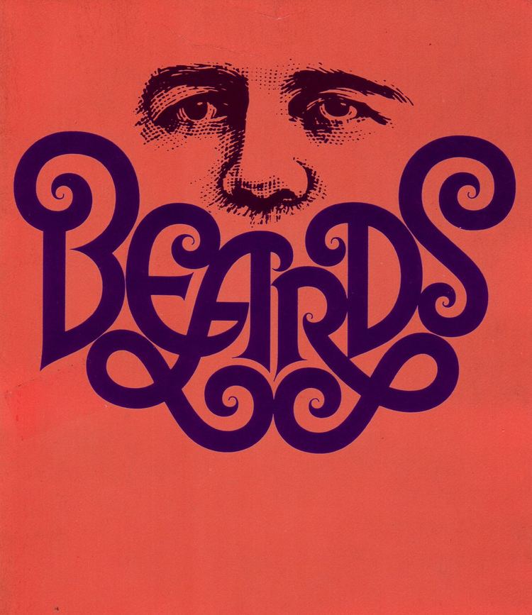
Lubalin and Ginzburg again turned one magazine’s demise into the creation of another, releasing Avant Garde six months later. The creation of the magazine’s logogram proved difficult, largely due to the inherent difficulties presented by the incompatible letterform combinations in the title. Lubalin’s solution, one which sought to meet Ginzburg’s hope for an expression of “the advanced, the innovative, the creative,” consisted of tight-fitting letterform combinations to create a futuristic, instantly recognizable identity. The demand for a complete typesetting of the logo was extreme in the design community, so Lubalin released ITC Avant Garde from his International Typeface Corporation in 1970. Unfortunately, Lubalin quickly realized that Avant Garde was widely misunderstood and misused in poorly thought-out solutions, eventually becoming a stereotypical 1970s font due to overuse. Steven Heller, one of Lubalin’s fellow AIGA medalists, notes that the “excessive number of ligatures [ . . . ] were misused by designers who had no understanding of how to employ these typographic forms,” further commenting that “Avant Garde was Lubalin’s signature, and in his hands it had character; in others’ it was a flawed Futura-esque face.” Regardless of ITC Avant Garde’s future uses, Lubalin’s original magazine logo was and remains highly influential in typographic design.
Page design
Avant Garde (January 1968 to issue 14 summer 1971) also provided Lubalin with a large format of wide typographic experimentation; the page format was an almost square 11.25 by 10.75 inches bound in a cardboard cover, a physical quality that, coupled with Lubalin’s layouts, caught the attention of many in the New York design scene. Often, the magazine would employ full-page typographic titles, which at the time was a largely new idea; in recent times, Rolling Stone art director Fred Woodward has used this method widely in his publication. Ginzburg, who held some experience as a photographer, gave Lubalin total control over the magazine’s look: “Herb brought a graphic impact. I never tried to overrule him, and almost never disagreed with him.” Other issues included a portfolio of Picasso’s oft-neglected erotic engravings, which Lubalin willingly combined with his own aesthetic, printing them in a variety of colors, in reverse, or on disconcerting backgrounds. Unfortunately, Avant Garde again caught the eye of censors after an issue featuring an alphabet spelled out by nude models; Ralph Ginzburg was sent to prison, and publication ceased with a still-growing circulation of 250,000.
U&lc magazine
Lubalin spent the last ten years of his life working on a variety of projects, notably his typographic journal U&lc and the newly founded International Typographic Corporation. U&lc (short for Upper and lower case) served as both an advertisement for Lubalin’s designs and a further plane of typographic experimentation; Steven Heller argues that U&lc was the first Emigre, or at least the template for its later successes, for this very combination of promotion and revolutionary change in type design. Heller further notes, “In U&lc, he tested just how far smashed and expressive lettering might be taken. Under Lubalin’s tutelage, eclectic typography was firmly entrenched.” Lubalin enjoyed the freedom his magazine provided him; he was quoted as saying “Right now, I have what every designer wants and few have the good fortune to achieve. I’m my own client. Nobody tells me what to do.”