
Date released 2002 | ||
 | ||
Link houseind.com/fonts/neutraface | ||
Neutraface documinitry
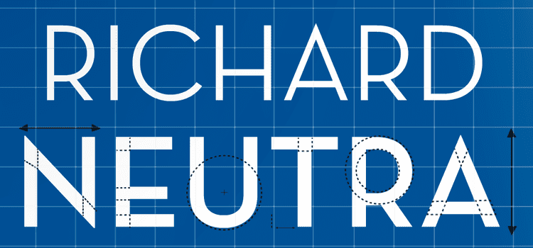
Neutraface is a geometric sans-serif typeface designed by Christian Schwartz for House Industries, an American type foundry. It was influenced by Richard Neutra's design principles and was developed with the assistance of Neutra's son and former partner, Dion Neutra.
Contents

My neutraface number 2 type specimen project
Design
Neutraface was designed by Christian Schwartz over the period of a year with assistance in art direction from Ken Barber and Andy Cruz. It was the result of a project started by Schwartz to design "the most typographically complete geometric sans serif family ever", based on Richard Neutra's principles of architecture and design. The Neutraface alphabet was developed through consultation with Neutra's son and former partner, Dion Neutra, and with reference to the signs on the buildings designed by Neutra. Since there were limited samples of Neutra's signage and no lowercase, much of the design was Schwartz's invention. The lowercase was influenced by Futura, Nobel and Tempo.
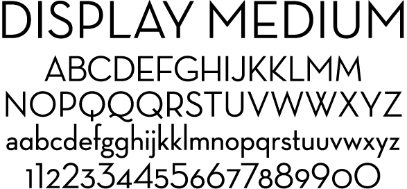
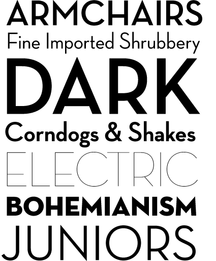
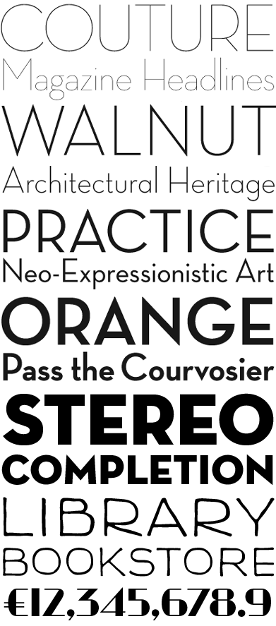
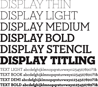
Although Neutraface was conceived as a display and headline typeface, Neutraface Text was created to complement Neutraface Display. Neutraface Text has a larger x-height than its display counterpart and increased stroke contrast.
Styles
Neutraface was originally released with Display and Text styles. Additional weights have been released.
Usage
Neutraface is very widely used, and Schwartz has commented, "I can't leave my apartment without running into an ad for a new condo development using it, or a restaurant, or a new cookbook." Some examples of the usage of Neutraface are in the signage for the New York City Shake Shack chain, book covers for Taschen's Movie Icons series, advertising material for Wendy's fast food restaurants, and posters for the 2008 film Quantum of Solace.
Neutraface was also the subject of a parody video of Lady Gaga's song "Poker Face" on YouTube, titled "Neutra Face: An Ode On A Typeface". The Official Neutraface Display fonts are used in the Julius Jr. Ending Credits.