Link hvdfonts.com Designer Hannes von Döhren | Date created 2010 | |
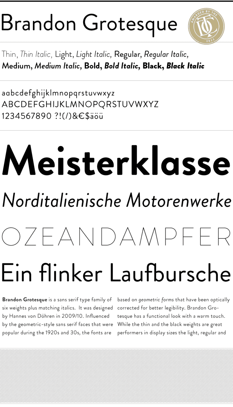 | ||
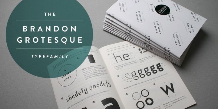
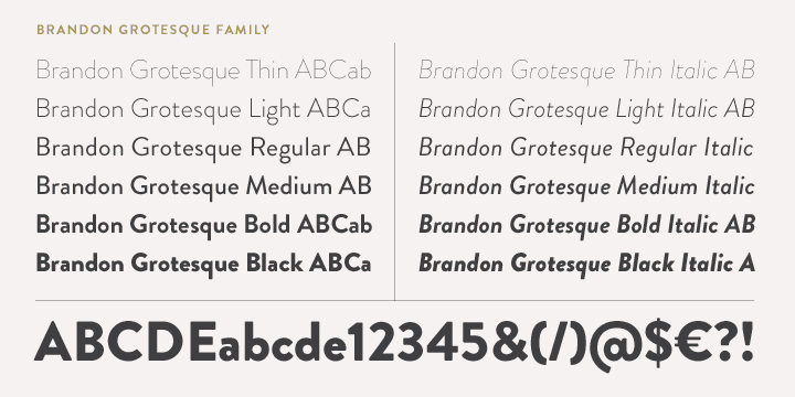
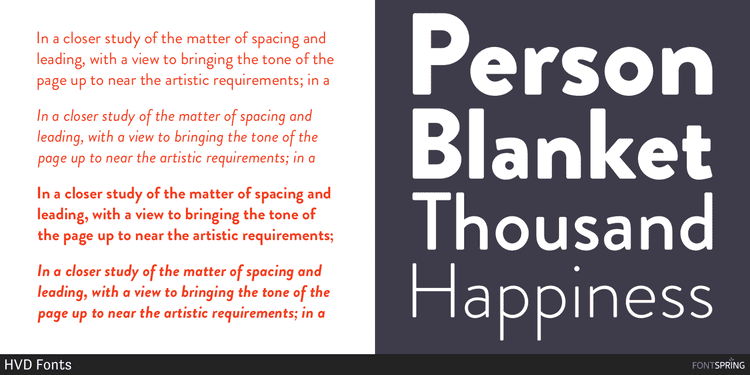
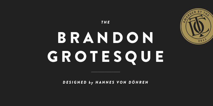
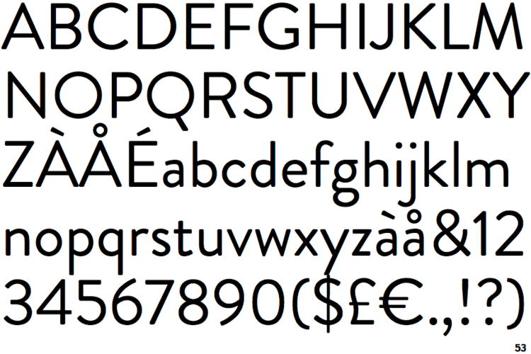
Brandon Grotesque is a sans-serif typeface designed by Hannes von Döhren of HVD Fonts during 2009 and 2010. Spacing and kerning was done by Igino Marini of iKern. The typeface includes Thin, Light, Regular, Medium, Bold and Black weights. Italic versions were also made available for each weight.
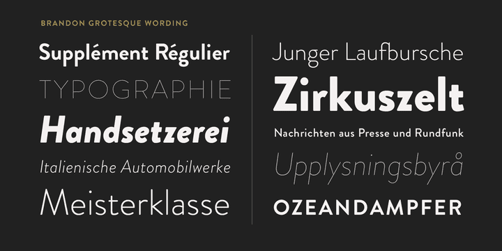
The typeface can be classified as a geometric sans-serif, heavily inspired by the typefaces of same classification during the 1920s and 1930s. It was designed to appear elegant through having a low x-height, a less common characteristic for sans-serif fonts.
In 2014, von Döhren released Brandon Text, a tighter version intended for body text.
Usage
Since 2010, it has been the corporate font of Comedy Central, used on promotional materials, idents and posters, such as for its Rally to Restore Sanity and/or Fear event, together with the font Eames Century Modern.
Coincidentally, Brandon Grotesque was selected as the wordmark typeface of Brandon University's revised logo.