December 17, 1940, Chicago, Illinois, United States
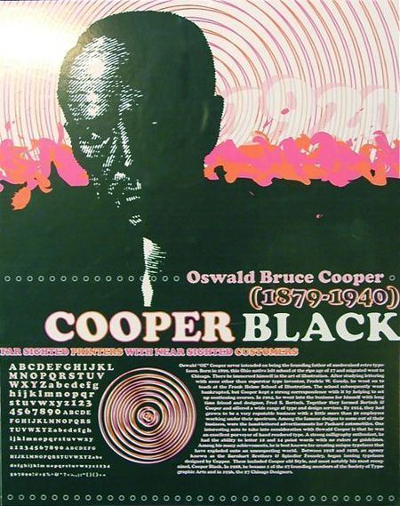
Oswald Bruce Cooper (April 13, 1879 – December 17, 1940) was an American type designer, lettering artist, graphic designer, and teacher of these trades.
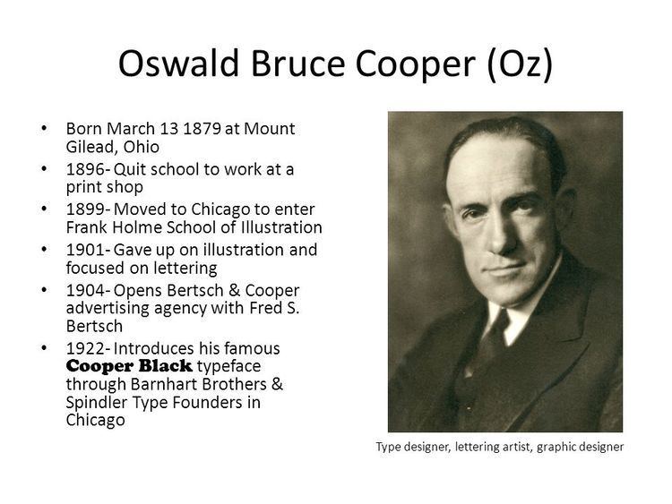
Cooper was born in Mount Gilead, Ohio but moved to Coffeyville, Kansas when quite young. He left high school at seventeen to become a printer’s devil. He studied illustration at Frank Holme’s School of Illustration, first as a correspondence student, then moving to Chicago to study in person. While doing poorly at drawing, he did so well in a lettering class taught by Frederic Goudy, that he soon became director of the correspondence department for the school. After Holme died in 1903, the school closed due to financial difficulties, and Cooper took it on himself to provide correspondence education to prepaid students.
Career
In 1904 Cooper and Fred S. Bertsch formed the design firm of Bertsch & Cooper, providing ad campaigns for such accounts as the Packard Motor Car Company and Anheuser-Busch Breweries, with Cooper providing distinctive hand lettering and sometimes the copy writing as well. In 1914 the firm became a full-service type shop. By the time Fred Bertsch retired in 1924, Bertch & Cooper employed more than fifty people and was the largest art production facility in the Middle West. As he showed considerable talent for writing, many advertising agencies sought his services as a copywriter, but he wrote only for himself and his own firm.
Personal life
Tall, lanky, homespun, Cooper was a shy man, avoiding social situations and even unnecessary business contacts. Those close to him called him "Oz," to everyone else, he was "Mister Cooper." In 1920, he married his second cousin, Mary Lou Foster. They had no children. For the last year-and-a-half of his life, Cooper was ill with cancer, dying in Chicago of the disease in 1940.
Typefaces
Cooper series (BB&S later ATF) When Barnhart Brothers & Spindler Type Foundry (BB&S) approached Cooper with a proposal to design a complete type family based on his lettering, Cooper had doubts over the deal, but Fred Bertsch saw it as opportunity to gain exposure for Cooper's work and to further promote the design studio, so the deal was made.
Cooper (1918) originally Cooper Oldstyle Roman
Cooper Italic (1924) included swash characters.
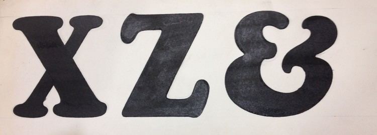
Cooper Black series (1922, BB&S later ATF). Called by designer as a font "for far-sighted printers with near-sighted customers," it was hated by conservative typographers, but was popular among graphic designers, to the point that the foundry had problems making enough fonts.
Cooper Black Condensed (1926)) 20% lighter than the Cooper Black, the designer described it as “condensed but not squeezed.”
Cooper Fullface series Cooper yearned to create a heavy “modern” face- akin to Broadway and other display types in height and proportion, but more nuanced while being a dense, black type. The Barnhart Brothers & Spindler foundry, for whom Cooper had designed a number of typefaces, saw the potential of the typeface as a big seller. Richard McArther, General Manager of the foundry, referred to it as “the hotsy stuff”, though he was highly critical of a number of characters in the original design. He requested a successive number of modifications, including the addition of Dwiggins-inspired serifs to the face to make it stand apart from similarly-weighted typefaces then on the market. He wanted to imbue the face with a considerable amount of “old-timey” flavor in order to impart a sense of originality to the face and have it sell across both Modern and Bodoni/Didot market segments. The resulting typeface was called Cooper Fullface, a jaunty and swollen caricature of a Didone with great potential for display advertising work. The final form of the face was a regulated and consistent balance of cartoonishness and earnest visual braggadocio, the bouncy, circus fairway-like swing of the original drawings of the letters taken down considerably and figures redrawn and redrawn for maximum readability. A specimen sheet was mailed out in 1929, and generated moderate sales, but too late- Barnhart Brothers & Spindler closed its foundry division shortly thereafter as part of ATF’s corporate roll-up of manufacturing. The American Type Founders continued to produce the face and sell it at a decent pace, renaming it Cooper Modern.
Cooper Fullface (1929, BB&S)
Cooper Fullface Italic (1929) Cooper designed a matching italic for Cooper Fullface, but it was never released. The BB&S foundry closure resulted in the foundry equipment being shipped to New Jersey a few weeks shy of the typeface’s completion. It is unfortunate, as the accompanying italic is perhaps Cooper’s masterpiece, a lively Bodoni-esque italic with more than a bit of influence from 19th Century display types, particularly in the treatment of the ball serifs on the uppercase “A”, “J”, “M”, and “N”. Cooper Fullface Italic stood as the missing bookend to Cooper’s career as a type designer for over a half-century. A digital version based on Cooper's original drawings was released by the Wordshape Type Foundry in 2010.
Boul Mich (1927, BB&S)) In 1927 Cooper was asked by the foundry to take an advertising headline from a newspaper clipping and fill it out into a design for a complete alphabet, which he did, disclaiming any credit for the original design. The face was named Boul Mich, after Michigan Boulevard in Chicago where many of the cities advertising agencies were located. Digital version released by Wordshape, 2010
Pompeian Cursive (1927, BB&S) Digital version released by Wordshape, 2010
Dietz Text (c. 1927, BB&S) Original drawings made by August Dietz were not suitable for making patterns, so Cooper spent two months making them ready for matrix cutting. It was the last of Oswald's fonts released by BB&S before the foundry was closed in 1929.
Other “Cooper Faces”
Packard (1913, ATF) Cooper's anonymous hand-lettering for Packard ads formed the basis of the Packard font prepared at the direction of Morris Fuller Benton of American Type Founders.
Cooper Tooled Italic (BB&S) was not designed by Oz Cooper, but was actually a knock-off of a "Cooper Italic" by a German foundry.
Cooper Tooled (1928, Lanston Monotype) designed by Sol Hess and based upon Cooper Hilite, though with the white line on the opposite side.
Cooper and Cooper Black were also copied by Monotype under the same names
Rugged Black + Italic were Intertype’s copies of Cooper Black + italic
Maiandra GD is inspired by Oz Cooper's hand lettering for an advertisement in 1909, which was based on Greek epigraphy