
Category Serif | Designer Frederic Goudy Date released 1901 | |
 | ||
Link linotype.com/1549209/copperplate-gothic-family.html Re-issuing foundries Mergenthaler Linotype Company | ||
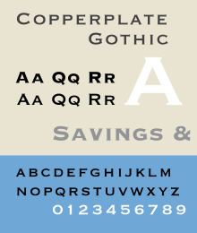
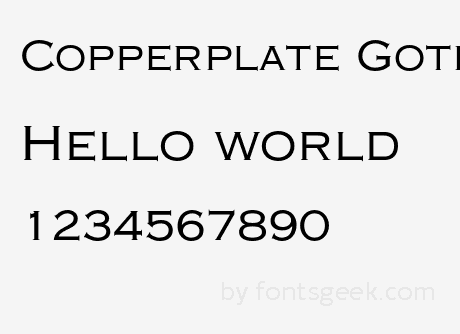
Copperplate Gothic is a typeface designed by Frederic W. Goudy and released by American Type Founders (ATF) in 1901.
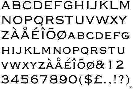
While termed a "Gothic" (another term for sans-serif), the face has small glyphic serifs that act to emphasize the blunt terminus of vertical and horizontal strokes. The typeface shows an unusual combination of influences; the glyphs are reminiscent of stone carving or lettering on copperplate engravings, the wide horizontal axis is typical of Victorian display types, yet the result is far cleaner and leaves a crisp impression in letterpress or offset printing.
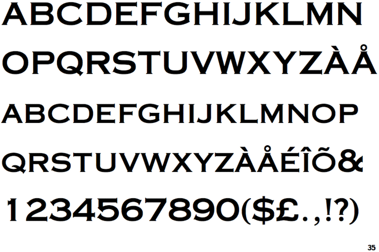
Goudy designed Copperplate Gothic in capitals only, since the design was intended to be used for headings and key words rather than for body text. It is not at all characteristic of Goudy's work, which is generally in the old-style serif genre. Goudy created it early in his career while in need of commissions, although he wrote in his 1946 autobiography that he 'treasured' the drawings for their quality and noted that the design remained largely used. It was developed on the initiative of ATF manager Clarence Marder while Goudy was living in Hingham, Massachusetts. ATF later cut other versions, such as bold styles, condensed and shaded styles, but never a lower case.
The typeface is often used in stationery, for social printing and business cards. It is also classically seen acid-etched into glass on the doors of law offices, banks and restaurants. This typeface was also used on the logo of the game show Who Wants to Be a Millionaire? and the Universal Pictures logo from 1997 until 2012. Since 2010, the typeface has been implemented in the uniforms and branding of the Golden State Warriors. It is also used for the logo of the California-based rock band Cake.
Master printer J.L. Frazier, no great fan of sans-serif types, wrote of it in 1925 that 'a certain dignity of effect accompanies...due to the absence of anything in the way of frills," making it a popular choice for the stationery of professionals such as lawyers and doctors.
Related typefaces
The general style of Copperplate Gothic is known as wedge-serif, due to the very narrow serifs pointing outwards, or as engraving faces due to the similarity with engraved letters. Copperplate Gothic's serifs, which are much less bold than the letters, are small by the standards of the genre. The wedge-serif style is sometimes called Latin, especially in Europe, and was quite popular there for much of the twentieth century. For example, Adrian Frutiger's early design Initiales Président (1952) was intended to be a French competitor; Frutiger in his autobiography noted that they were for makers of type "one of the safest investments. Smaller printers in particular had a steady demand for them." His later Méridien (also called Frutiger Serif) is a text face with some similarities, although this has more normal-sized serifs and a true lower-case.