
Date released 2007 | Classification Old-style Foundry Adobe Type | |
 | ||
Link adobe.com/mena_en/type/browser/landing/arno/arno.html | ||
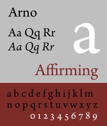
Arno is a serif type family created by Robert Slimbach at Adobe intended for professional use. The name refers to the river that runs through Florence, a centre of the Italian Renaissance. Arno is an old-style serif font, drawing inspiration from a variety of 15th and 16th century typefaces. Slimbach has described the design as a combination of the period's Aldine and Venetian styles, with italics inspired by the calligraphy and printing of Ludovico degli Arrighi.
Contents
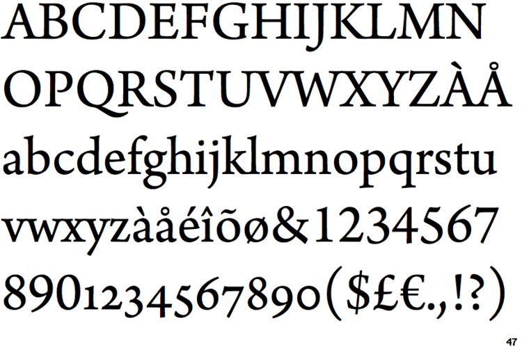
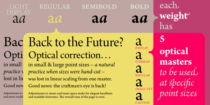
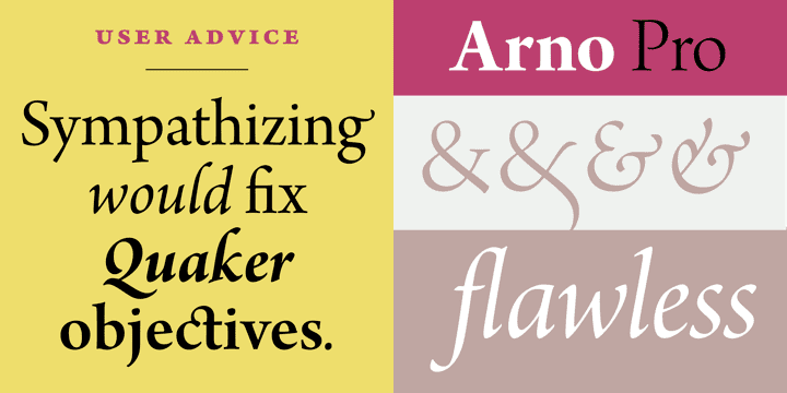
Arno was released in five optical sizes: separate fonts for different text sizes from captions to headings. In addition, Arno contains alternate letter styles such as swash italics inspired by Renaissance calligraphy. Other supported OpenType features include proportional and tabular numbers, old style figures, subscripts and superscripts, and ordinals.
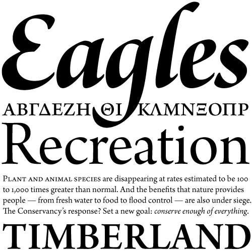
One of the most complete serif font families ever designed, Arno supports Adobe CE, Adobe Western 2, Cyrillic, mono- and polytonic Greek, Latin Extended and Vietnamese character sets with small caps, as well as dingbat and fleuron characters inspired by early printing.
Availability
Part of the Adobe Originals programme, Arno is included with Adobe Creative Suite 3, Adobe Font Folio 11 and Adobe Typekit.
Inspiration
The font family is a multi-purpose type suitable for book design, inspired by the calligraphically-inspired humanistic types of the Italian Renaissance. Slimbach described his goal as giving it "a tangible style" to be "as readable as possible".
Reception
Arno has received positive reviews. Reviewing the font for Typographica, designer Mark Simonson described it as "nicely sturdy" for body text and highlighted the sophistication of its italic alternate programming, noting that when enabled Arno "almost becomes a different typeface". Font expert Stephen Coles compared it to Requiem. Designer and calligrapher Paul Shaw suggested that its design represents a different, more "lively" and mannered approach to the more sleek and neutral-looking Bembo and Slimbach's earlier Minion.
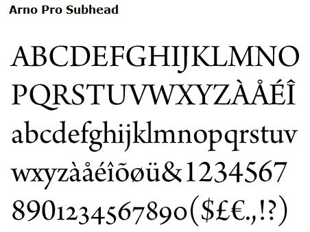
Optical sizes
A light weight is included only in the display style. Slimbach commented that he felt that using light styles at text sizes would be a mistake because they would be hard to read.
Awards
It was a winning entry in the Type Directors Club 2007 Type Design Competition (TDC2), under the Type System / Superfamily category.
Document design expert Matthew Butterick used Arno in the print edition of his book Typography for Lawyers.