
 | ||
Metro is a sans-serif typeface family created by William Addison Dwiggins for the American branch of the Mergenthaler Linotype Company. It was released from around 1929 onwards for the hot metal typesetting printing equipment of the period.
Contents
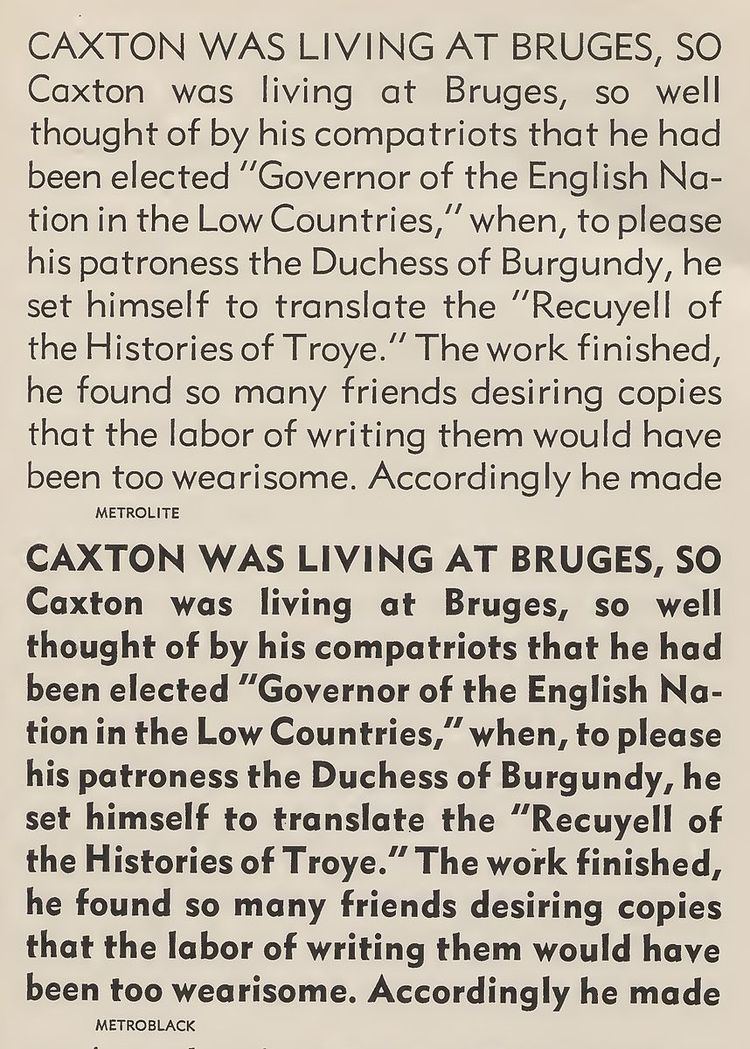
Metro was inspired by a wave of new "geometric" sans-serif designs such as Futura, which were based on simple geometric shapes like circles and straight lines, rather than on the traditional 'grotesque' style of sans-serifs such as Franklin Gothic. Dwiggins however intended to create a font with breaks from pure geometry which could make the design more interesting to read in the lower-case, such as considerable variation in stroke width and sheared terminals on many letters. Dwiggins only drew the boldest weight, Metroblack, with further weights drawn by the Linotype design team based on his design concept.
With a chunky design and wide spacing, Metro was often used in twentieth-century American newspapers for section headings, and Linotype promoted it with their 'legibility group' of typefaces suitable for printing on poor-quality newsprint paper.
The Metro series was redesigned on entering production, with several characters changed to mimic the then-popular Futura. Some revivals return to Dwiggins' original design choices or offer them as alternates.
Metal type releases
Digitisations
Several digitisations have been released by Linotype, with Metro No. 2 based on its use in metal type, Metro Office offering a modernised design with some use of Dwiggins' original characters, and Metro Nova offering a complete, somewhat modernised design with a wide range of weights and alternate characters.
Besides official Linotype digitisations, many unofficial revivals or designs based on Metro have proliferated. Concourse by Matthew Butterick is a loose revival adding a wide variety of stylistic alternate character designs and small capitals. Bitstream's "Geometric 415" is an unofficial revival directly based on Metro No. 2. Richmond by Jim Parkinson is a somewhat condensed revival created for the San Francisco Chronicle.