
Date released 1902–1967 | ||
 | ||
Also known as Gothic #1, Square Gothic Heavy, Gothic #16 | ||
Franklin gothic audio visual
Franklin Gothic and its related faces are realist sans-serif typefaces originated by Morris Fuller Benton (1872–1948) in 1902. “Gothic” was a contemporary term (now little-used except to describe period designs) meaning sans-serif. Franklin Gothic has been used in many advertisements and headlines in newspapers. The typeface continues to maintain a high profile, appearing in a variety of media from books to billboards. Despite a period of eclipse in the 1930s, after the introduction of European faces like Kabel and Futura, they were re-discovered by American Designer(s) in the 1940s and have remained popular ever since.
Contents
- Franklin gothic audio visual
- History
- Hot metal copies
- Cold type copies
- Digital copies
- Alternate Gothic
- Monotone Gothic
- News Gothic
- Lightline Gothic
- Hot metal variants
- Usage
- References
History
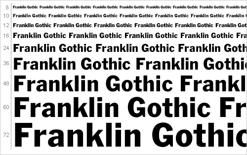
Franklin Gothic itself is an extra-bold sans-serif type. It draws upon earlier, nineteenth century models, from many of the twenty-three foundries consolidated into American Type Founders in 1892. Historian Alexander Lawson speculated that Franklin Gothic was influenced by Berthold’s Akzidenz-Grotesk types but offered no evidence to support this theory which was later presented as fact by Philip Meggs and Rob Carter. It was named in honor of a prolific American printer, Benjamin Franklin. The faces were issued over a period of ten years, all of which were designed by Benton and issued by A.T.F.
Many years later, the Foundry again expanded the line, adding two more variants:
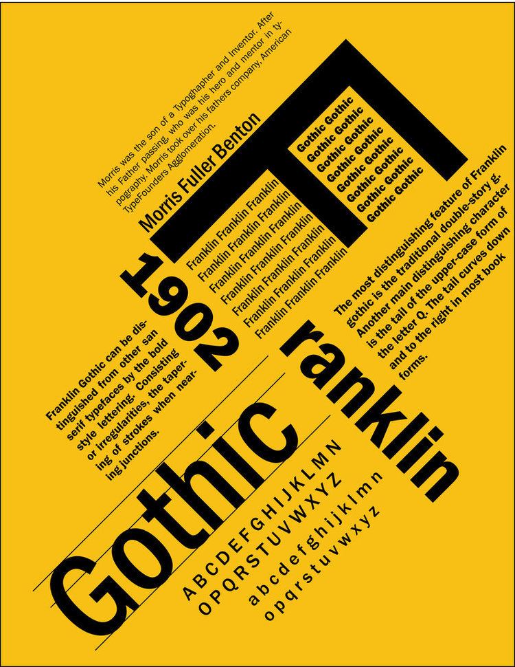
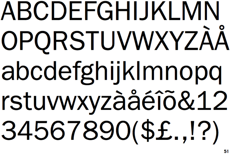
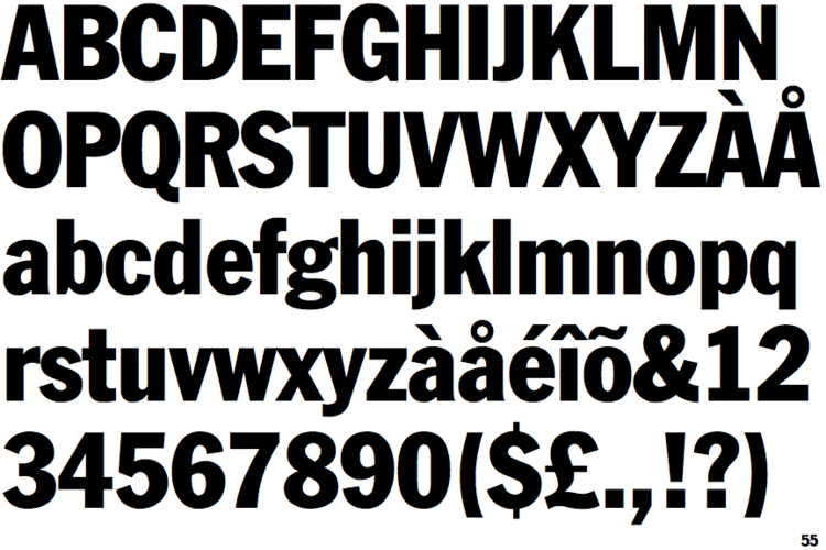
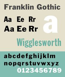
It can be distinguished from other sans serif typefaces by its more traditional double-story a and especially g (as double-story gs are rare in sans-serif fonts), the tail of the Q and the ear of the g. The tail of the Q curls down from the bottom center of the letterform in the book weight and shifts slightly to the right in the bolder fonts.
Hot metal copies
Barnhart Brothers & Spindler copied the face as Gothic #1, while both Linotype and Intertype, called their copies Gothic #16. Monotype’s copy kept the name Franklin Gothic, but because of the demands of mechanical composition, their version was modified to fit a standard arrangement. The Ludlow version was known as Square Gothic Heavy.
Cold type copies
Due to the post-war popularity of Gothic faces, most producers of cold type offered their own versions of Franklin Gothic. These included:
Digital copies
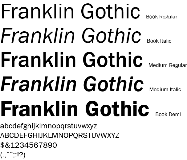
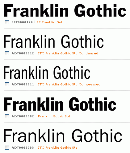
Digital copies have been made by Adobe, International Typeface Corporation, Monotype Imaging, and URW. Victor Caruso drew a multi-weight family for the International Typeface Corporation (ITC) in 1980 and in 1991, ITC commissioned the Font Bureau in Boston to create condensed, compressed and extra compressed versions of ITC Franklin Gothic. Bitstream’s version is called Gothic 744. Microsoft Windows has distributed "Franklin Gothic Medium," one of ITC's variants of the font, in all copies since at least Windows 95.
While ITC Franklin Gothic is the most common release, it has been criticised for modifying the structure of the family considerably. Calligrapher and design historian Paul Shaw argued that it was a failure for "mucking about with the distinctive Franklin Gothic g. In ITC Franklin Gothic...the g keeps popping up like a schoolchild overly eager to answer a question."
Alternate Gothic
Alternate Gothic was designed by M.F. Benton for A.T.F. in 1903. It is essentially a moderately bold condensed version of Franklin Gothic, made in three numbered widths. No.1 is the most condensed, 3 the least.
Hot metal copies
This face was copied by Monotype under the same name, #1 by Ludlow, Linotype and Intertype as Gothic Condensed. Ludlow’s Trade Gothic Condensed is very similar as well. Two variants were made:
Cold type copies
Alternate Gothic was copied by Compugraphic as Alpin Gothic.
Digital copies
Digital copies have been made by URW, Elsner+Flake, and Monotype as CG Alternate Gothic #3.
Micah Rich and several contributors of The League of Moveable Type have made a popular OFL-licensed version of Alternate Gothic #1, League Gothic.
Monotone Gothic
Monotone Gothic was designed by M.F. Benton for A.T.F. in 1907. It is essentially a lighter, more extended version of Franklin Gothic. Only one weight was made and it was apparently never copied under that name by any other Foundry. Digital versions of Franklin Gothic Light Extended are essentially knock-offs of this face.
News Gothic
News Gothic was designed by M.F. Benton for A.T.F. in 1908 as a continuing effort to consolidate and systematize the 19th-century Gothic faces inherited from the company’s predecessors. It is essentially a medium weight companion to Franklin Gothic. Morris cut seven variations for A.T.F.:
As with Franklin Gothic, the foundry expanded the line sometime later, adding two more variants:
Particularly extensive designs in the same style were Trade Gothic from Linotype and Record Gothic by Ludlow. Benton Sans is a notable, and extremely comprehensive, modern revival.
Lightline Gothic
Lightline Gothic was designed by M.F. Benton for A.T.F. in 1908 as a lighter version of News Gothic, which makes it an ultra-light version of Franklin Gothic. Only one weight was made and it was apparently never copied under that name by any other foundry. Digital versions of Franklin Gothic Ultra-Light are essentially knock-offs of this face.
Hot metal variants
In 1921, M.F. Benton had the capitals of this face cast in different sizes on identical bodies, thus creating, ex nihilo, a lining Gothic which was sold under the name Lightline Title Gothic