
10765.45 −32.82 (−0.30%) | 1256.92 −8.10 (−0.64%) | |
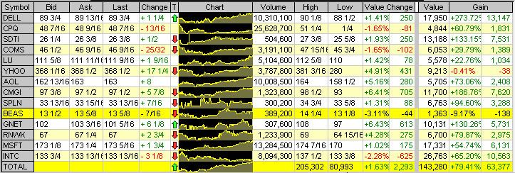 | ||
A sparkline is a very small line chart, typically drawn without axes or coordinates. It presents the general shape of the variation (typically over time) in some measurement, such as temperature or stock market price, in a simple and highly condensed way. Sparklines are small enough to be embedded in text, or several sparklines may be grouped together as elements of a small multiple. Whereas the typical chart is designed to show as much data as possible, and is set off from the flow of text, sparklines are intended to be succinct, memorable, and located where they are discussed.
Contents
History
In 1983, Edward Tufte formally documented the "sparkline" graphical style, then called "intense continuous time-series".
In early 1998, interface designer Peter Zelchenko introduced a feature called "inline charts", designed for the PC trading platform Medved QuoteTracker. This is believed to be the earliest known implementation of sparklines.
In 2006, the term sparkline itself was introduced by Edward Tufte for "small, high resolution graphics embedded in a context of words, numbers, images". Tufte described sparklines as "data-intense, design-simple, word-sized graphics".
On May 7, 2008, Microsoft employees filed a patent application for the implementation of sparklines in Microsoft Excel 2010. The application was published on November 12, 2009, prompting Tufte to express concern at the broad claims and lack of novelty of the patent.
Usage
Sparklines are frequently used in line with text. For example:
The Dow Jones Industrial Average for February 7, 2006 .
The sparkline should be about the same height as the text around it. Tufte offers some useful design principles for the sizing of sparklines to maximize their readability.