
 | ||
Link linotype.com/1245388/din-1451-family.html Foundry FontShop International, Mergenthaler Linotype Company | ||
Din 1451
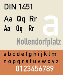
DIN 1451 is a sans-serif typeface that is widely used for traffic, administrative and technical applications.
Contents
- Din 1451
- Typemovie din 1451 ff din
- Overview
- History
- Releases
- Third party adaptations
- Uses in corporate branding and media
- References
It was defined by the German standards body DIN - Deutsches Institut für Normung (German Institute for Standardization) in the standard sheet DIN 1451-Schriften (typefaces) in 1931.
Originally designed for industrial uses, the first DIN-type fonts were a simplified design that could be applied with limited technical difficulty. Due to the design's legibility and uncomplicated, unadorned design, it has become popular for general purpose use in signage and display adaptations. Many adaptations and expansions of the original design have been released digitally.
Typemovie din 1451 ff din
Overview
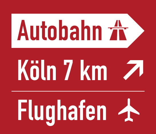
The DIN 1451 typeface family includes both a medium (Mittelschrift) and a condensed (Engschrift) version; an older extended version (Breitschrift) is no longer used since the early 1980s, but may still be encountered on older road signs in Germany. DIN 1451 is the typeface used on road signage in Germany and a number of other countries. It was also used on German car number plates from 1956, until replaced there in January 1995 by FE-Schrift, a typeface especially designed to make the plates more tamper-proof and to optimize automatic character recognition. The typeface has gained popularity due to its wide exposure through its release as a PostScript typeface in 1990. Since then it is also used by non-governmental organisations and businesses. For graphic design and desktop publishing, several type foundries offer redesigned and extended versions of this typeface.
History
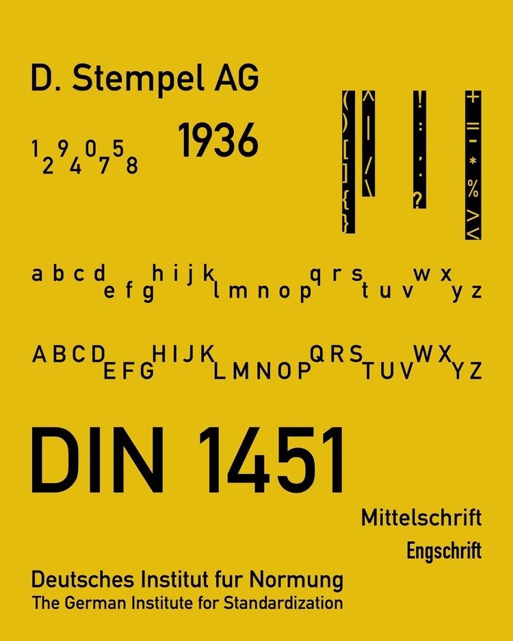
In 1931 the DIN institute published DIN 1451. It contained several standard typefaces for mechanically engraved lettering, hand-lettering, lettering stencils and printing types. These were to be used in the areas of signage, traffic signs, wayfinding, lettering on technical drawings and technical documentation.

The origins of DIN 1451 Engschrift (Condensed) for hand lettering go back to 1905, when the Königlich Preußische Eisenbahn-Verwaltung (Royal Prussian Railway Administration) standardized the lettering to be used on all its rolling stock in a master drawing (pattern drawing) known as Musterzeichnung IV 44. In 1915 the then Prussian-Hessian Railways decided that all lettering on railway platforms and stations had to be executed according to the 1905 master drawing as well. As a by-product of the merger of all German railway companies into Deutsche Reichsbahn in 1920, the Prussian railway typeface had already become a national de facto standard before the DIN Committee of Typefaces took up its work for DIN 1451 a few years later. The DIN Committee of Typefaces was headed by the Siemens engineer Ludwig Goller (1884–1964), who also led the central standardization office at Siemens & Halske in Berlin between 1920 and 1945. ]
The design included not only the DIN "Engschrift" but also a DIN "Mittelschrift" (medium width, now very popular. A DIN "Breitschrift" (Extended) design was also included, but it has never been widely used.
In order to enable quick and easy reproduction, all drawings were originally based on a coarse grid and could be executed with compass and rulers. The standard sheet DIN 1451-Schriften (typefaces) was released in 1931 as a pre-norm. With some minor changes DIN 1451 was officially released as a norm in 1936. In 1938 Temporary Order No. 20 required DIN 1451 to be used on the new German Autobahn (motorways). This and other similar regulations resulted in DIN 1451 dominating German public lettering until today.
In 1923 Stempel was the first type foundry that produced printing types according to a DIN Standard. The design follows DIN 16, an earlier standard for oblique lettering on technical drawings which had been released in 1919. In 1929, the Berthold type foundry released a similar typeface. DIN 16 had also been made available as lettering templates engraved in celluloid material for drafting use by the company of Filler and Fiebig in Berlin.
Within the scope of public and technical lettering the use of the DIN 1451 typefaces spread rapidly, once they were adopted. They were released as celluloid lettering stencils for smaller applications, as larger metal stencils for application to machinery, vehicles and airplanes, and as cast metal lettering for street and building signage. Printing types according to DIN 1451 have never been produced though. During World War II DIN 1451 was also adopted for the Protectorate of Bohemia and Moravia. The 1943 version of DIN 1451 also included a showing of Cyrillic characters, although their design did not match the weight and proportions of DIN Mittelschrift.
Geometric sans serif lettering and typefaces were very popular in the 1920s and 1930s. At the Bauhaus the design of lettering on coarse grids was advocated by Herbert Bayer and Joost Schmidt during the Dessau period. Although being designed in a similar way, the DIN typefaces lacked elegance and did not take advantage from these design trends.
Inspired by the DIN standard, a consortium of Dutch organisations created an equivalent standard lettering, NEN 3225. Created by a group of designers including Jan van Krimpen, the design has no similarity to the DIN standard: it is a humanist family with serif and sans-serif styles. The sans-serif is similar to Gill Sans and Johnston and the serif on the Garalde model.
Releases
The transferable-lettering-sheet company, Letraset made several variants available in the 1970s. Also the Berthold type foundry adopted the DIN typefaces for their optomechanical phototype setting systems such as Staromat. In 1980 the DIN typefaces were redrawn by Adolf Gropp (1911–1996), a lettering artist from Frankfurt. The drawings were made on a finer grid. This enabled an exact definition of details such as the amount of overshoot of round characters (e.g. C, G and O) below the baseline and above the cap height. Also characters such as S for which an accurate construction drawing had never been made were now defined using lines and arcs for the new cutting plotters that were to be used for the lettering on motorway signage. A number of the glyphs were changed, in particular those for "a", "6" and "9" as well as "t" in DIN Engschrift.
By the mid 1980s, Linotype adopted the redrawn DIN typefaces for digital photocomposition. Together with Adobe they released it as DIN Mittelschrift and DIN Engschrift in 1990. Thus the typefaces became part of the Adobe/Linotype PostScript typeface library. The use of DIN typefaces started to appear in the work of cutting edge graphic designers and design studios such as Uwe Loesch in Germany, Tel Design in the Netherlands as well as David Carson and April Greiman in the USA. Soon other leading designers began using DIN Mittelschrift and Engschrift, making it a popular option to other sans serif faces.
Third-party adaptations
With the popularity of the DIN fonts, with their minimal, modern design, several designers and companies have released their own interpretations and adaptations, often adding new weights such as light or extra-bold, and italics, causing a range of digital interpretations to exist.
One of the most famous and best-selling digitisations of DIN is FF DIN (1995), created by Dutch typeface designer Albert-Jan Pool for FontFont. Typographica editor Stephen Coles has particularly praised it for the quality of its hinting for onscreen display. Users include the New York City Ballet, ETH Zurich, The Verge and the film The Wolf of Wall Street. Unlike the original design, it uses conventional weight names.
As the original DIN design is out of copyright, other companies have offered digital releases (or obtained rights to resell Linotype's). Parachute (Latin, Arabic, Cyrillic, Greek), Elsner+Flake, Paratype (with Cyrillic characters) and others have issued revivals of some DIN styles, often upgraded with additional weights. Fontsite renamed its release 'Fette 1451'.
An extensive set of digitisations is that made by Peter Wiegel with donations requested from users under the OFL. This includes the regular style (Mittelschrift) in two grades for printing with less and more ink spread, and the less well-known Breitschrift. He also digitised the rounded DIN 16 and inclined DIN 17, using the names TGL 0-16 and 0-17, the names under which they were known in the German Democratic Republic.