FF DIN is a realist sans-serif typeface designed in 1995 by Albert-Jan Pool, based on DIN-Mittelschrift and DIN-Engschrift, as defined in the German standard DIN 1451. DIN is an acronym for Deutsches Institut für Normung (German Institute of Standardisation).
At a 1994 meeting of the ATypI (Association Typographique Internationale) in San Francisco, Pool encountered Erik Spiekermann, who encouraged him to design a revival of DIN 1451 for release by FontFont, the type foundry Spiekermann had just established. Today, FF DIN is one of the foundry’s best-selling typefaces.
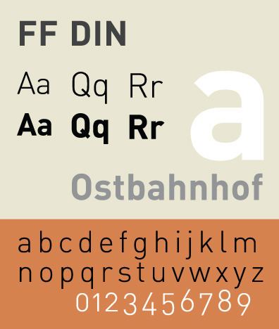
Sharing structural similarities with DIN 1451, FF DIN differs in its weight distribution and naming conventions, and has a far wider character set. It includes ranging (old style) figures and several refinements that allow it to perform better as a print and screen text face.
The family includes five font weights in two widths (Normal and Condensed), each with italics. The entire family includes extended characters such as arrows, fractions, Euro sign, lozenge, mathematical symbols, extra accented Latin letters, and superscript numeral figures. Alternate glyphs include rounded dots, old style figures, and alternate cedilla. With time Eastern European, Greek and Cyrillic character sets have been added as well.
square dot with extra whitespace above the lower case irounded/extended shoulder of the lower case rstraight leg of the uppercase Rstraight spur of the lower case athe geometric apostrophe with the bottom slantIn summer 2010, FontFont introduced a completely new drawn round version called FF DIN Round, including five weights (Light, Regular, Medium, Bold, Black). Assisted by Ivo Gabrowitsch of FontShop International, Albert-Jan Pool wrote the brochure FF DIN Round – digital block letters. It provides additional information on both the design and the history of round sans serif typefaces. FF DIN Round Pro also includes a Cyrillic character set for all weights.
FF DIN is the central typeface of JetBlue Airways’ and the Los Angeles County Metropolitan Transportation Authority’s corporate identity.Adidas uses FF DIN as its main typeface, adopted after switching from "Adihaus".American Eagle Outfitters uses FF DIN as its main sans-serif typeface, for both marketing and branding.ABC’s World News with Charles Gibson uses the font for its lower third graphics.The University of Canberra uses it for all official publications. The Canadian Broadcasting Corporation also makes heavy usage for its corporate identity needs.The New York City Ballet uses FF Din.PNC Financial Services, the sixth-largest bank in the United States, uses a modified version of FF DIN called PNC Sans in marketing and advertising, though the PNC corporate logo is typeset in Rotis Semi Serif.The title of Monsoon Wedding is done in DIN.It was used in the next bumpers during Toonami from 2004 to 2007 and again in 2012.It was the official video credit font from 2005 to September 2007 on MTV Latin America.It is also used in the Australian Office of Film and Literature Classification for their rating system.The ACLU identity includes the use of FF DIN Regular and, secondarily, FF DIN Bold.Valve Corporation use FF DIN as the standard typeface on their websites, as well as the logo for the video game Portal 2.Lowe's uses FF DIN in their new tagline as well as in various promotional materials.Identity of the London Design Festival 2008 was FF DIN.Used extensively in the BBC Two quiz show Only Connect.KHL uses FF DIN as the primary font family on their Russian site.Variations of DIN are being increasingly used in video games and other product promotional material as of 2011.FF DIN Condensed is used as webfonts throughout the popular tech news site The VergePosters for the film The Wolf of Wall Street use FF DIN.Henry Williams Signalling Control Panels.As of March 18, 2014, Maranatha Baptist University uses a form of the DIN font for its promotions and branding.ETH Zurich uses FF DIN Pro for posters, brochures and leaflets.The 3D printer manufacturer Markforged uses FF DIN as their primary corporate typeface.