
 | ||
Connectograms are graphical representations of connectomics, the field of study dedicated to mapping and interpreting all of the white matter fiber connections in the human brain. These circular graphs based on diffusion MRI data utilize graph theory to demonstrate the white matter connections and cortical characteristics for single structures, single subjects, or populations.
Contents
Background and description
Circular representations of connections have been used in a number of disciplines; examples include representation of aspects of epidemics, geographical networks, musical beats, diversity in bird populations, and genomic data. The connectogram, as a graphical representation of brain connectomics, was proposed in 2012.
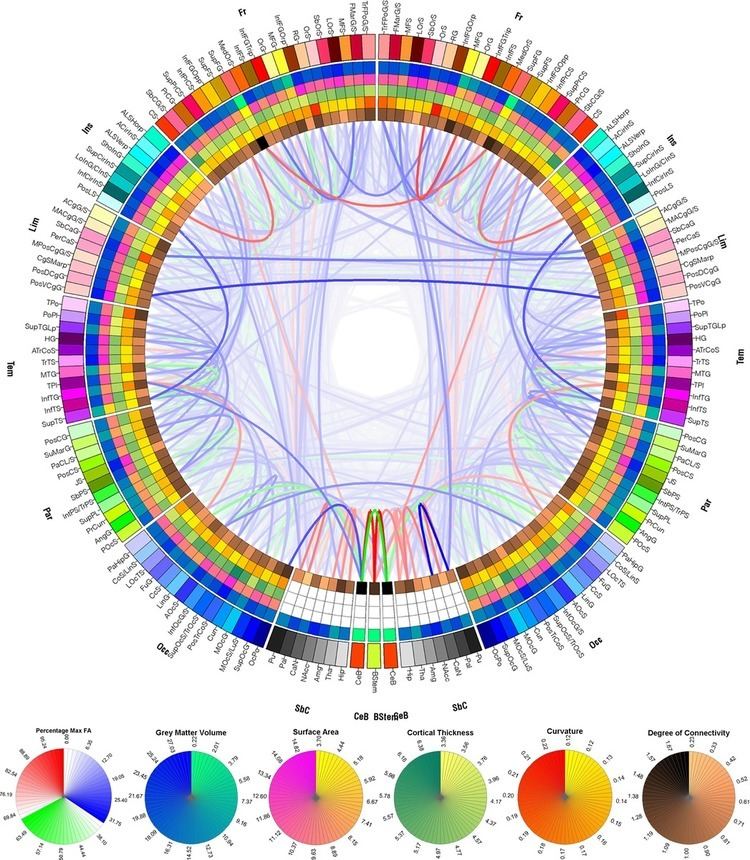
Connectograms are circular, with the left half depicting the left hemisphere and the right half depicting the right hemisphere. The hemispheres are further broken down into frontal lobe, insular cortex, limbic lobe, temporal lobe, parietal lobe, occipital lobe, subcortical structures, and cerebellum. At the bottom the brain stem is also represented between the two hemispheres. Within these lobes, each cortical area is labeled with an abbreviation and assigned its own color, which can be used to designate these same cortical regions in other figures, such as the parcellated brain surfaces in the adjacent image, so that the reader can find the corresponding cortical areas on a geometrically accurate surface and see exactly how disparate the connected regions may be. Inside the cortical surface ring, the concentric circles each represent different attributes of the corresponding cortical regions. In order from outermost to innermost, these metric rings represent the grey matter volume, surface area, cortical thickness, curvature, and degree of connectivity (the relative proportion of fibers initiating or terminating in the region compared to the whole brain). Inside these circles, lines connect regions that are found to be structurally connected. The relative density (number of fibers) of these connections is reflected in the opacity of the lines, so that one can easily compare various connections and their structural importance. The fractional anisotropy of each connection is reflected in its color.
Brain mapping
With the recent concerted push to map all of the human brain and its connections, it has become increasingly important to find ways to graphically represent the large amounts of data involved in connectomics. Most other representations of the connectome use 3 dimensions, and therefore require an interactive graphical user interface. The connectogram can display 83 cortical regions within each hemisphere, and visually display which areas are structurally connected, all on a flat surface. It is therefore conveniently filed in patient records, or to display in print.
Clinical use
On an individual level, connectograms can be used to inform the treatment of patients with neuroanatomical abnormalities. Connectograms have been used to monitor the progression of neurological recovery of patients who suffered a traumatic brain injury (TBI). They have also been applied to famous patient Phineas Gage, to estimate damage to his neural network (as well as the damage at the cortical level—the primary focus of earlier studies on Gage).
Empirical study
Connectograms can represent the averages of cortical metrics (grey matter volume, surface area, cortical thickness, curvature, and degree of connectivity), as well as tractography data, such as the average densities and fractional anisotropy of the connections, across populations of any size. This allows for visual and statistical comparison between groups such as males and females, differing age cohorts, or healthy controls and patients. Some versions have been used to analyze how partitioned networks are in patient populations or the relative balance between inter- and intra-hemispheric connections.
Modified versions
There are many possibilities for which measures are included in the rings of a connectogram. Irimia and Van Horn (2012) have published connectograms which examine the correlative relationships between regions and uses the figures to compare the approaches of graph theory and connectomics. Some have been published without the inner circles of cortical metrics. Others include additional measures relating to neural networks, which can be added as additional rings to the inside to show metrics of graph theory, as in the extended connectogram here: