
Classification Old style Date released 1903 | ||
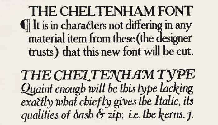 | ||
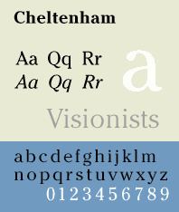
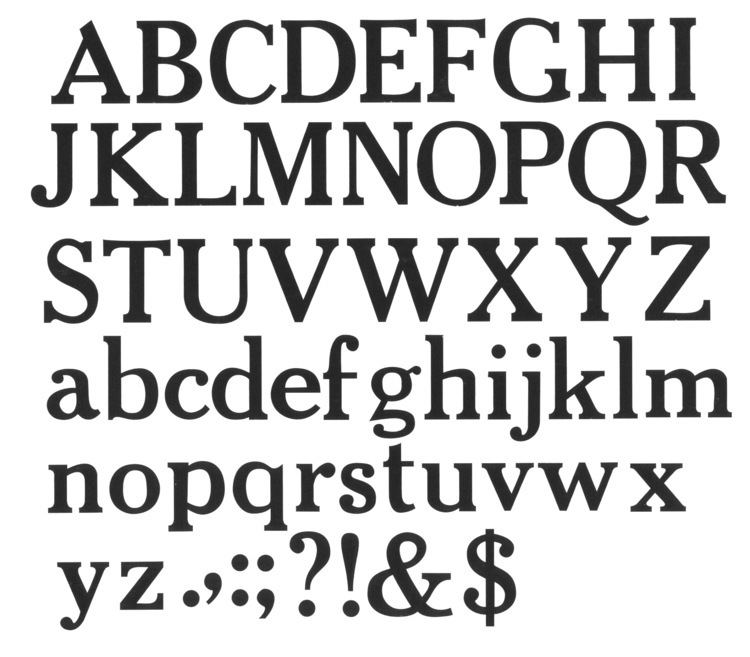
Cheltenham is a typeface for display use designed in 1896 by architect Bertram Goodhue and Ingalls Kimball, director of the Cheltenham Press. The original drawings were known as Boston Old Style and were made about 14" high. These drawings were then turned over to Morris Fuller Benton at American Type Founders (ATF) who developed it into a final design. Trial cuttings were made as early as 1899 but the face was not complete until 1902. The face was patented by Kimball in 1904. Later the basic face was spun out into an extensive type family by Morris Fuller Benton.
Contents
Cheltenham is not based on a single historical model, and shows influences of the Arts and Crafts Movement. Originally intended as a text face, "Chelt" became hugely successful as the "king of the display faces." Part of the face's huge popularity is because, as it has elements of both an old style and transitional face, a Cheltenham headline complements virtually any body type. The overwhelming popularity of the face for display purposes lasted until the advent of the geometric sans-serif typefaces of the 1930s.
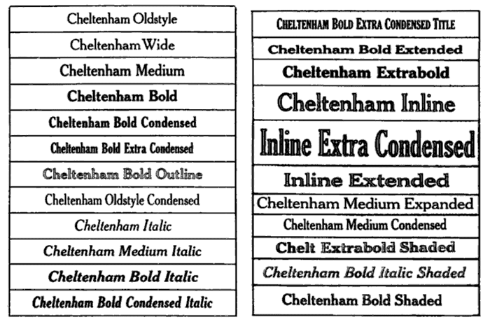
Foundry Type
The following versions were available in foundry type:

Cold Type Versions
The popularity of Cheltenham continued strong right in the cold type era, and it was offered by various manufacturers under the following names:
A cold type variant ITC Cheltenham, was also designed by Tony Stan for the International Typeface Corporation, in 1975. It features a larger x-height and improved italic details. The family includes 4 weights and 2 width each, with complementary italics.
Digital Versions
The original face has been digitized by the current owner, Kinsley/ATF and is sold by Bitstream Inc. The ITC version is also available from Linotype, Monotype, and Adobe Systems, along with ITC Cheltenham Handtooled, a 1993 version with highlight, designed by Ed Benguiat. Other versions are available from Tilde, Font Bureau, URW++, Scangraphic Digital Type Collection, and Elsner+Flake. Besley Clarendon is available from HiH.
Prominent usage
In 2003 The New York Times introduced a more unified Cheltenham typographic palette for its headline use in the print edition. Previously, Cheltenham was only one of several types including a sans-serif in a Victorian looking mix of headline faces. Tom Bodkin, assistant managing editor and design director of the Times, engaged typeface designer Matthew Carter to create multiple weights and a heavily condensed width of Cheltenham to replace most of the Latin Extra Condensed face in use, as well as Bookman and a variant of Century Bold.
In the U.S. Congress the bill or resolution number of all bills and resolutions set for public printing is set in Cheltenham. The typeface is also featured within the bills and laws themselves to designate title and section headings.
The Liturgical Press uses the Cheltenham Bold typeface for Lectionaries prescribed by the United States Conference of Catholic Bishops for Roman Catholic dioceses in the United States.
IDG's ...for Dummies series of how-to books are set in ITC Cheltenham.
L.L.Bean's logo is set in Cheltenham.
Akai's logo is set in ITC Cheltenham Ultra.
The street name plaques of Helsinki are set in Cheltenham.
This font is used prominently in the Japanese anime Cowboy Bebop, most notably for the ending cards of each episode, usually with the phrase "See you Space Cowboy..."