
Also known as Metropolitan Date created 1914 | Date released 1929 | |
 | ||
Link catalog.monotype.com/family/monotype/centaur Designer Similar Bruce Rogers (typographer), Frederic Warde, Nicolas Jenson | ||
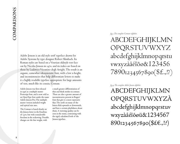
Centaur is a Serif typeface by book and typeface designer Bruce Rogers, based on the Renaissance-period printing of Nicolas Jenson around 1470. It was given widespread release by Monotype, paired with an italic designed by calligrapher Frederic Warde and based on the slightly later work of calligrapher and printer Ludovico Vicentino degli Arrighi. The italic has sometimes been named separately as the "Arrighi" italic.
Contents
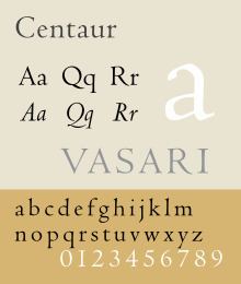
Centaur is an elegant and quite slender design, an effect possibly amplified in the digital release compared to the metal type. It was designed for fine book printing and is often used both for printing body text and also titles and headings. One of its most notable uses has been in the designs of Penguin Books, who have regularly used it for titling.
Historical background
Rogers' primary influence was Nicholas Jenson's 1470 Eusebius, considered the model for the modern upright printing of the Roman alphabet, which Rogers studied through enlarged photographs. Centaur also shows the influence of types cut by Francesco Griffo in 1495 for a small book titled De Aetna written by Pietro Bembo. The typeface is classified as belonging to the humanist style of old-style designs, based on the predominant influence of Jenson's work. The style is also called Venetian for the city Jenson worked in during his career as a printer.
Italics did not exist in Jenson's time, and so the inspiration for Centaur's italic comes from thirty years later, in the calligraphy and printing of Ludovico Vicentino degli Arrighi. Arrighi was a Rome-based calligrapher who made the transition to working in printing, releasing a writing manual, La operina…', and other printed works. These used an italic font presumably based on his calligraphy. It inspired later French italic types from 1528 onwards.
Revival
Rogers' revival was originally drawn as titling capitals in 1914 for the Metropolitan Museum of Art. Rogers later expanded it, adding lower case, for his 1915 limited edition of Maurice de Guérin's The Centaur.
For the original release, matrices were cut by Robert Wiebking and the type was privately cast by American Type Founders. Some years later, the Monotype Corporation commissioned Rogers to release it for the general market. Rogers did not feel able to create a matching italic, and asked the calligrapher Frederic Warde if he could pair Centaur with a design Warde had created based upon Ludovico Arrighi’s 1520 chancery face, made in 1926 for the Officina Bodoni. Warde's design had the separate name Arrighi, which appears in some earlier specimens.
The completed family was released for general use in 1929, with a first showing in Monotype's specimen booklet The Trained Printer and the Amateur by Alfred W. Pollard. Monotype described it as a 'long-descender type of great distinction', emphasising its feeling of not having been restricted to allow tighter linespacing, as other types often had been in the hot metal period. Monotype has sold the design with bold and bold italic designs (their invention, since bold type did not exist until much later), and swash italic alternate characters.
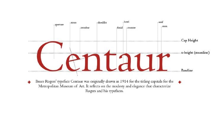
Centaur shows some of the irregularities of early type compared to later designs. The dots of the i and j are very visibly shifted to the right, a feature of Jenson's original design. The horizontal stroke of the 'e' is slanted, not exactly horizontal as came to be the norm in print. On the other hand, the italic capitals slope in the modern tradition, which was established after Arrighi's time in the later 16th century.
Digitisations
Centaur has been digitised, both by Monotype in collaboration with Adobe, and by LTC, who assumed the rights to many Lanston (American) Monotype typefaces under the name of Metropolitan. The revivals have slightly different features; Monotype’s having a bold and bold italic and swash caps and LTC’s having a more complex, less smooth digitisation with many italic alternates and complementary ornaments. A number of amateur revivals have also been developed, none complete as of 2015.
Related fonts
Other Monotype fonts of the hot metal period inspired by Renaissance printing included Lutetia by Jan van Krimpen (another Venetian design), Bembo (with a roman based on a slightly later font used by Aldus Manutius) and Dante.
Among other Venetian revivals, Adobe Jenson is a notable and extremely complete digital revival from 1996 with features such as optical size fonts for different text sizes. William Morris's Golden Type began revivals of the Jenson style in 1892 with a more solid structure (no matching italic was created for it), while American Type Founders' Cloister Old Style was created by its design team led by Morris Fuller Benton around 1915, during the same period as Centaur. Ludlow created another release with italic under the direction of Ernst F. Detterer and Robert Hunter Middleton in the 1920s. American Type Founders also issued a very eccentric Jenson revival inspired by the work of Morris which is little-known today. Tobias Frere-Jones created a revival in 1994 named Hightower Text that is bundled with some Microsoft software, adding his own italic design.
Usage
Outside its common uses, Centaur is also used for the wordmark of John Varvatos and in the children's book Crispin: The Cross of Lead, set in the Middle Ages.