Windsor is a serif typeface created by Eleisha Pechey (1831-1902) and released by the Stephenson Blake type foundry. It is intended for use such as display and in headings rather than for body text.
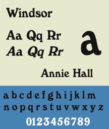
Capitals M and W are widely splayed, P and R have very large upper bowls. The lowercase a, h, m and n of the Windsor font have angled right hand stems, e has an angled cross-stroke. Bitstream in their release notes to its digitisation call it 'a creative variation on the old-style form.
Various foundries have released versions, including Linotype, Elsner+Flake, URW++ and Mecanorma. As many early digitisations were sublicensed, several of these may represent the same digitisation marketed by different rights-holders, possibly upgraded with modern features such as contextual ligature substitution. A range of weights have been created for it, such as condensed, outline and bold.
Beginning with 1977's Annie Hall, almost all the title sequences and credits of Woody Allen's films use sparse, white Windsor Light Condensed over a black background. The same font was used in the Ebury Press 2007 edition (ISBN 0091920213) of his 2007 book Mere Anarchy.Windsor Bold is used for the title and credits of the TV series All in the Family, 227, Who's The Boss?, and The Goldbergs.The Whole Earth Catalog, published between 1968 and 1972, used Windsor font on its cover.Max's Kansas City in New York City used lowercase Windsor Bold in its logo from 1965 to 1981. The 7th Street Entry at the First Avenue nightclub in Minneapolis, Minnesota has also used lowercase Windsor Bold in its logo since 1981.Windsor Bold is also the typeface used in the 1980s trading card series Garbage Pail Kids.For a majority of its run, and following its expansion to an hour long in 1975, The Price is Right flashed phrases during the intro that were in Windsor. Originally, the phrase "One Hour" was flashed in an unknown script font, but by mid-December 1975, it was switched to "Hour Power" in Windsor, and the font remained in use until the opening titles were abandoned in 2009. Some episodes, particularly specials, instead used Cooper Black beginning in the late 1990s; this was abandoned in the fall of 2007.A condensed version of Windsor is used on the letter strips in Parker Brothers' 1978 game Punch Line.