
Classification Grotesque; Mixed; Signage | Date created 1963 | |
 | ||
Designer | ||
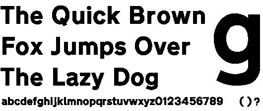
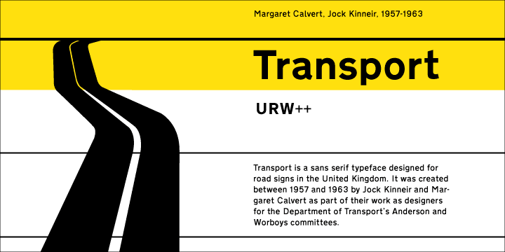
Transport is a sans serif typeface first designed for road signs in the United Kingdom. It was created between 1957 and 1963 by Jock Kinneir and Margaret Calvert as part of their work as designers for the Department of Transport's Anderson and Worboys committees.
Contents
History
Before its introduction, British road signs used the capitals-only Llewellyn-Smith alphabet that was introduced following the Maybury Report of 1933 and revised in 1955–57. Older signs, known as fingerposts, tended to use a variety of sans serif alphabets as supplied by their manufacturers. For the kinds of roads on which either of these alphabets was likely to be seen, legibility was not a pressing issue, but the planning and building of Britain's first motorway in the 1950s was a catalyst for change.
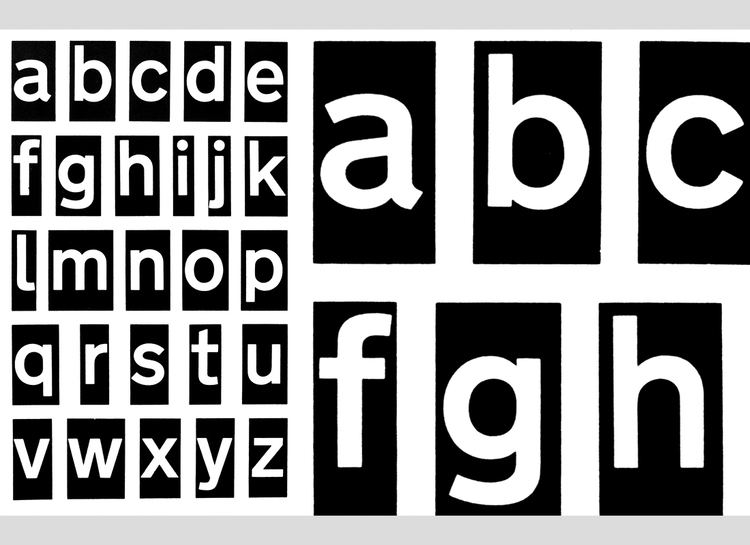
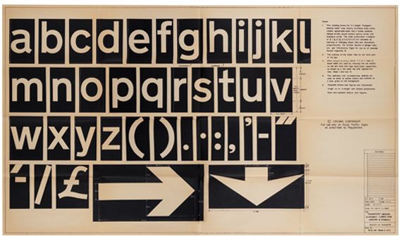
The Ministry of Transport appointed an Advisory Committee on Traffic Signs for Motorways under the chairmanship of Sir Colin Anderson in 1957 and Jock Kinneir and his assistant Margaret Calvert were appointed as graphic designers to it. All aspects of signing were investigated and tested, initially on the Preston bypass (1958, now part of the M6 motorway), before their introduction on the (London–Yorkshire) M1 motorway a year later. The committee looked at examples from other European countries as well as the USA but Kinneir and Calvert found them somewhat harsh and unsatisfactory. Instead, they developed a more rounded typeface with distinctive tails to 'a', 't', and 'l', and bar-less fractions, all of which helped legibility.
The department, seeing the successful early results of this work then appointed another committee, under the chairmanship of Sir Walter Worboys and again using Kinneir and Calvert as designers, to look at Traffic Signs for All-Purpose Roads. Work for this also resulted in the introduction of the pictogram signs based on those recommended by the 1949 United Nations World Conference on Road and Motor Transport.
Characteristics
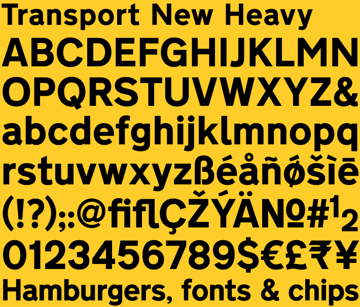
Two forms of the typeface exist; Transport Medium and Transport Heavy. Both have the same basic form, but Transport Heavy is boldface, to allow easier readability of black letters on white backgrounds, such as those used on non-primary roads, while Transport Medium is lighter, and is used for white letters on dark backgrounds, such as the green primary route signs.
The Transport typefaces are the only ones allowed on UK road signs (except for motorway signs, where route numbers appear in their own separate typeface known as Motorway).
Only a limited number of symbols are available in Transport, mainly those commonly used in road signs, such as apostrophes, the pound sign and certain vulgar fractions such as ½ and ⅓. Various diacritics are also available, for use in languages other than English, such as Welsh and Irish.
Other uses around the world
Although developed in the United Kingdom, the typeface has been used in many other countries around the world. In addition to the Crown dependencies, British overseas territories and some limited residual usage in Commonwealth states, the typeface is also used in Hong Kong, Iceland, Ireland, Greece, and Portugal, and in much of the Middle East. Denmark uses a variation with added spacing and modified figures. Italy and Spain use bolder variants, called Alfabeto Normale in Italy and Carretera Convencional in Spain (the latter only on non-motorway roads).
In countries where other scripts (such as the Arabic script) are used, Transport is often used for Latin transliterations. Road signs in the Republic of Ireland use all-caps Transport Heavy for English names; for Irish names, mixed-case Transport Heavy oblique is used with variants for A, a, i, M and N: script a, dotless i, and tall versions of m and n.
In Indonesia, since April 2014, changeable message signs/electronic signs use Transport.
New Transport
An updated version of the typeface has been developed by Henrik Kubel of A2/SW/HK and Margaret Calvert during 2012, with the family expanded to include six different weights. One of its first public uses has been on the UK's revamped central government website, 'GOV.UK', where it is has been selected as the sole font for all text. The original Transport family, with its two weights, has been digitised by URW++.