
Date released September 1914 | ||
 | ||
Link linotype.com/802/itc-souvenir-family.html | ||
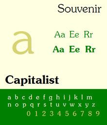
Souvenir is a serif typeface designed in 1914 by Morris Fuller Benton for American Type Founders. It was loosely based on Schelter-Antiqua and Schelter-Kursiv, a 1905 Art Nouveau type issued by the J.G. Schelter & Giesecke foundry in Leipzig. It has a much softer look than other old style faces, with a generally light look, rounded serifs, and very little contrast between thick and thin strokes. Like Cheltenham, it shows the influence of the Arts and Crafts Movement without belonging to a specific historical style. A 1970s redesign by Ed Benguiat, adding extra styles and an italic, became far more popular than the initial release, and is the source of most versions sold today.
Contents
At the time of its issue it achieved only a moderate popularity but was known as "the printer's friend" because of its forgiving qualities on press. In the 1970s, because of its friendly, curving structure, it became very popular in uses such as in body text of educational material and for headings in book printing. Historians have described it as 'laid-back', 'the friendliest of Benton's designs' and as 'like Times Roman dipped in chocolate'.
Cold type copies
In 1967 Ed Benguiat licensed the design from ATF and re-drew the face for the Photo-Lettering Corporation. When the International Typeface Corporation (ITC) was formed in 1971 it not only issued this design as ITC Souvenir but hired Benguiat to draw additional weights. He even added swashes for each variant, thus increasing its attractiveness. It was the bold and demi-bold weights that subsequently achieved a ubiquitous popularity, leading to it being made available for photocomposition by all the leading producers under the name Souvenir by Alphatype, Berthold, Compugraphic, Dymo, Harris, Star/Photon, Mergenthaler, Monotype, Varityper, while it was called Sovran by Graphic Systems Inc.
Hot metal copies
The sudden popularity of this face in the 1970s led to the creation of Linotype matrices in two weights by Matrotype. This is perhaps the only time when a phototype was subsequently cut into metal.
Digital copies
Because of cross-licensing agreements, the original digitisation is sold by a variety of companies. Digital copies are widely available from Linotype, Adobe, Monotype, and many other vendors. The company URW++ created a matching sans-serif design to complement it.
Reputation
Due to its enormous popularity in the 1970s, Souvenir has become associated with the design of that era. This inevitably led to a backlash commencing in the 1980s and 1990s. Simon Garfield lists it as the "seventh worst typeface in the world." Others on record as detesting the type include Frank Romano (who said "There's nothing wrong with Souvenir that a complete redesign wouldn't cure"), Peter Guy, and Mark Batty (who called it "A terrible typeface. A sort of 'Saturday Night Fever' typeface wearing tight white flared pants."). The backlash can be compared to that against Comic Sans some decades later, another typeface intended to seem casual and friendly that came to be seen as overused in inappropriate circumstances.