
 | ||
Although people in many parts of the world share common alphabets and numeral systems (versions of the Latin writing system are used throughout the Americas, Australia, and much of Europe and Africa; the Hindu-Arabic numerals are nearly universal), styles of handwritten letterforms vary between individuals, and sometimes also vary systematically between regions.
Contents
Arabic numerals
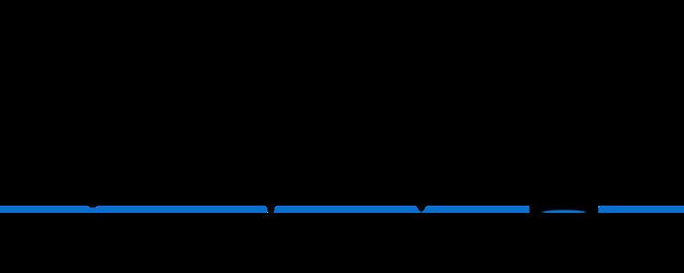
The handwritten numerals used in Western countries have two common forms:
Aside from these two main forms, other regional variations abound.
The numeral 0 — Some writers put a diagonal slash through the numeral 0 (zero), a practice that was used on some early, low-resolution computer terminals which displayed a slashed "zero" glyph to distinguish it from the capital letter O. This practice conflicts with the use of the letter "Ø" in the Danish and Norwegian languages, and the empty set character "∅" used in set theory. Forms that avoid confusion with Danish include:
Confusion between the numeral 0 and the letter O can be resolved by using a script letter O (with a loop at the top), and leaving the numeral 0 without embellishments; this was a common practice before use of the slashed zero became the norm
The numeral 1 — This numeral is sometimes written with a serif at the top extending downward and to the left. People in some parts of Europe extend this stroke nearly the whole distance to the baseline. It is sometimes written with horizontal serifs at the base; without them it can resemble the shape of the numeral 7, which has a near-vertical stroke without a crossbar, and a shorter horizontal top stroke. This numeral is often written as a plain vertical line without an ear at the top; this form is easily confused with the capital letter I and with the lower-case letter L.
The numeral 2 — In the U.S., Germany and Austria a "curly" version used to be taught and is still used by many in handwriting. This 2 can be confused with a capital script Q, or a letter Z. It appears as ɚ.
The numeral 3 — This numeral is sometimes written with a flat top, similar to the character Ʒ (ezh). This form is sometimes used to prevent people from fraudulently changing a 3 into an 8.
In Taiwan, the top is often written with a diagonal line from the top left, and the overall figure may be so changed that to foreigners it is completely unrecognizable even as a number.
The numeral 4 — Some people leave the top "open" — all the lines are either vertical or horizontal, as in a seven segment display. This makes it easier to distinguish from the numeral 9. Whether the horizontal bar terminates at or crosses the right vertical bar is insignificant in the West, but to be distinguished from certain Chinese characters (particularly 丩) it must cross.
The numeral 5 — In Taiwan, the left vertical bar is extended upwards as a long stem. If this is slanted, the overall figure may more closely resemble an uppercase Y. If casually written it can be confused with a letter S.
The numeral 6 — Can be confused with a letter capital G, or the lower case b, or the "9" if inverted. In situations where the number 6 may appear at various angles (such as on billiard balls, some styles of playing cards, and dice), it can be underlined (appearing as 6) or followed by a full stop (appearing as 6.) to indicate the proper viewing angle to disambiguate between 6 and 9; a 9 may or may not appear with similar underlining or full stop (as 9 or 9.). It can also be written with a straight line rather than a curly line on top, appearing as b
The numeral 7 — The traditional form found in copperplate penmanship begins with a serif at the upper left and has a wavy horizontal stroke (a swash). In China and Japan, this numeral is commonly written with such a serif, but no swash and no crossbar through the middle. It is usually written with just two strokes, the top horizontal and the (usually angled) vertical. A short horizontal bar is sometimes used to cross the vertical in the middle, to distinguish the seven from a numeral one, especially in cultures (such as French) that write 1 with an exaggerated upstroke. This form is used commonly throughout continental Europe, parts of the United States, and frequently in Australia. In Taiwan two horizontal bars are sometimes used, although an exaggerated serif is the feature which most clearly distinguishes 7 from 1. When the cross is added in the center it can cause confusion with a script capital F.
The numeral 9 — In parts of Europe, this numeral is written with the vertical ending in a hook at the bottom. This version resembles how the lowercase letter g is commonly written. () Elsewhere the usual shape is to draw the vertical straight to the baseline. A 9 may or may not appear with underlining or full stop (as 9 or 9.) in order to avoid confusion with 6. In South Korea, the 9 is written with the loop above or even to the right of the stick. The backwards version can also be found in Southern Taiwan.
The Latin writing system
The lowercase letter p — The French way of writing this character has a half-way ascender as the vertical extension of the descender, which also does not complete the bowl at the bottom. In early Finnish writing, the curve to the bottom was omitted, thus the resulting letter resembled a 'n' with a descender ('ɲ').
The lowercase letter q — In block letters, some Europeans like to cross the descender to prevent confusion with the numeral 9, which also can be written with a straight stem. In North America the descender often ends with a hook curving up to the right. ()
The lowercase letter s — See long s.
The lowercase letters u and v — These letters have a common origin and were once written according to the location in the word rather than the sound. The v came first; the u originally had a loop extending to the left and was only used to start words. All other locations for either u or v were written with the latter. In Germany (especially southern Germany), Austria and Switzerland, lowercase u is often written with a horizontal stroke or swish over it (ū, ũ), to distinguish it from n.
The capital letter J — In Germany, this letter is often written with a long stroke to the left at the top. This is to distinguish it from the capital letter "I".
The capital letter S — In Japan, this letter is often written with a single serif added to the end of the stroke.
The capital letter Z — This letter is usually written with three strokes. In parts of Europe such as Germany and Spain, it is commonly written with a short horizontal crossbar added through the middle. This version is sometimes preferred in mathematics to help distinguish it from the numeral 2. In Polish, the character Ƶ is used as an allographic variant of the letter Ż. In Japan it is often written with a short diagonal crossbar through the middle. () In France, it is often written with a loop at the bottom.
Sütterlin script
Sütterlin, the form of handwriting taught in schools and generally used in Germany until the mid 20th century, was very different from that used in other European countries. However, it was generally only used for German words. Any foreign words included in the text would usually be written in a "normal" script.
Slant
The slant of a sample of writing is a reflection of the copybook that is taught.