
Foundry ParaType | Commissioned by Rospechat Date created 2009 | |
 | ||
Classification Humanist sans-serifTransitional serifMonospaced font Designer(s) Alexandra Korolkova with Olga Umpelova and Vladimir Yefimov | ||
The Public Type or PT Fonts are a family of free/libre fonts released from 2009 onwards, comprising PT Sans, PT Serif and PT Mono. They were commissioned from the design agency ParaType by Rospechat, a department of the Russian Ministry of Communications, to celebrate the 300th anniversary of Peter the Great's orthography reform and to create a font family that supported all the different variations of Cyrillic script used by the minority languages of Russia, as well as the Latin alphabet.
Contents
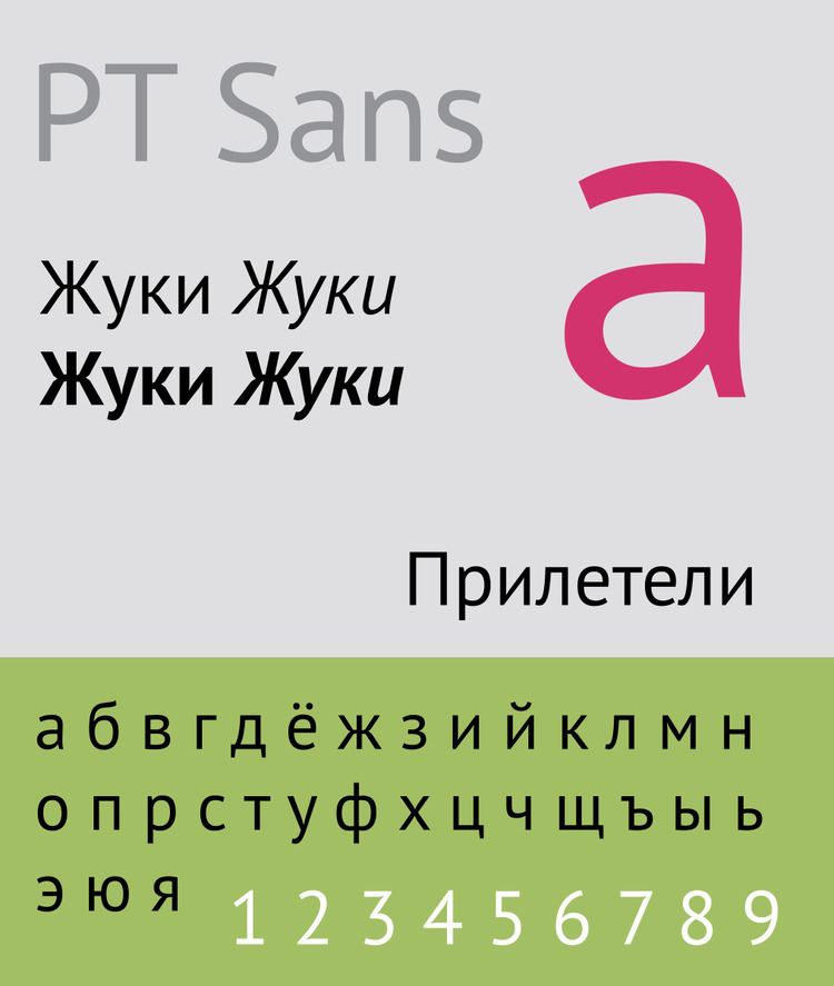
Primarily designed by Alexandra Korolkova, the family includes sans-serif and serif designs, both with caption styles for small-print text, and a monospaced font for use in programming. They are available under the English-language SIL Open Font License; the original font, PT Sans, was also released under ParaType's own Free Font License. Additional styles, such as extended, condensed and extra-bold, are sold from ParaType as PT Sans Pro and PT Serif Pro.
Features
The fonts include Latin and Cyrillic characters and covers almost all minority languages of the Russian Federation. The slashed-Р ruble symbol (before it became official in December 2013) is included at the U+20B9…U+20CF code points.
Regarding classification of design, to Western eyes PT Sans can be considered a humanist sans-serif font, with open letterforms and a true italic featuring calligraphic a and f glyphs. PT Serif can be considered a transitional serif font, with strongly vertical axes but limited variation of stroke width, and insistent, dagger-like serifs on lower-case letters. Its inclusion of optical sizes is extremely rare in libre fonts, EB Garamond being the only other widely used libre font with this feature.
In the most common open-source release, PT Sans and PT Serif feature regular, italic, bold and bold italic designs. They also include a caption style: this is a wider version of the typeface with a greater x-height (taller lower-case letters), designed for legibility at small font sizes and on outdoor signs. PT Sans also includes a condensed version in regular and bold without italics. In caption styles, PT Serif has a caption italic style while PT Sans has a bold version. PT Mono includes regular and bold styles.
Commercial releases include for PT Sans additional light, demi-bold, extra bold and black weights, in regular, narrow, condensed and extra-condensed styles. PT Serif gains an additional 32 styles, with narrow and extended widths, black, extra-bold and demi-bold weights. The professional releases also add text figures and small caps.
Operating system support
PT Sans is included in the Fedora Linux package repository since February 2010, in the Gentoo Linux repository since January 2011, and in OS X since Lion.