
 | ||
A monospaced font, also called a fixed-pitch, fixed-width, or non-proportional font, is a font whose letters and characters each occupy the same amount of horizontal space. This contrasts with variable-width fonts, where the letters and spacings have different widths. For example, the two high-use letters "I" and "E" do not need the same footprint. Both letters differ in center-to-next-letter edge (and center-to-center) spacing distance needs (margins) in variable width fonts. The variable that changes is offset from what would otherwise be monospaced centering. In a modern proportional font, every dimension can be scaled and changed, but such sizing mathematically must still maintain monospacing or variable spacing.
Contents
Note that this article generally assumes Western (Latin-based, Cyrillic, or Greek) writing systems. East Asian rules of typography, for example, require CJK fonts to be always monospaced at least as far as the main characters for writing words (i.e. not punctuation) are concerned. Other scripts vary in their use of monospaced fonts.
The first monospaced Western typefaces were designed for typewriters, which could only move the same distance forward with each letter typed—simply because all striker arms on a typewriter are physically the same width or won't align and pass through the positioning gap. This also later meant that monospaced fonts need not be hand-typeset (since Gutenberg, using physical blocks) and electric motorized cam driven auto typesetters could be manufactured. Monospace fonts being the same size and spacing, unlike variable width fonts and were and are arguably, easier to deal with since everything is uniformly spaced.
Examples of monospaced fonts include Courier, Courier New, Lucida Console, Monaco, and Consolas.
Use in computers
Monospaced fonts were widely used in early computers and computer terminals, which often had extremely limited graphical capabilities. Hardware implementation was simplified by using a text mode where the screen layout was addressed as a regular grid of tiles, each of which could be set to display a character by indexing into the hardware's character map. Some systems allowed colored text to be displayed by varying the foreground and background color for each tile. Other effects included reverse video and blinking text. Nevertheless, these early systems were typically limited to a single console font.
Even though computers can now display a wide variety of fonts, the majority of IDEs and software text editors employ a monospaced font as the default typeface. This increases the readability of source code, which is often heavily reliant on distinctions involving individual symbols, and makes differences between letters more unambiguous in situations like password entry boxes where typing mistakes are unacceptable. Monospaced fonts are also used in terminal emulation and for laying out tabulated data in plain text documents. In technical manuals and resources for programming languages, a monospaced font is often used to distinguish code from natural-language text.
Optical character recognition has better accuracy with monospaced fonts. Examples are OCR-A and OCR-B.
The term modern is sometimes used as a synonym for monospace generic font family. The term modern can be used for a fixed-pitch generic font family name used in OpenDocument format (ISO/IEC 26300:2006) and Rich Text Format.
Use in art
Multiple art forms have developed within computers' and typewriters' monospaced typographic settings in which the nth character of every line align vertically with each other. (Such a group of characters is sometimes called a column.) A proportional and monospaced font's reproduction of an element of ANSI art, line drawing, is illustrated below.
The failure of a proportional font to reproduce the desired boxes above motivates monospaced fonts' use in the creation and viewing of ASCII and ANSI art. Some poetry composed monospaced on typewriters or computers also depends on the vertical alignment of character columns. E. E. Cummings' poetry is often set in monospaced type for this reason. Some classic video games (eg. Nethack) and those imitating their style (eg. Dwarf Fortress) use a monospaced grid of characters to render their state for the player.
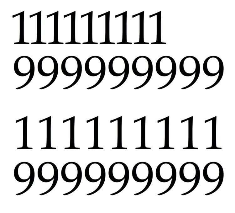
Tabular figures
Many fonts that generally are not monospaced have numerals that are known as tabular figures. As tabular spacing makes all numbers with the same number of digits the same width, it is used for typesetting documents such as price lists, stock listings and sums in mathematics textbooks, all of which require columns of numbers to line up on top of each other for easier comparison. Tabular spacing is also a common feature of simple printing devices such as cash registers and date-stamps. Fonts intended for professional use in documents such as business reports may also make the bold style numbers take up the same width as the regular, so a total in bold takes up the same width as the sum in regular style.
The alternative to tabular spacing is proportional spacing, which places the numbers closely together, reducing empty space in a document, and is thought to allow the numbers to blend into the text more effectively. With modern fonts using the TrueType or OpenType formats, it is possible to include both proportional and tabular figures in the same font file, and choose between them using font options settings in applications such as Microsoft Word or web browsers.
Other uses
In biochemistry, monospaced fonts are preferred for displaying nucleic acid and protein sequences, as they ensure that the representation of every nucleotide or amino acid occupies the same amount of space. Alignment of the letters makes it easier to compare different sequences visually.
Both screenplays and stage play scripts frequently use monospaced fonts, to make it easier to judge the time a script will last for from the number of pages. The industry standard is 12 point Courier. A tradition holds that on this format one page of script will take one minute of screen or stage time.
Monospaced fonts are frequently used in tablature music for guitar and bass guitar. Each line in a tabulature represents a guitar string, which requires that chords played across multiple strings be tabbed in vertical sequence, a feat accomplished only with the predictability of fixed width.