
 | ||
In statistics, a P–P plot (probability–probability plot or percent–percent plot) is a probability plot for assessing how closely two data sets agree, which plots the two cumulative distribution functions against each other. P-P plots are vastly used to evaluate the skewness of a distribution.
Contents
The Q–Q plot is more widely used, but they are both referred to as "the" probability plot, and are potentially confused.
Definition
A P–P plot plots two cumulative distribution functions (cdfs) against each other: given two probability distributions, with cdfs "F" and "G", it plots
Thus for input z the output is the pair of numbers giving what percentage of f and what percentage of g fall at or below z.
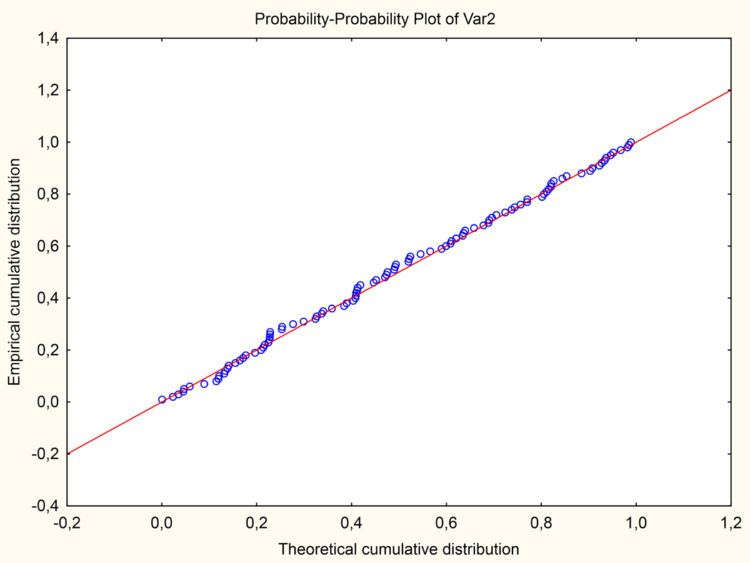
The comparison line is the 45° line from (0,0) to (1,1) – the distributions are equal if and only if the plot falls on this line – any deviation indicates a difference between the distributions.
Example
As an example, if the two distributions do not overlap, say F is below G, then the P–P plot will move from left to right along the bottom of the square – as z moves through the support of F, the cdf of F goes from 0 to 1, while the cdf of G stays at 0 – and then moves up the right side of the square – the cdf of F is now 1, as all points of F lie below all points of G, and now the cdf of G moves from 0 to 1 as z moves through the support of G.
Use
As the above example illustrates, if two distributions are separated in space, the P–P plot will give very little data – it is only useful for comparing probability distributions that have nearby or equal location. Notably, it will pass through the point (1/2, 1/2) if and only if the two distributions have the same median.
P–P plots are sometimes limited to comparisons between two samples, rather than comparison of a sample to a theoretical model distribution. However, they are of general use, particularly where observations are not all modelled with the same distribution.
However, it has found some use in comparing a sample distribution from a known theoretical distribution: given n samples, plotting the continuous theoretical cdf against the empirical cdf would yield a stairstep (a step as z hits a sample), and would hit the top of the square when the last data point was hit. Instead one only plots points, plotting the observed kth observed points (in order: formally the observed kth order statistic) against the k/(n + 1) quantile of the theoretical distribution. This choice of "plotting position" (choice of quantile of the theoretical distribution) has occasioned less controversy than the choice for Q–Q plots. The resulting goodness of fit of the 45° line gives a measure of the difference between a sample set and the theoretical distribution.
A P–P plot can be used as a graphical adjunct to a tests of the fit of probability distributions, with additional lines being included on the plot to indicate either specific acceptance regions or the range of expected departure from the 1:1 line. An improved version of the P–P plot, called the SP or S–P plot, is available, which makes use of a variance-stabilizing transformation to create a plot on which the variations about the 1:1 line should be the same at all locations.