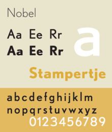
Designer S.H. de Roos Date released 1929 | Classification Geometric Foundry Amsterdam Type foundry | |
 | ||
Nobel typeface top 8 facts
Nobel is a geometric sans-serif typeface designed by Sjoerd Henrik de Roos (1877–1962) and Dick Dooijes (1909–1998) in the period 1929–1935 for the Amsterdam Type foundry). Capitalizing upon Lettergieterij Amsterdam's substantial financial interest in the Berlin typefoundry H. Berthold AG, de Roos conceived of a revival of Berthold Grotesk. Begun just two years after the release of Futura, Nobel is a similar exploration of geometric form but allows far more biomorphic shapes and variation.
Andrea Fuchs and Fred Smeijers of the Dutch Type Library (DTL) produced a revival in 1993. In the same year in the United States, Tobias Frere-Jones, then at Font Bureau, began a revival of the Nobel face. Cyrus Highsmith and Dyana Weissman later added the light weights. Frere-Jones described it as an interesting compromise between the purer geometry of Futura and traditional letters: "Futura cooked in dirty pots and pans."
Nobel is used by Lexus in its literature and marketing materials.
