
Link emigre.com/EF.php Date created 1996 | Variations Mrs Eaves XL, Mr Eaves | |
 | ||
Designer | ||
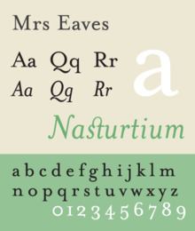
Mrs Eaves is a transitional serif typeface designed by Zuzana Licko in 1996. It is a variant of Baskerville, designed in Birmingham, England in the 1750s. Mrs. Eaves adapts Baskerville for use in display contexts, such as headings and book blurbs, through the use of a low x-height and a range of unusual combined characters or ligatures.
Contents
Mrs. Eaves was released by Emigre, a type foundry run by Licko and husband Rudy VanderLans, and has been joined by an 'XL' version for body text, as well as Mr. Eaves, a sans-serif companion.
Mrs eaves
Description
Mrs Eaves is named after Sarah Eaves, the woman who became John Baskerville's wife. Like his typefaces, John Baskerville was, himself, a controversial character. As Baskerville was setting up his printing and type business, he hired Sarah Eaves as his live-in housekeeper; eventually, her husband Richard abandoned her and their five children, and Mrs. Eaves became Baskerville's mistress and eventual helpmate with typesetting and printing. She married Baskerville within a month of her estranged husband's death. Selection of the name Mrs Eaves honors one of the forgotten women in the history of typography.
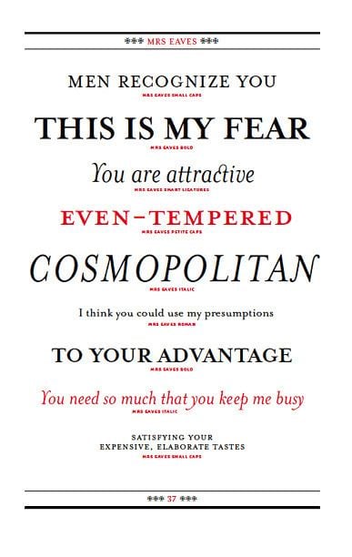
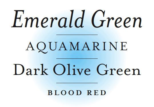
Stylistically, Mrs Eaves is a revival of the Baskerville typefaces cut for Baskerville by John Handy. Like Baskerville, Mrs Eaves has a near vertical stress, departing from the old style model. Identifying characters, similar to Baskerville's types, are the lowercase g with its open lower counter and swashlike ear. Both the roman and italic uppercase Q have a flowing swashlike tail. The uppercase C has serifs at top and bottom; there is no serif at the apex of the central junction in uppercase W; and the uppercase G has a sharp spur suggesting a vestigial serif.
Licko's design is unorthodox and not a pure revival. In creating it, she was influenced by how it would be printed by contrast to printing in Baskerville's time: considering the flatness of offset lithography in comparison to letterpress printing, and the resolution of set devices and on-screen display. The overall stroke weight of Mrs Eaves is considerably heavier than most other revivals, countering the often anemic reproduction of smaller point sizes in other digital revivals of Baskerville, and restoring some of the feeling of letterpress printing's unpredictability. To compensate for this and create a brighter-looking page, Licko lowered the x-height, reducing the amount of space taken up by ink on the page.
Issue 38, The Authentic Issue, saw the first extensive use of Mrs Eaves in Emigre Magazine. [1]
In an interview featured in Eye (No. 43, Vol. 11, Spring 2002), Licko explained why she thought Mrs Eaves was a successful typeface:
Derivatives
Several derivatives of Mrs Eaves have been released. These include Mrs Eaves XL (2009), a tighter derivative with a higher x-height intended for body text, and Mr Eaves and Mr Eaves XL, a sans-serif design similar to Johnston and Gill Sans.
Mrs Eaves XL was intended to provide a solution to a common criticism of Mrs. Eaves' original release: its very loose and uneven spacing, which makes Mrs Eaves unsuitable for body text. Emigre noted themselves that "The spacing is generally too loose for large bodies of text, it sort of rambles along ... Economy of space was not one of the goals behind the original Mrs Eaves design."
Mr Eaves was released in both regular and XL designs, matching the original Mrs Eaves and Mrs Eaves XL. Both heights were released in two widths: regular and narrow, and in two styles: Sans, a humanist design closest to the original serif model, and a more simplified Modern design resembling geometric sans-serif fonts like Futura.
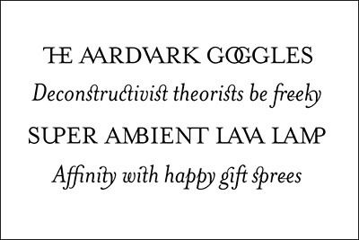
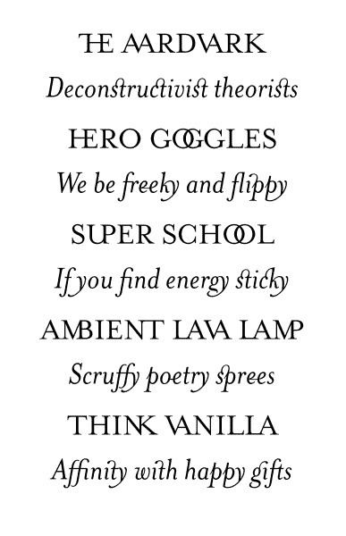
Ligatures
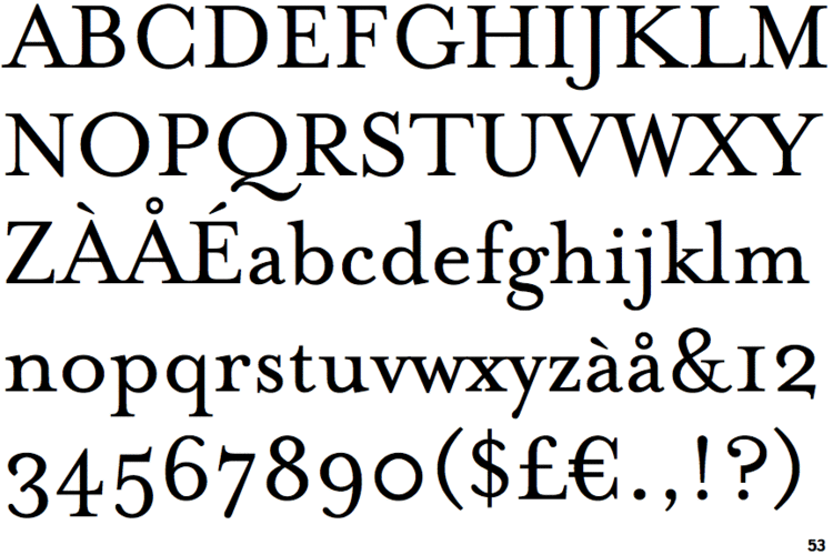
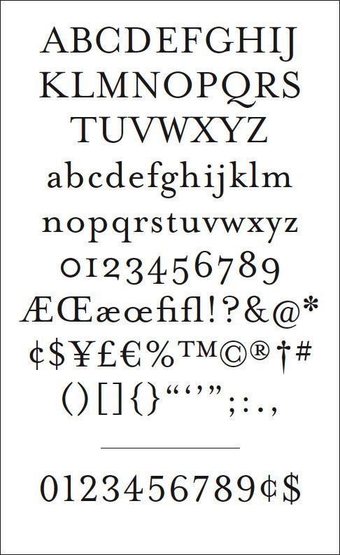
Mrs Eaves is particularly well known for its range of ligatures, ranging from the common to the fanciful and including intertwined and swash designs. Ligatures in all variants of Mrs Eaves include the standard fi, ffi, and fl ligatures, as well as the classic eighteenth-century ct and st ligatures and others with no historical precedent. These have been released in a variety of formats: originally ligatures were released in separate expert set fonts; more recently they are issued as stylistic alternates using the OpenType format. A Just Ligatures variant is available in roman and italic. The OpenType format fonts also contain all 213 ligatures.
Identifying characteristics
Prominent uses
The WordPress logotype is set in Mrs Eaves. It is also used for the titles (but not author names) on the covers and spines of the current Penguin Classics from Penguin Books.
Blacktree's Quicksilver wordmark uses Mrs Eaves. Roman and petite caps.
Bowdoin College uses Mrs Eaves in the college wordmark and in many other official materials.
Logo of Mandate Pictures.
Radiohead's 2003 album Hail to the Thief prominently used Mrs Eaves in its related artwork.
NBC's For Love or Money.
The body text from the published Browne Review.
Coldplay uses the font currently in their logo along with any other promotional artwork related to their 2015 album A Head Full Of Dreams.