Date released 1997 | ||
 | ||
Link fontbureau.com/fonts/MillerDisplay | ||
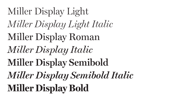
Miller is a transitional serif typeface released in 1997 by the Font Bureau, a U.S.-based digital type foundry. It was designed by Matthew Carter, based on the "Scotch Roman" style which originates from types cut by Richard Austin in Scottish type foundries in the early 19th century.
Contents
The general purpose versions of Miller are Miller Text and Miller Display, though since their release they have given rise to a number of variants, including Miller Daily, Miller Headline and Miller Banner, as well as some variants commissioned for use in specific publications. The Miller family is widely used, mostly in newspapers and magazines.
Background
The Miller family was designed by Matthew Carter and developed by Carter with the assistance of the Font Bureau's Tobias Frere-Jones and Cyrus Highsmith, and the encouragement of James Mosley, a librarian at St Bride Library.
Miller is a "Scotch Roman"—a style which originated in types cut by Richard Austin at the Scottish type foundries of Alexander Wilson and William Miller in the period of 1810–1820. Although Miller remains faithful to the Scotch Roman style (for example, in having both roman and italic small caps), it is not based on any single historical example. Mosley described Carter's revival of Miller as follows:
Matthew Carter's Miller is not a facsimile of Miller's Scotch Roman, any more than his Galliard was a facsimile of any one type by Robert Granjon. What it has done is to capture the good color, and the generous breadth and modelling of its model, and to bring a valid version of 'Scotch Roman' back into current use after a lapse [in England] of some decades. Miller was made with current production needs in mind, of which the two versions, 'Display' and the more robust 'Text' versions are evidence, and so is its relatively large x-height.
Variants
As well as the general purpose versions of Miller, Miller Text and Miller Display, numerous variants designed by Carter and others have been added to the Miller family. Variants include:
Usage
Miller and its variants are widely used in newspapers, magazines and other publications around the world. Miller Daily is used for body copy in The Washington Post, while Miller Banner features in Glamour magazine. Another Miller variant, Miller News, was commissioned by Simon Esterson of The Guardian for his 1998 redesign of the newspaper, Miller Globe was designed for The Boston Globe, and Bibliographical Miller was commissioned by the University of California, Los Angeles for use in its Aldine Press incunable collection. The Miller family has also been used in the National Post, The Straits Times, The Dallas Morning News, Hindustan Times and the San Jose Mercury News.
A 2005 survey by Ascender Corporation found Miller to be the tenth most popular typeface featured in American newspapers. As of 2010, it is Carter's biggest source of royalties amongst the fonts to which he owns the rights.
